top
ABOUT
POPA creates simple forms with dynamic uses, across scales ranging from master plans to buildings, interiors, and products. Themes we actively pursue are generosity, versatility, passive climate control through siting and materials, and smart interactions of new, old, and possible. We prefer appropriate technology over only the latest, to engage a broader spectrum of contexts and connections. Clear and responsive designs made through collaboration are a constant goal.
POPA is directed by Casey Mack, RA, LEED AP. After completing his M.Arch at Columbia, Mack worked with the Office for Metropolitan Architecture in Hong Kong and New York. Currently teaching architectural thesis at Pratt Institute, he has previously taught urban design at the New York Institute of Technology and Passivhaus housing at Parsons. He is the author of Digesting Metabolism: Artificial Land in Japan 1954–2202 (Hatje Cantz, 2022).
POPA is directed by Casey Mack, RA, LEED AP. After completing his M.Arch at Columbia, Mack worked with the Office for Metropolitan Architecture in Hong Kong and New York. Currently teaching architectural thesis at Pratt Institute, he has previously taught urban design at the New York Institute of Technology and Passivhaus housing at Parsons. He is the author of Digesting Metabolism: Artificial Land in Japan 1954–2202 (Hatje Cantz, 2022).
arch
ARCHITECTURE
products
PRODUCTS
writing
WRITING
combicourt
Combi-Court Co-op
Los Angeles, CA, 2025
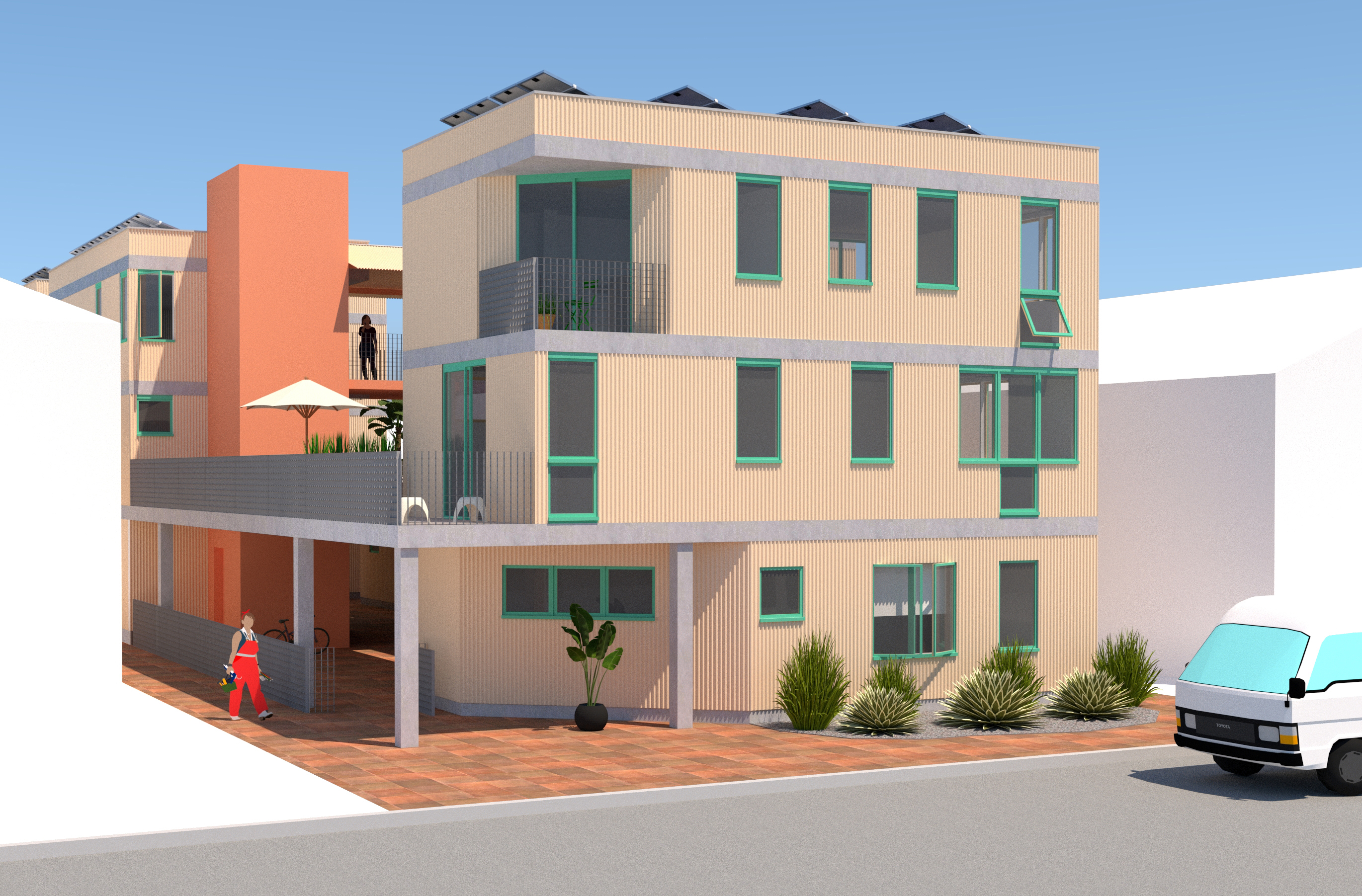
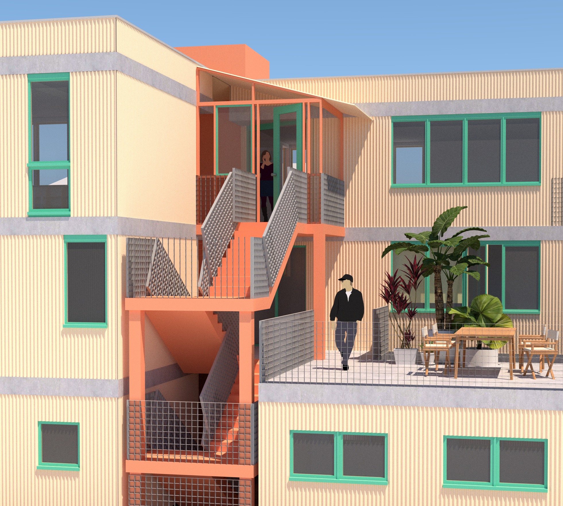
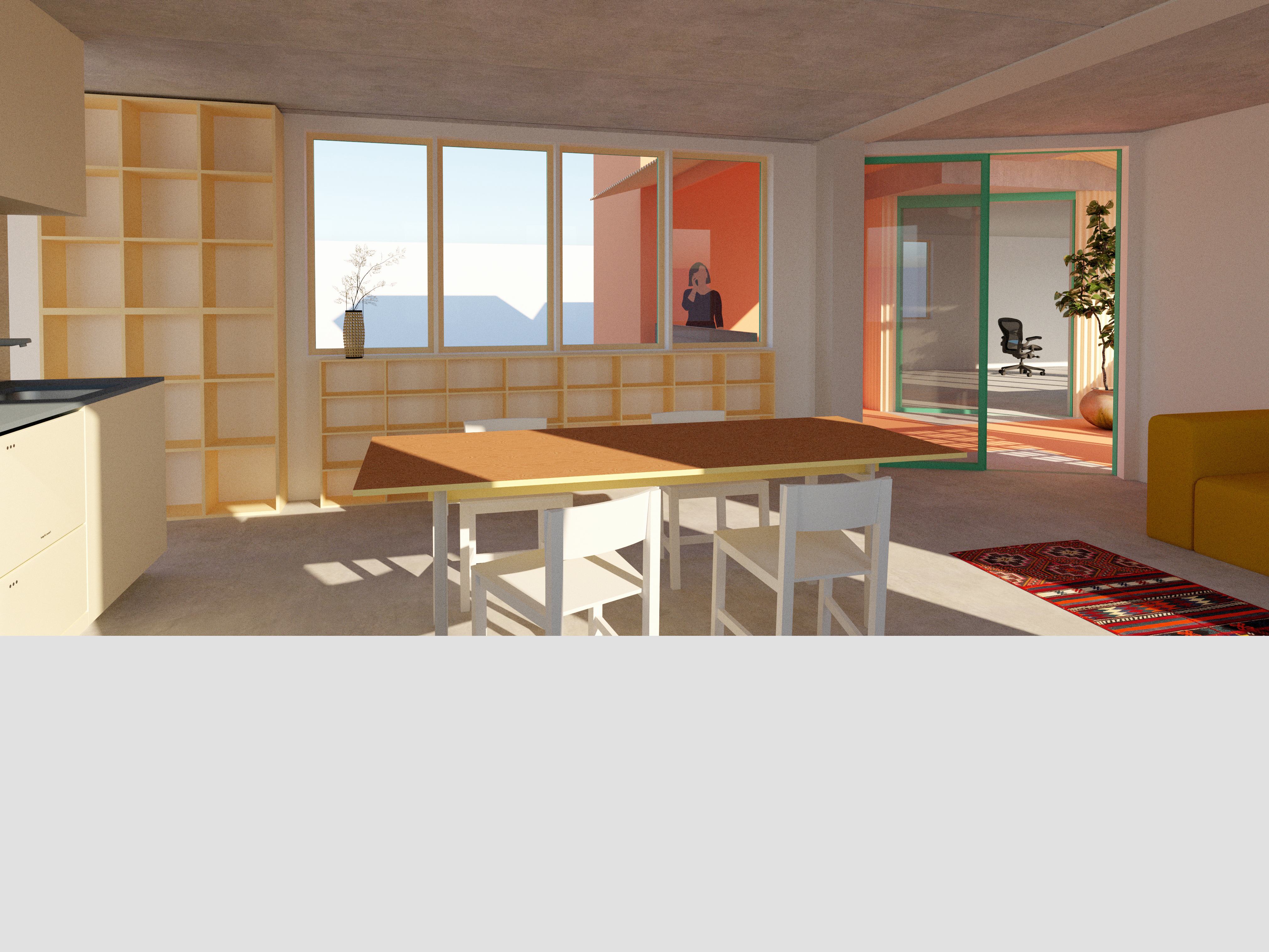
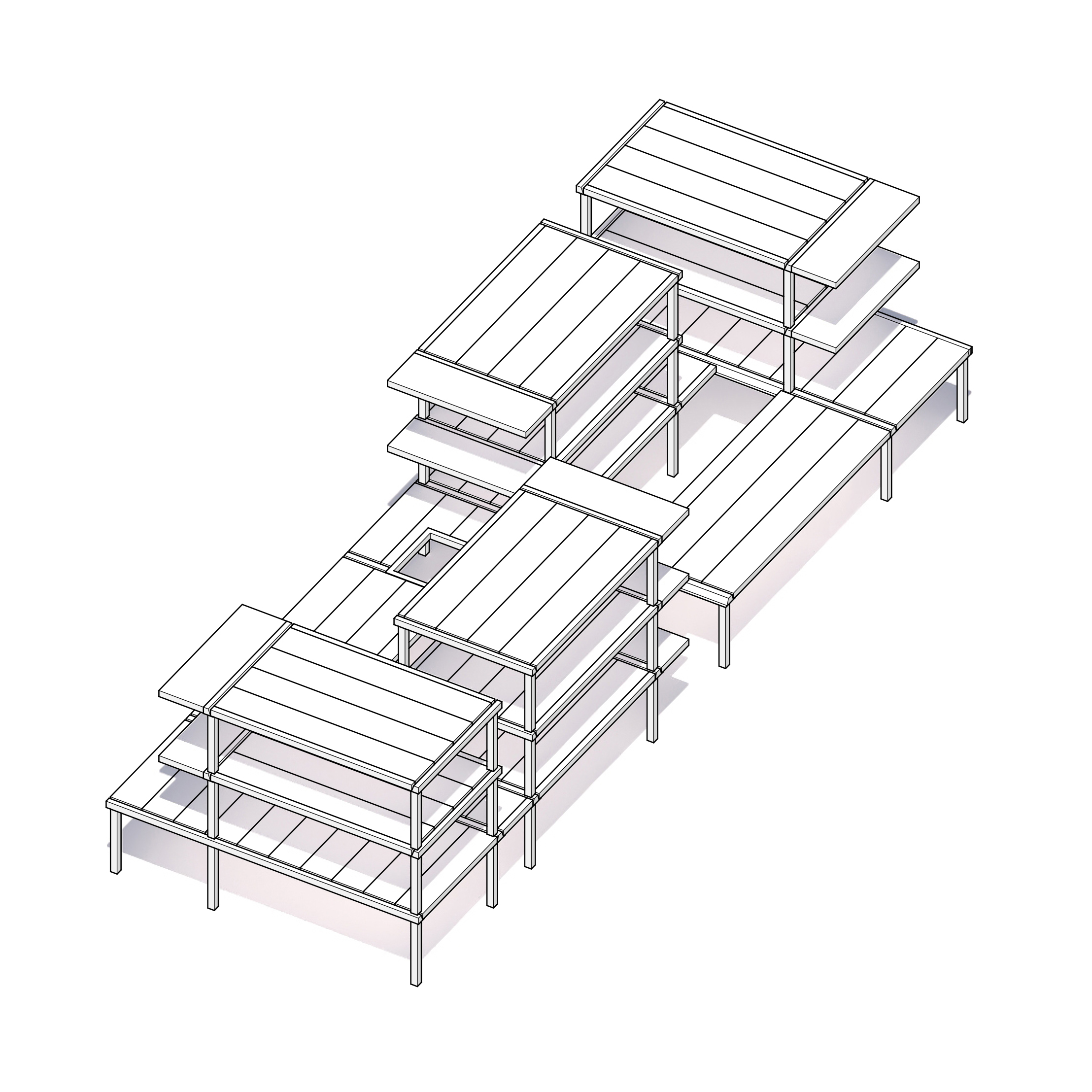
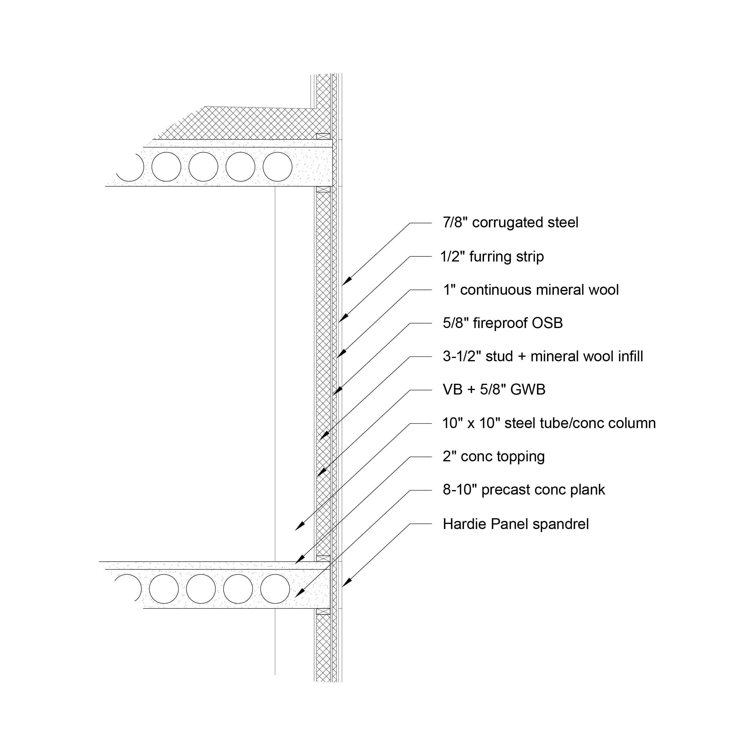
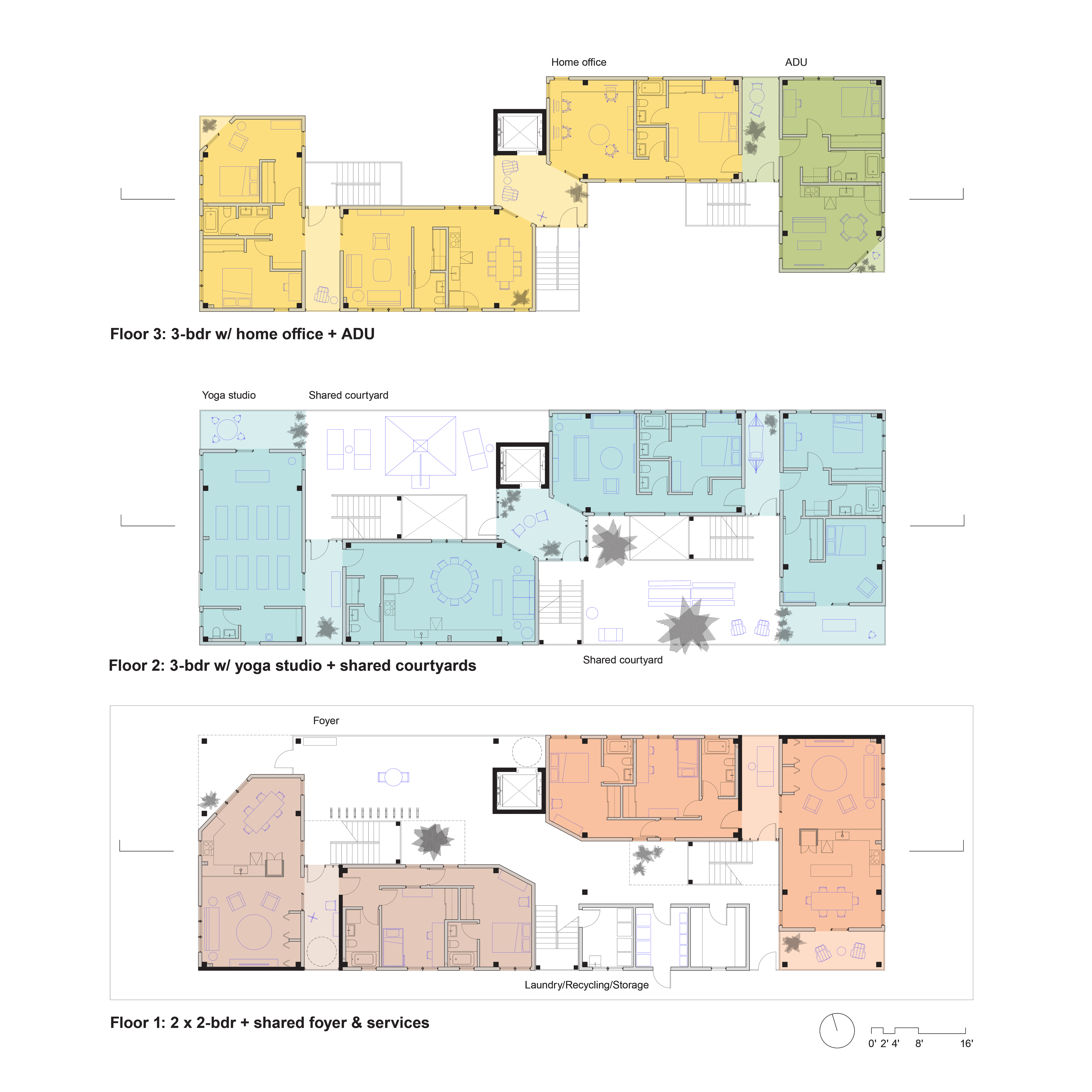
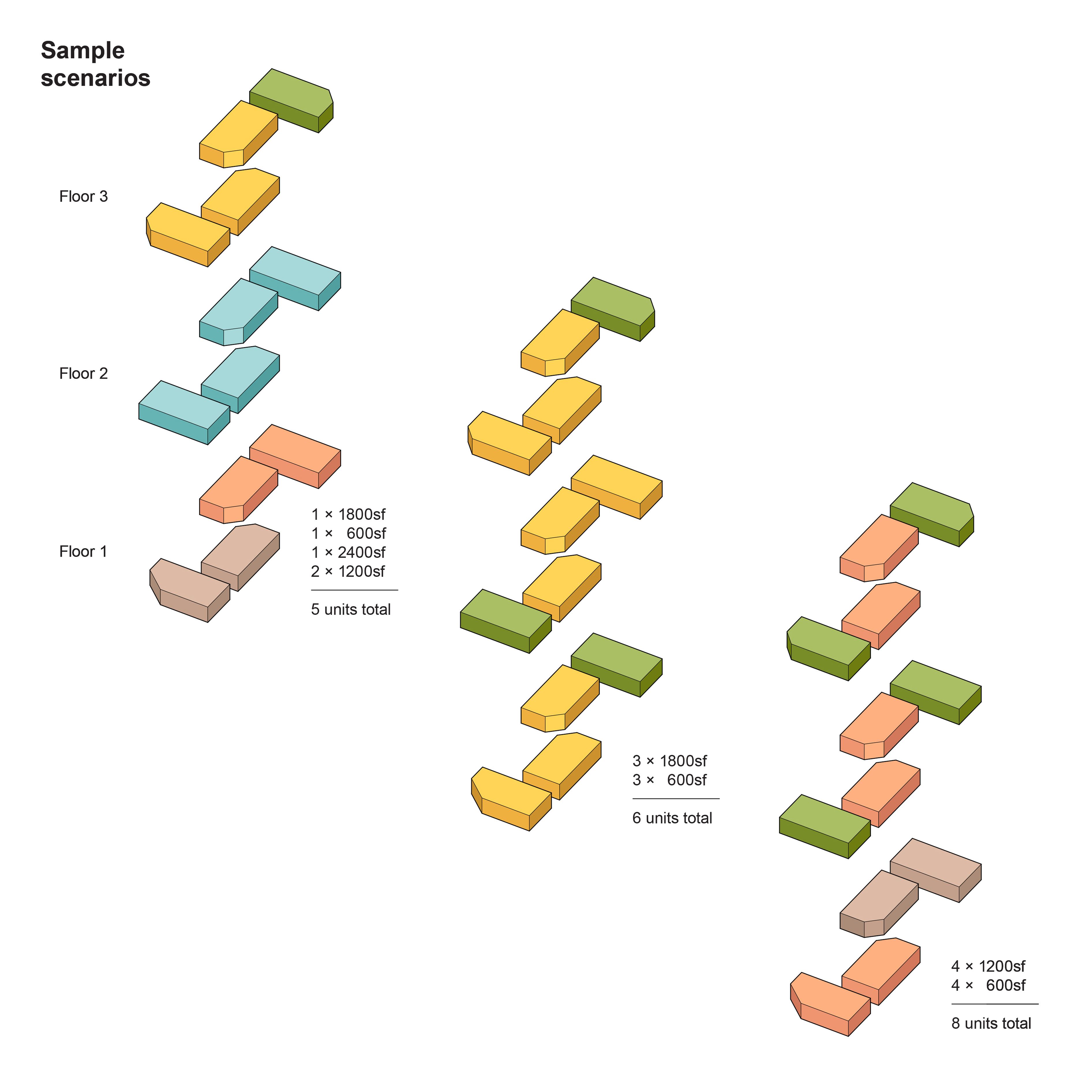
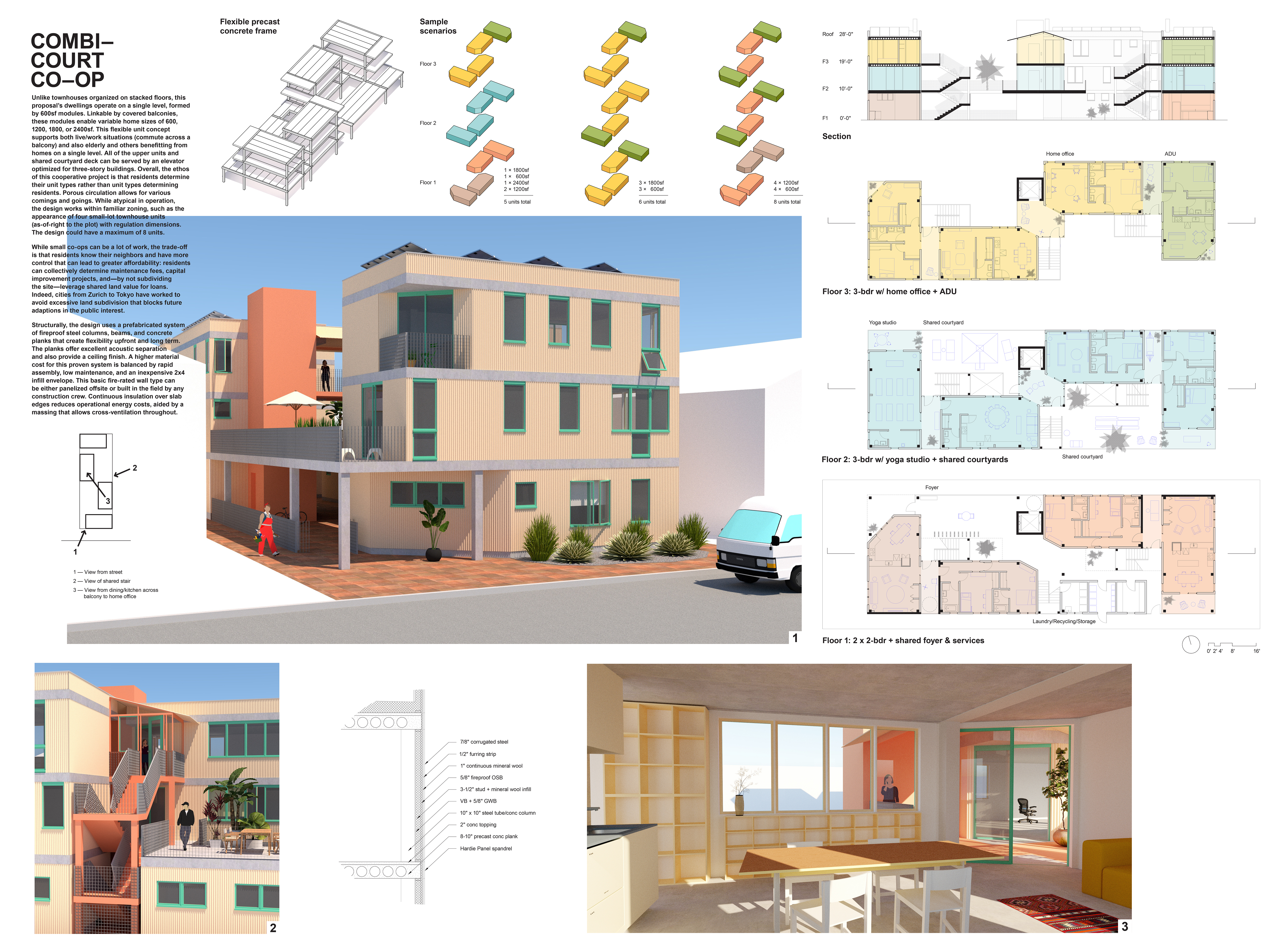
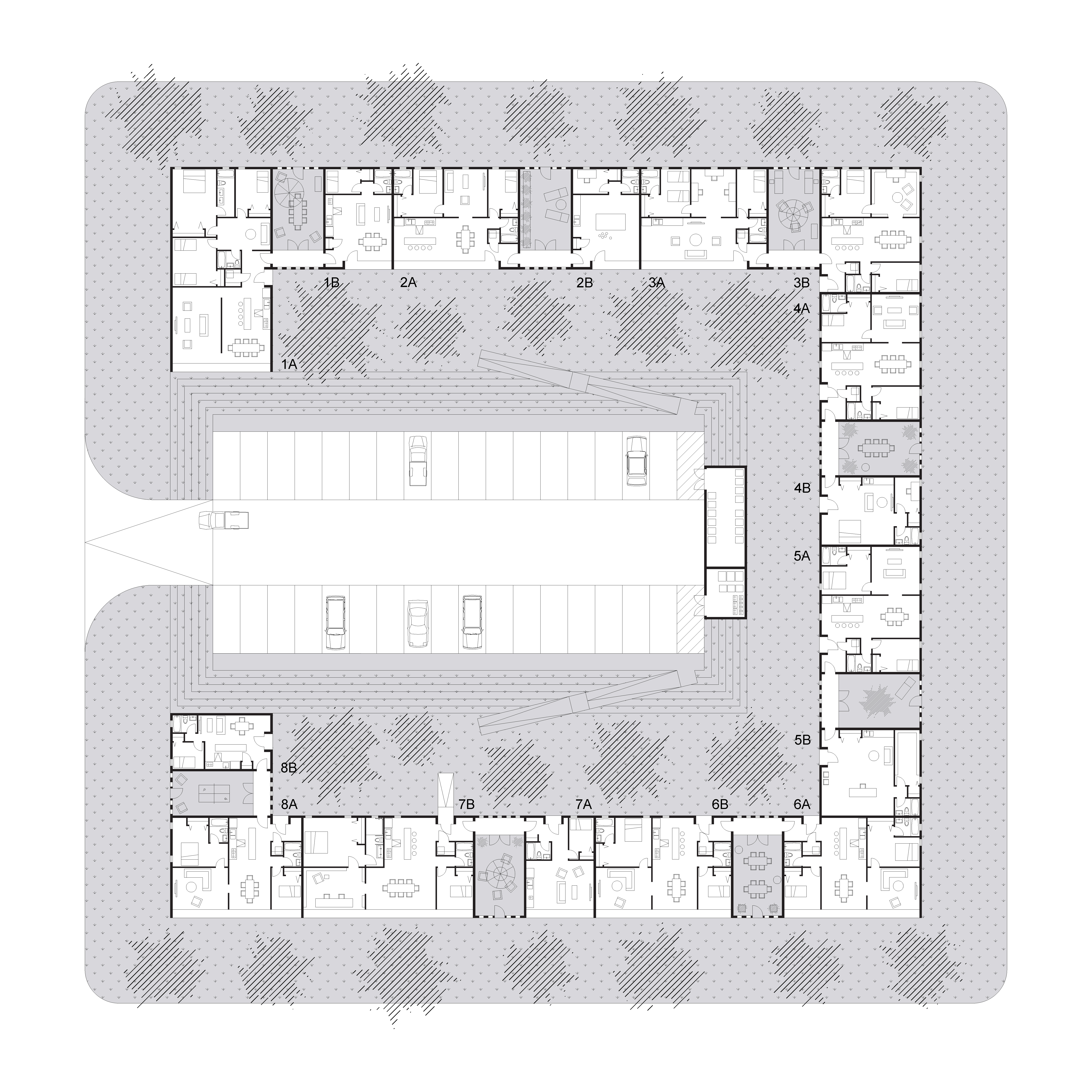
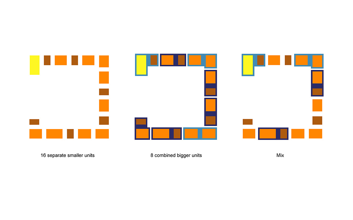
Unlike townhouses organized on stacked floors, this proposal’s dwellings operate on a single level, formed by 600sf modules. Linkable by covered balconies, these modules enable variable home sizes of 600, 1200, 1800, or 2400sf. This flexible unit concept supports both live/work situations (commute across a balcony) and also elderly and others benefitting from homes on a single level. All of the upper units and shared courtyard deck can be served by an elevator optimized for three-story buildings. Overall, the ethos of this cooperative project is that residents determine their unit types rather than unit types determining residents. Porous circulation allows for various comings and goings. While atypical in operation, the design works within familiar zoning, such as the appearance of four small-lot townhouses (as-of-right to the plot) with regulation dimensions. The design could have a maximum of eight units.
While small co-ops can be a lot of work, the trade-off is that residents know their neighbors and have more control that can lead to greater affordability: residents can collectively determine maintenance fees, capital improvement projects, and—by not subdividing the site—leverage shared land value for loans. Indeed, cities from Zurich to Tokyo have worked to avoid excessive land subdivision that blocks future adaptations in the public interest.
Structurally, the design uses a prefabricated system of fireproof steel columns, beams, and concrete planks that create flexibility upfront and long term. The planks offer excellent acoustic separation and also provide a ceiling finish. A higher material cost for this proven system is balanced by rapid assembly, low maintenance, and an inexpensive 2x4 infill envelope. This basic fire-rated wall type can be either panelized offsite or built in the field by any construction crew. Continuous insulation over slab edges reduces operational energy costs, aided by a massing that allows cross-ventilation throughout.
The Combi-Court Co-op is a proposal for the Small Lots/Big Impacts housing competition, sponsored by CityLAB UCLA.
Structural and prefabrication consultant: Peikko
passiveshack
Passive Shack
Moultonborough, NH, 2022–
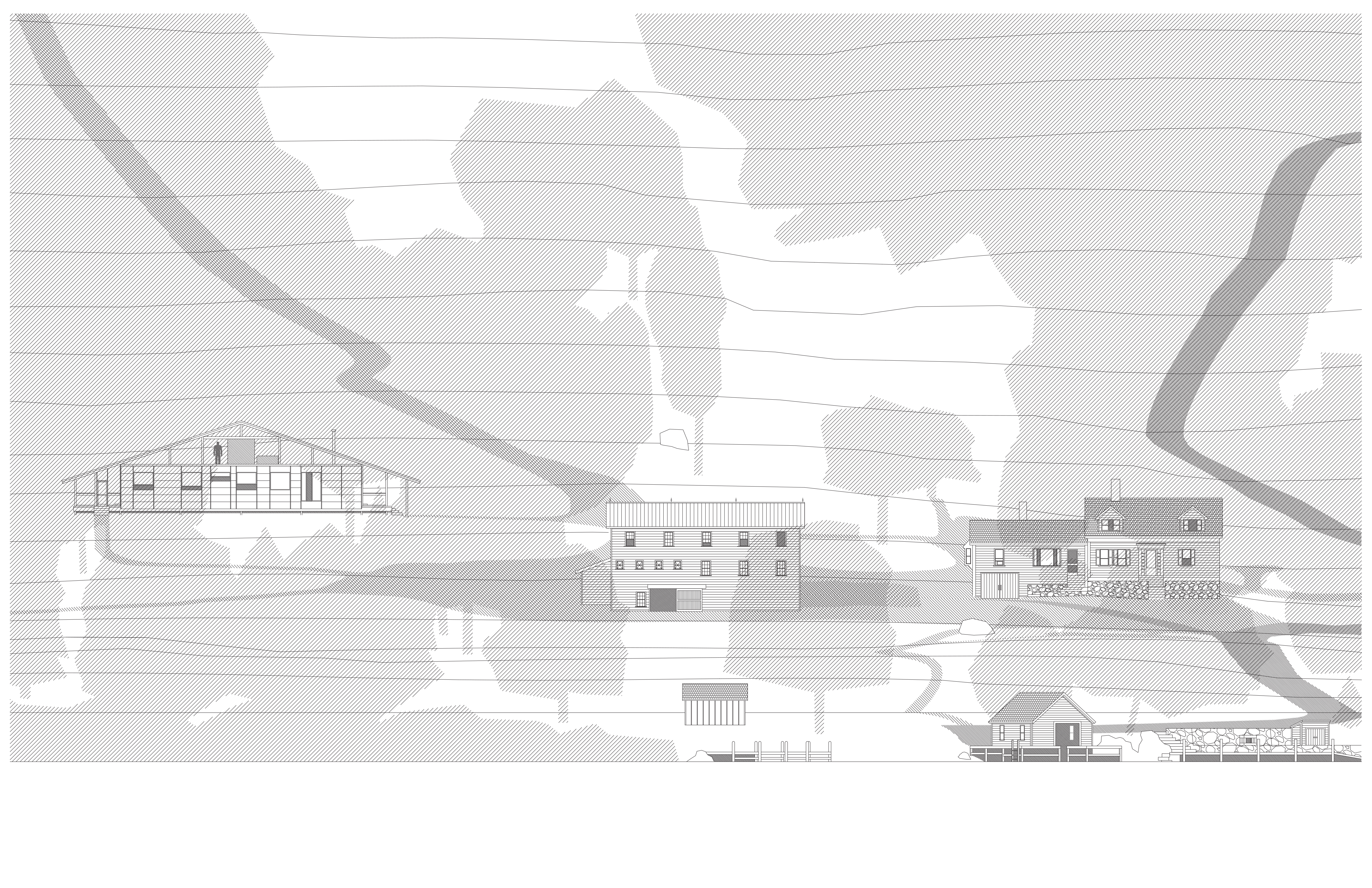
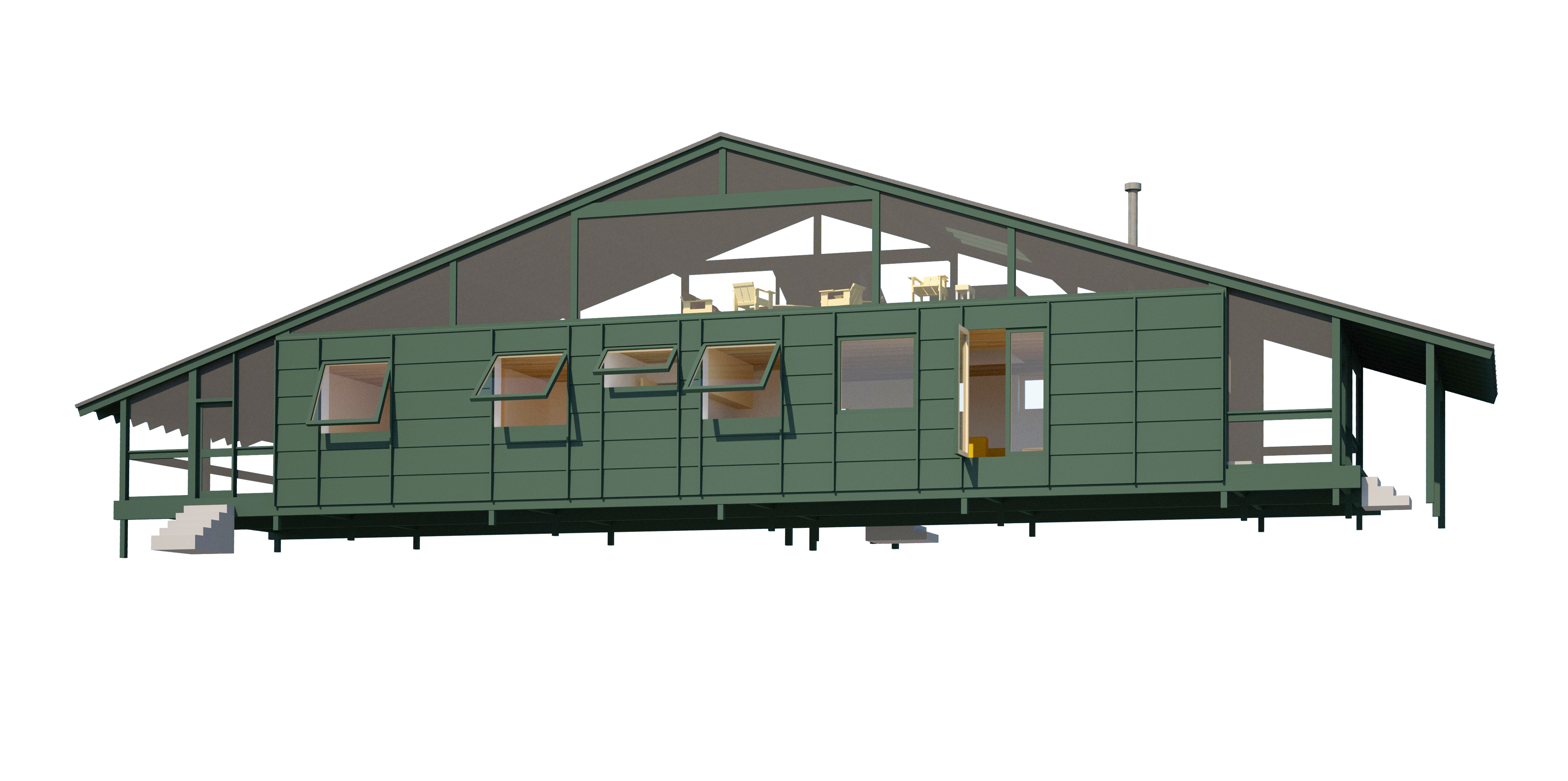
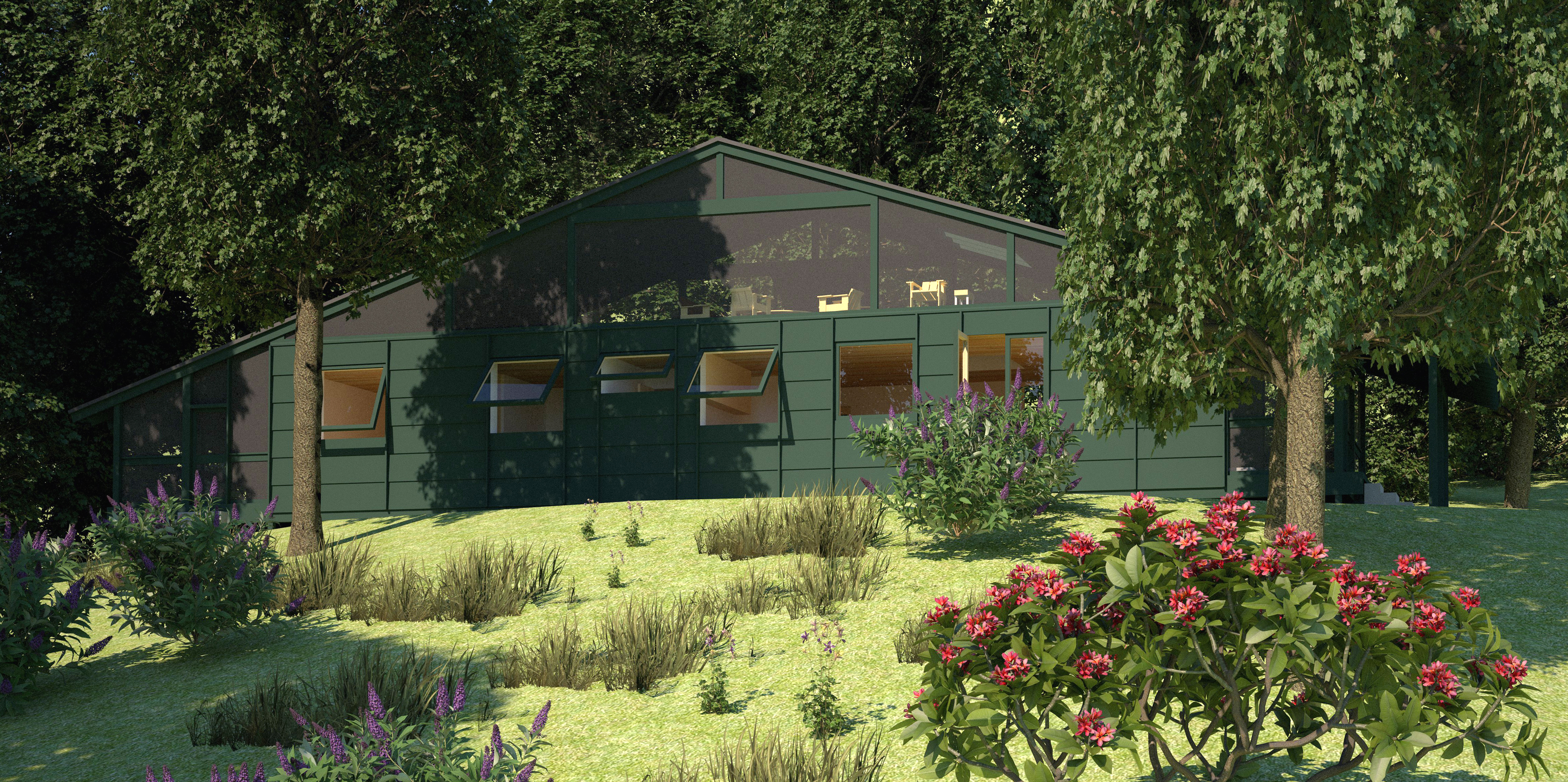
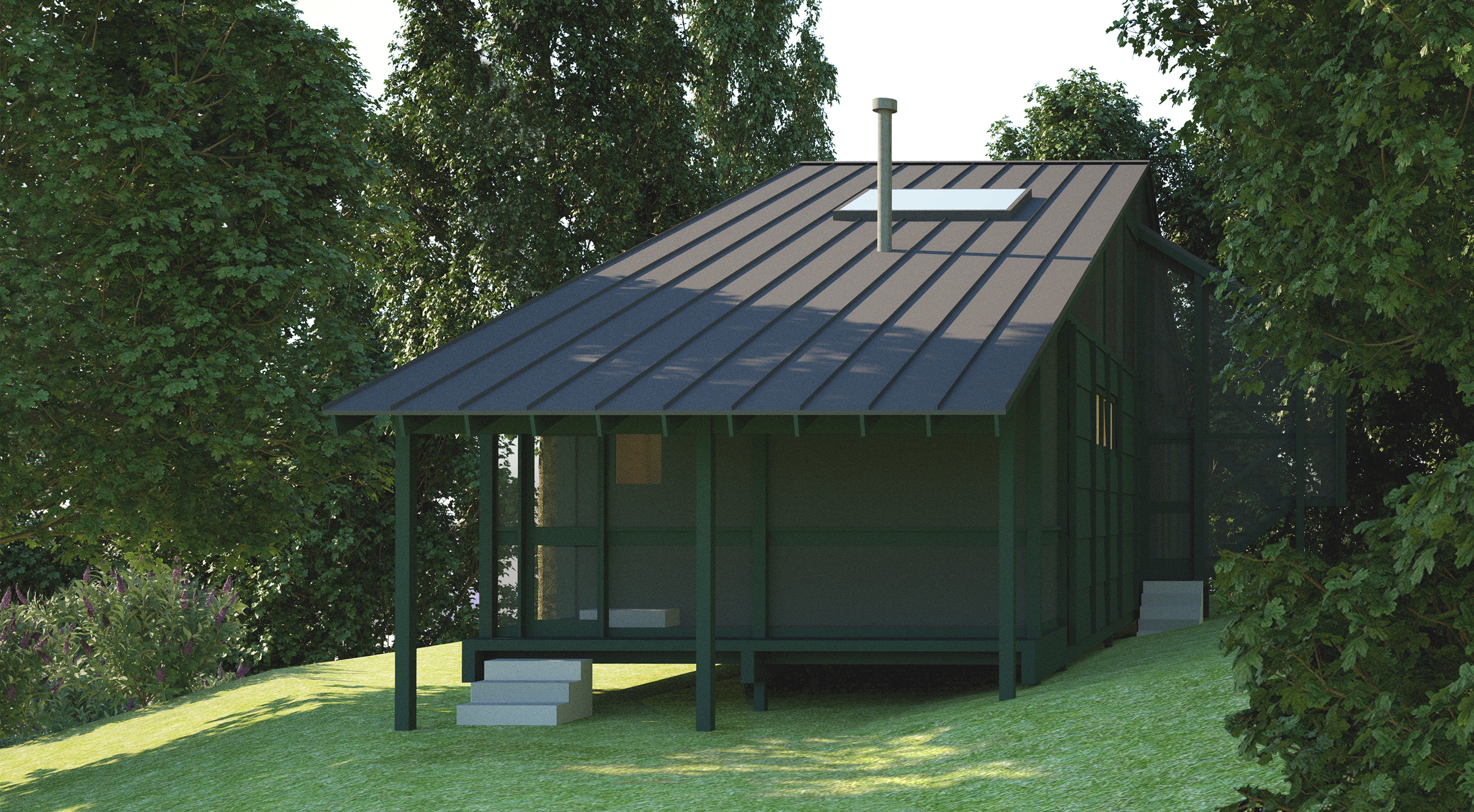

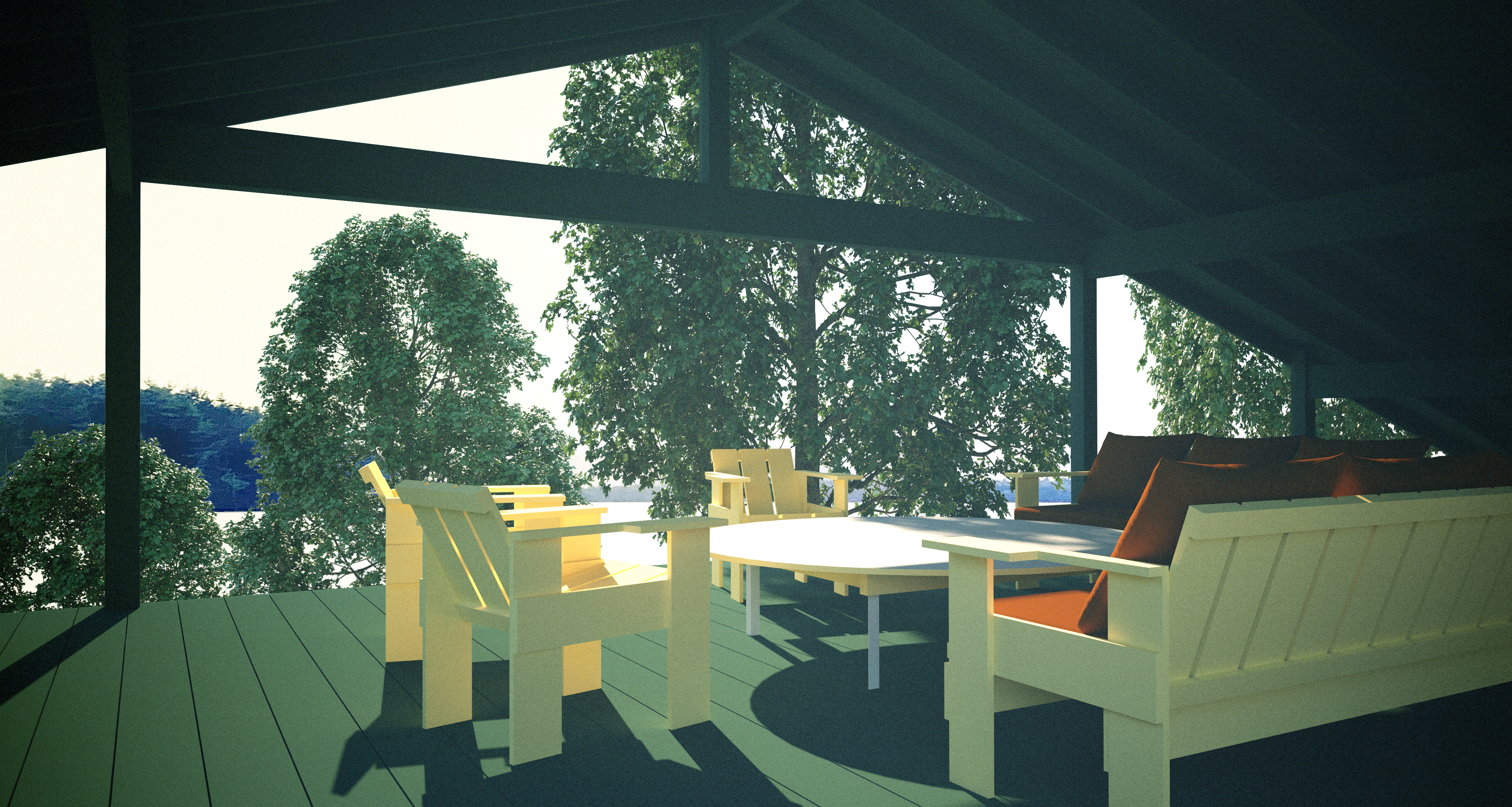

In cottages, [the] predominant character is simplicity.
It ought, accordingly, to pervade every portion of cottage architecture.
— A. J. Downing, The Architecture of Country Houses, 1850
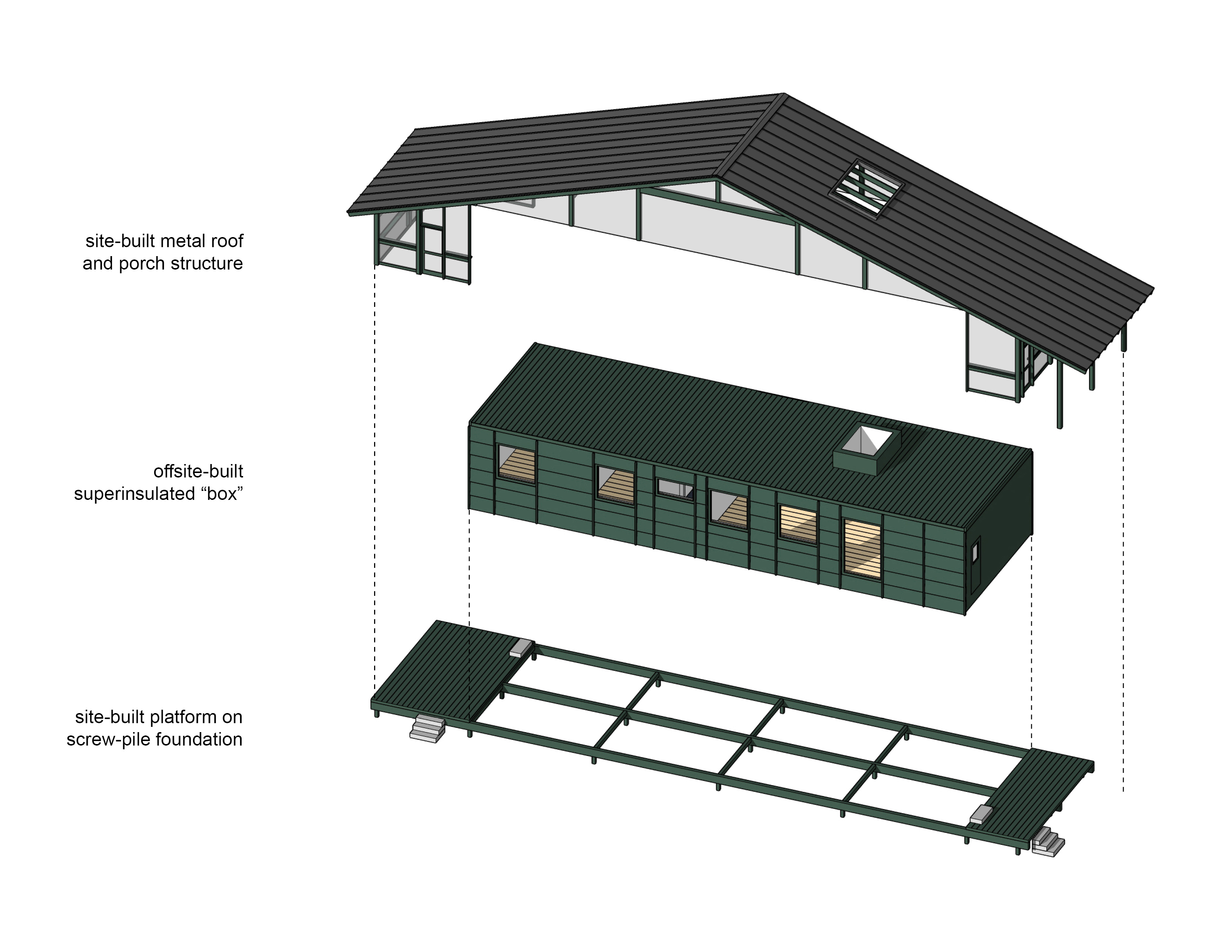
Currently in schematic design, the Passive Shack draws on the Passivhaus approach for high-performance low-energy buildings. A hallmark of this approach is rectangular volumes devoid of large wall openings and extensions into landscape, unlike traditional Japanese and modern architecture unconcerned with R-values and airtightness. This muteness in the typical Passivhaus is counteracted here by enframing an idealized superinsulated box with three screened porches, formed and sheltered by a large gabled roof. The porches, roof, and their exposed structure offer tectonics and mediation between inside and out that energy-efficient houses so often lack, while accepting the use of their technology. The biggest and most social porch of the shack, on the roof of the box, provides elevated views out over a lake and the feel of a large tent.
Programmatically, the shack offers a winterized all-electric guest house and quiet work space on the property of an uninsulated 1820s farmhouse used as a summer house.
mottainai
Mottainai Metabolism: A New Artificial Land
Sakaide, Japan, 2021
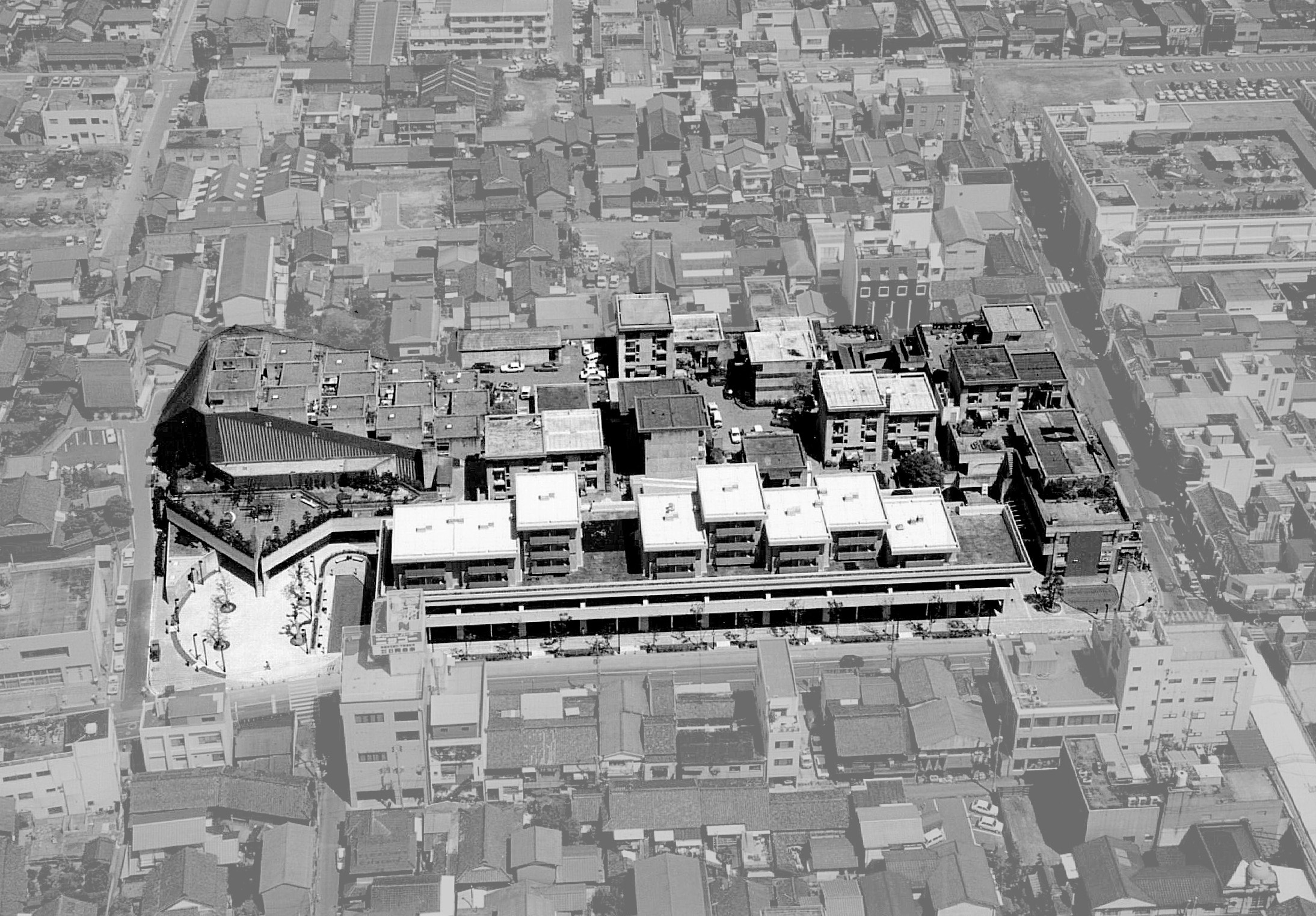
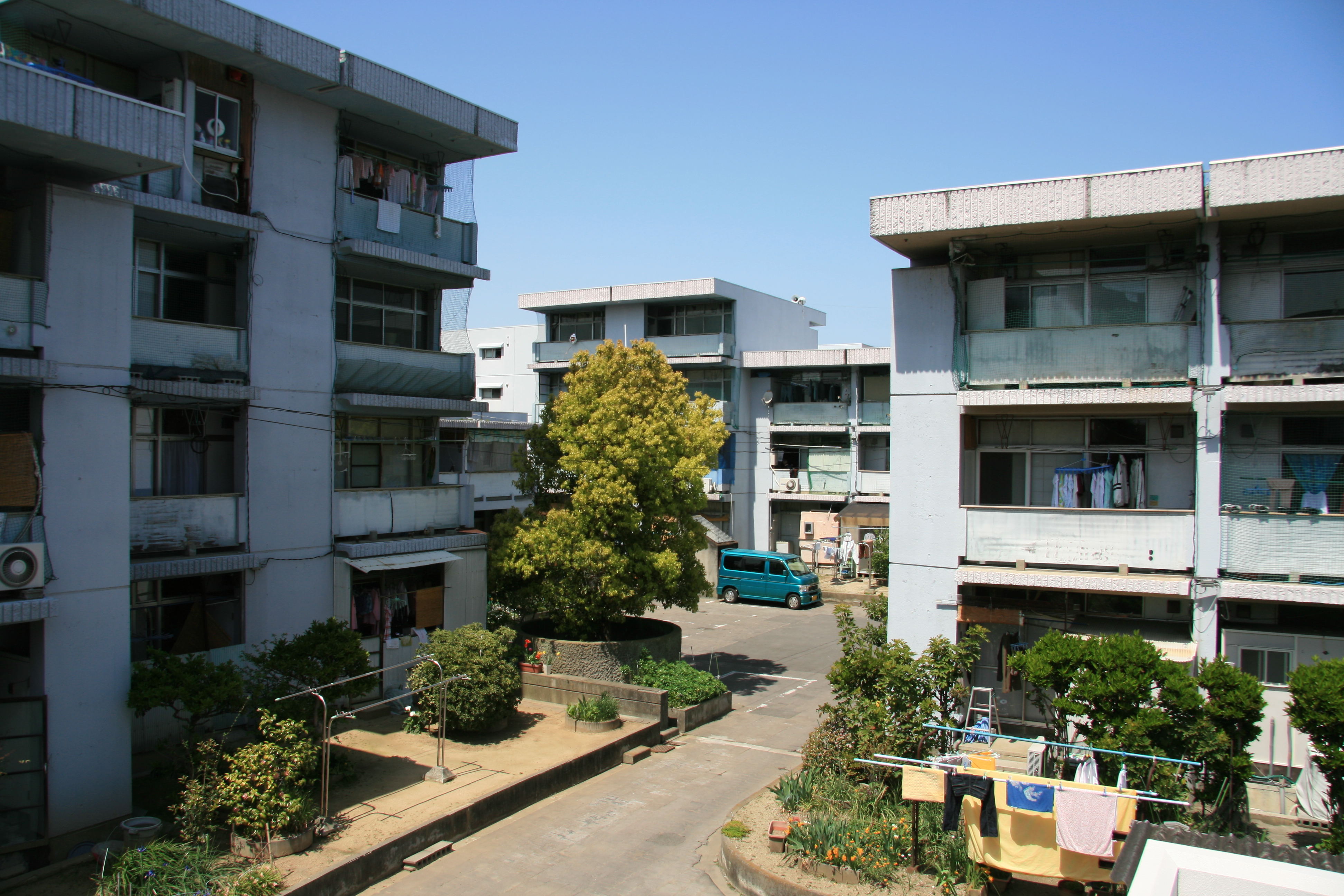

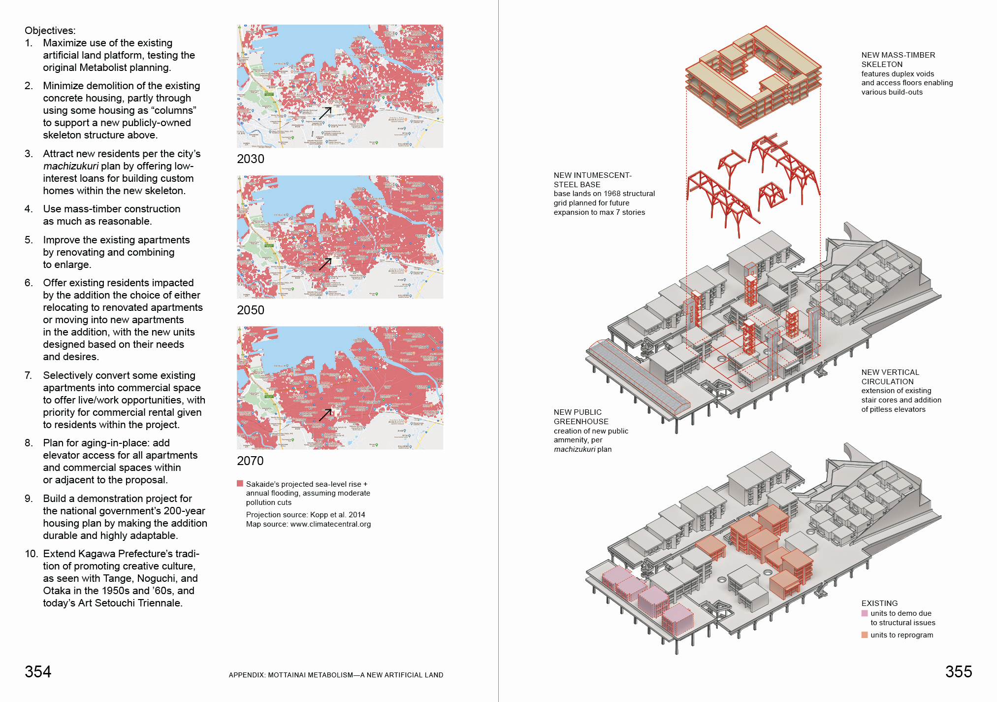
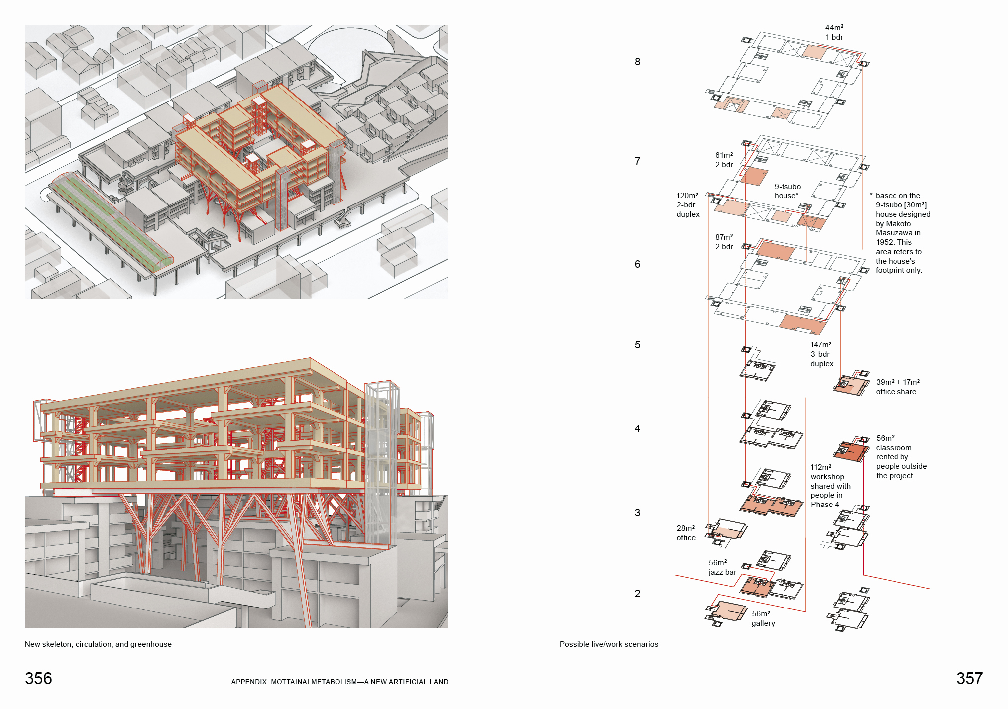
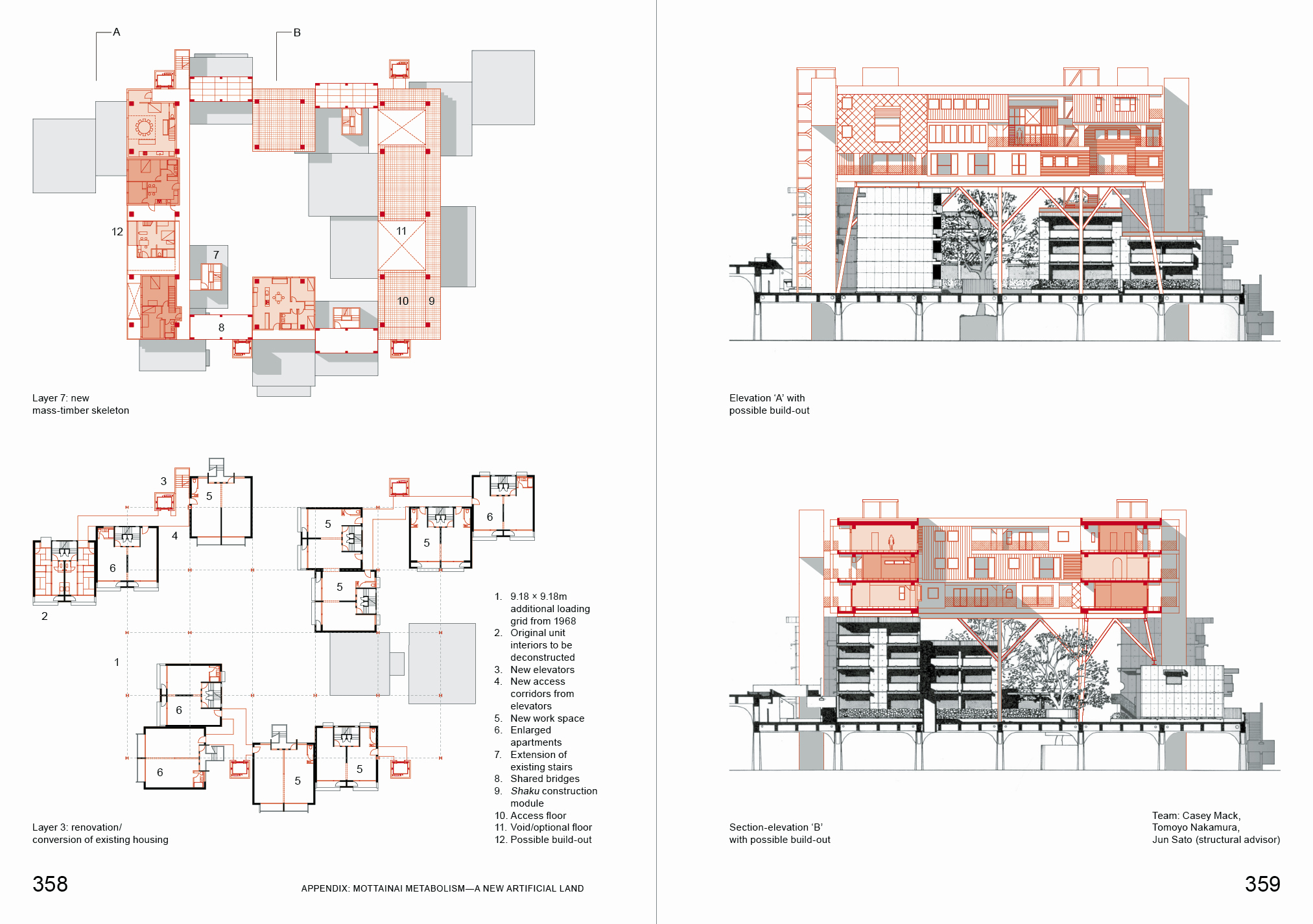
In 1968, the Metabolist architect Masato Otaka completed Phase 1 of his “artificial land platform” in Sakaide, a small city on the coast of Shikoku Island on Japan’s Inland Sea. Built with the support of the local government, the platform duplicated the ground of the city in reinforced concrete, lifted into the air. On the existing ground was space for new public facilities, while above on the artificial ground was new public housing. The platform was engineered to allow a significant degree of freedom in how the blocks of housing can be composed and change over time. It can take additional loading from future construction up to seven stories.
Today, this flexibility has been lying latent since the platform was finished. Since that time, Sakaide has lost population and the public housing’s quality has declined. Another challenge is sea-level rise, with safe land area in the city anticipated to shrink over the coming decades. To address these issues, POPA proposes to layer a new artificial land on top of the old one. This addition use the embedded potential in the original platform to help reinvigorate its area of city, attracting and hopefully retaining new and existing residents through creating customizable live/work opportunities.
A motivating idea in the proposal is mottainai. A Japanese expression originally meaning “what a waste!,” it’s come to mean the opposite: the practice of avoiding waste. Against the dominant tendency in Japan of “scrap-and-build,” where buildings are torn down instead of renovated, the proposal reuses and conserves Otaka’s design as much as possible, both as a physical infrastructure and a social ambition to serve the city. How can a new artificial land knit with the old to support density and diversity in a condition of population and land shrinkage? Should Otaka’s artificial land be reconceived as an artificial island? Facing the necessity of adaptation, what would we like the future to look like?
Mottainai Metabolism was conceived for Casey Mack’s book Digesting Metabolism: Artificial Land in Japan 1954—2202 (Hatje Cantz, 2022).
Structural advisor: Jun Sato
bathroom
36th Street bathroom renovation
New York, NY, 2021
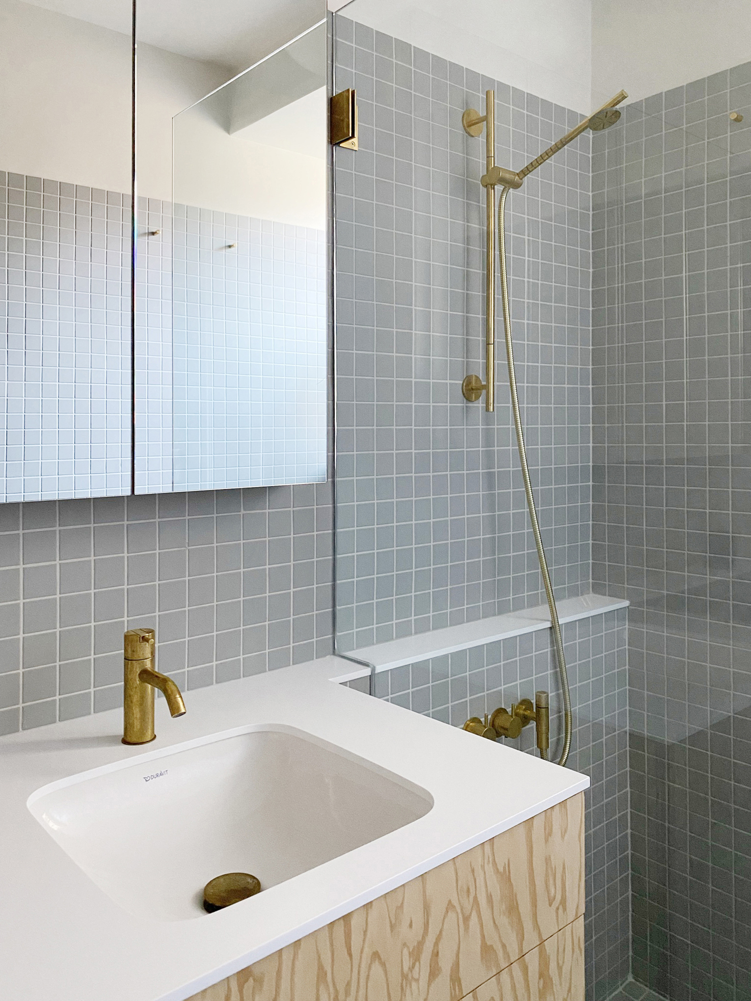

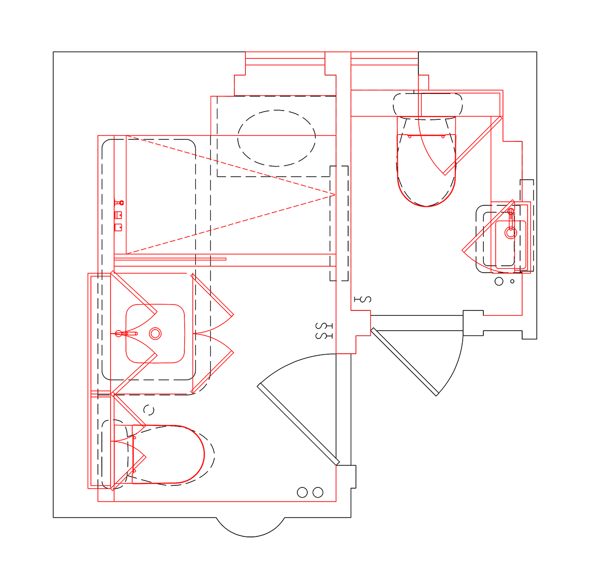
Renovation of a full- and half-bath in a fine prewar building, with the design providing improved spaciousness, calm, and ergonomics through new materiality, storage, and layout. A main goal was modular coordination of tile work.
practice
When Practice Becomes Form
New York, NY, 2021
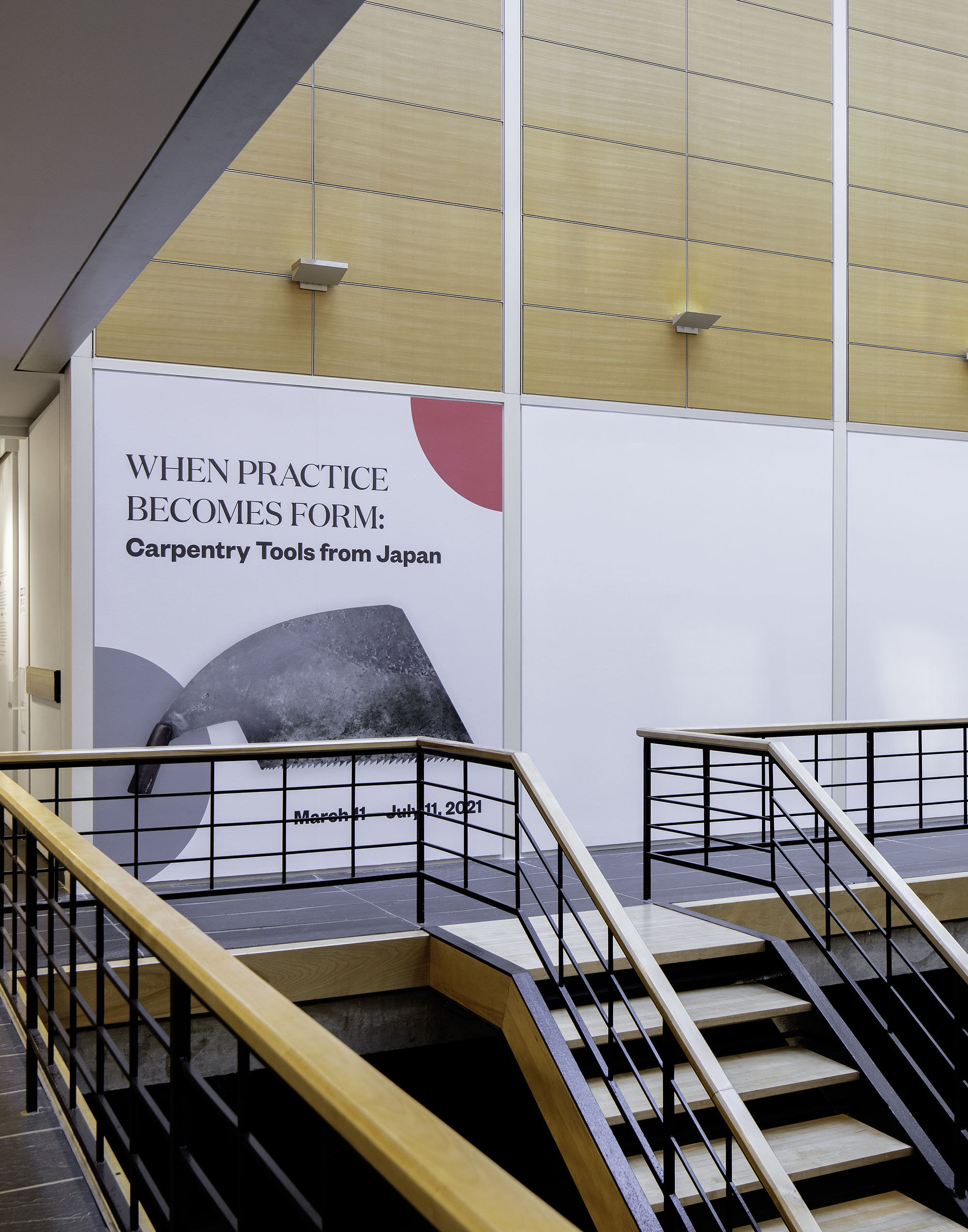
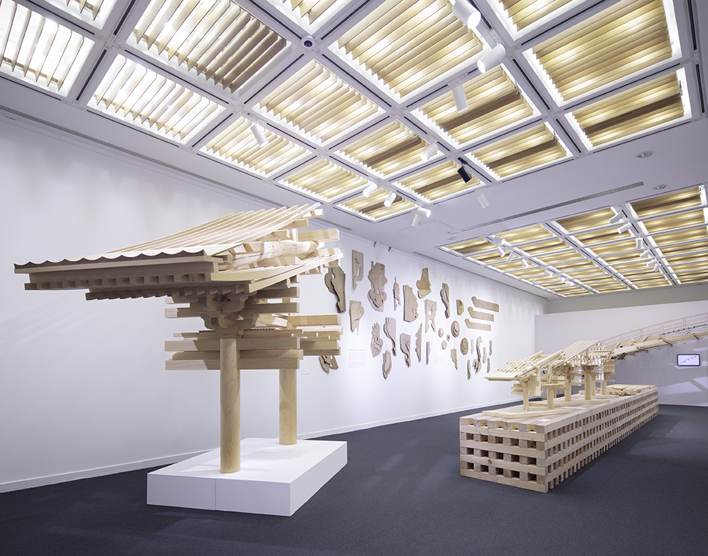


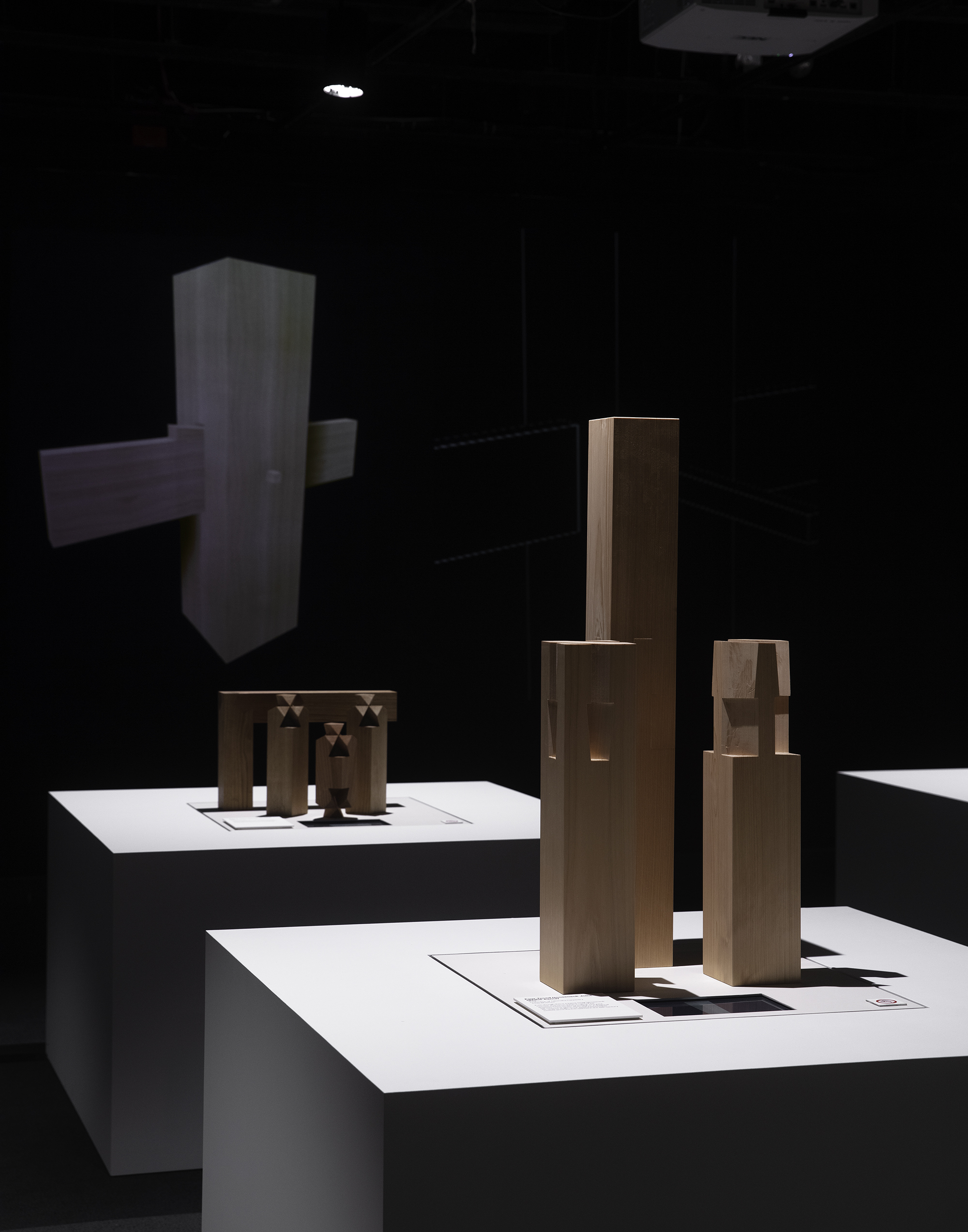
In collaboration with Sou Fujimoto, POPA acted as local architect on this exhibition design for Japan Society’s “When Practice Becomes Form: Carpentry Tools from Japan.” Through tools, patterns, and large-scale models of temples and timber joints loaned from the Takenaka Carpentry Tools Museum in Kobe, the show displays the artistry of the nation’s traditional wood structures, and indicates their relevance for today’s practices. The long display table in the show’s first gallery is built from stacked Douglas fir, the typical American lumber type, used in contrast to the Japanese cypress of the exhibited models. Joined with a minimum of fasteners and using the material’s off-the-shelf lengths, the table is easily unbuilt to allow reuse for different constructions.
Photos: Naho Kubota
Photos: Naho Kubota
andes
Andes House
Andes, NY, 2019
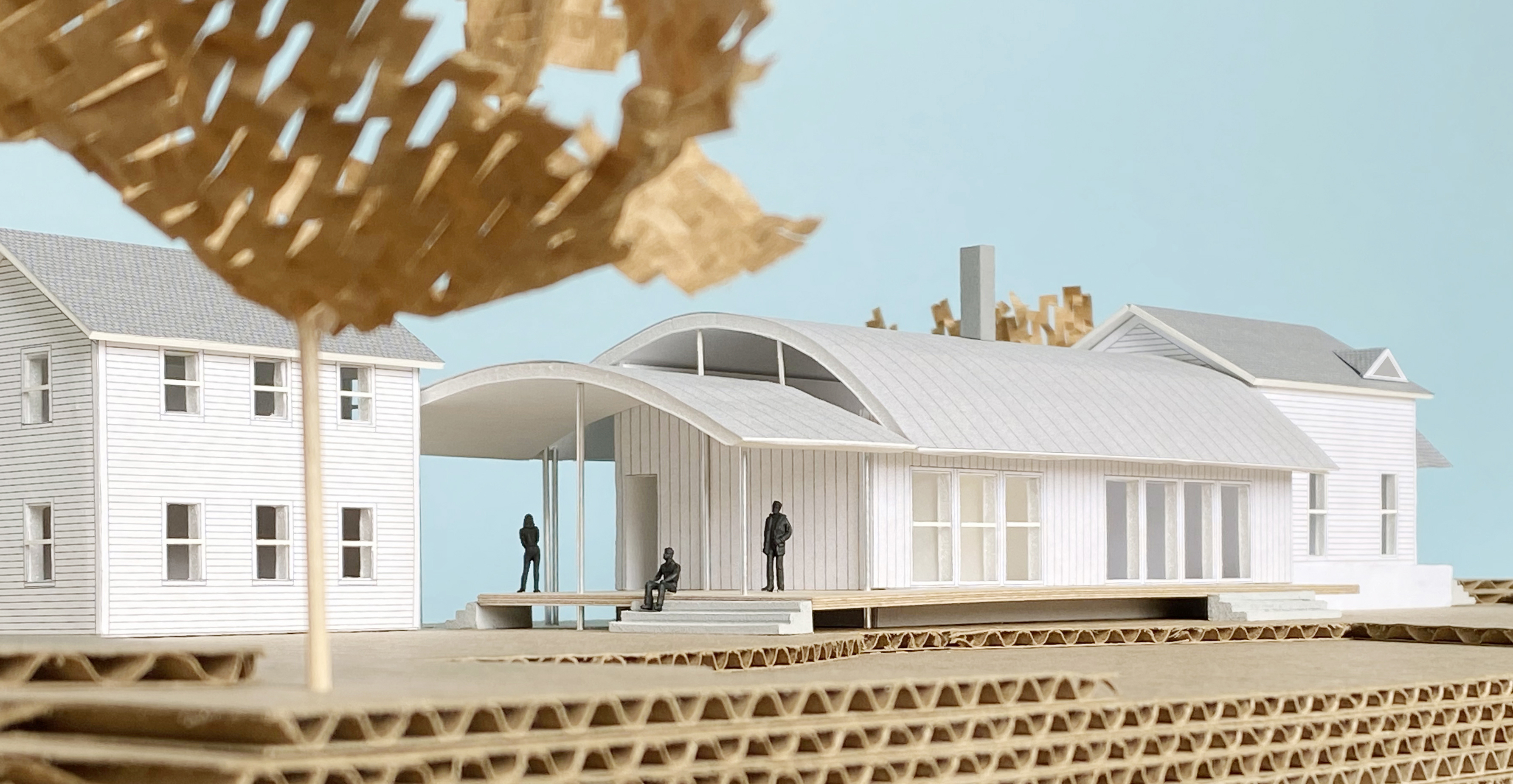
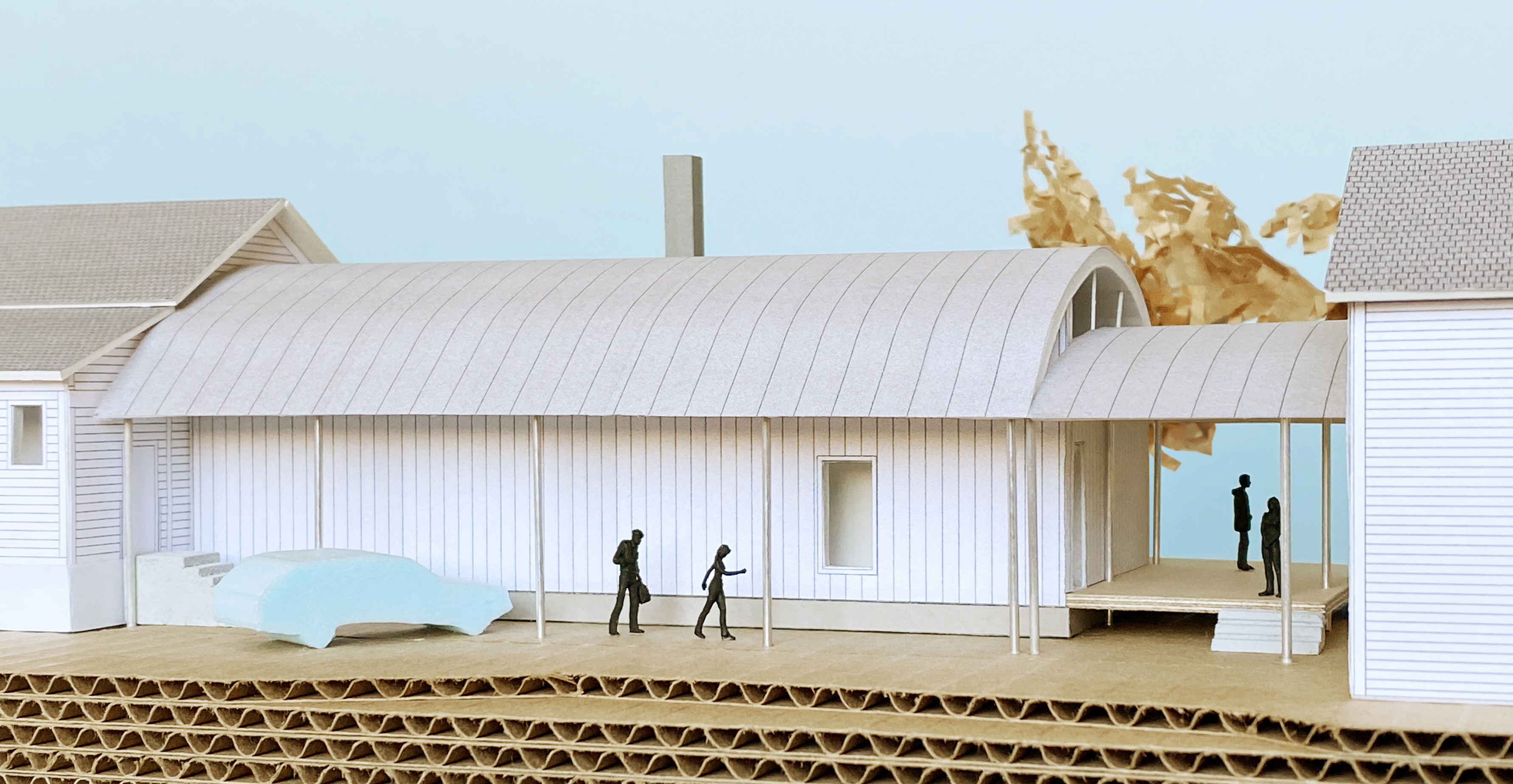
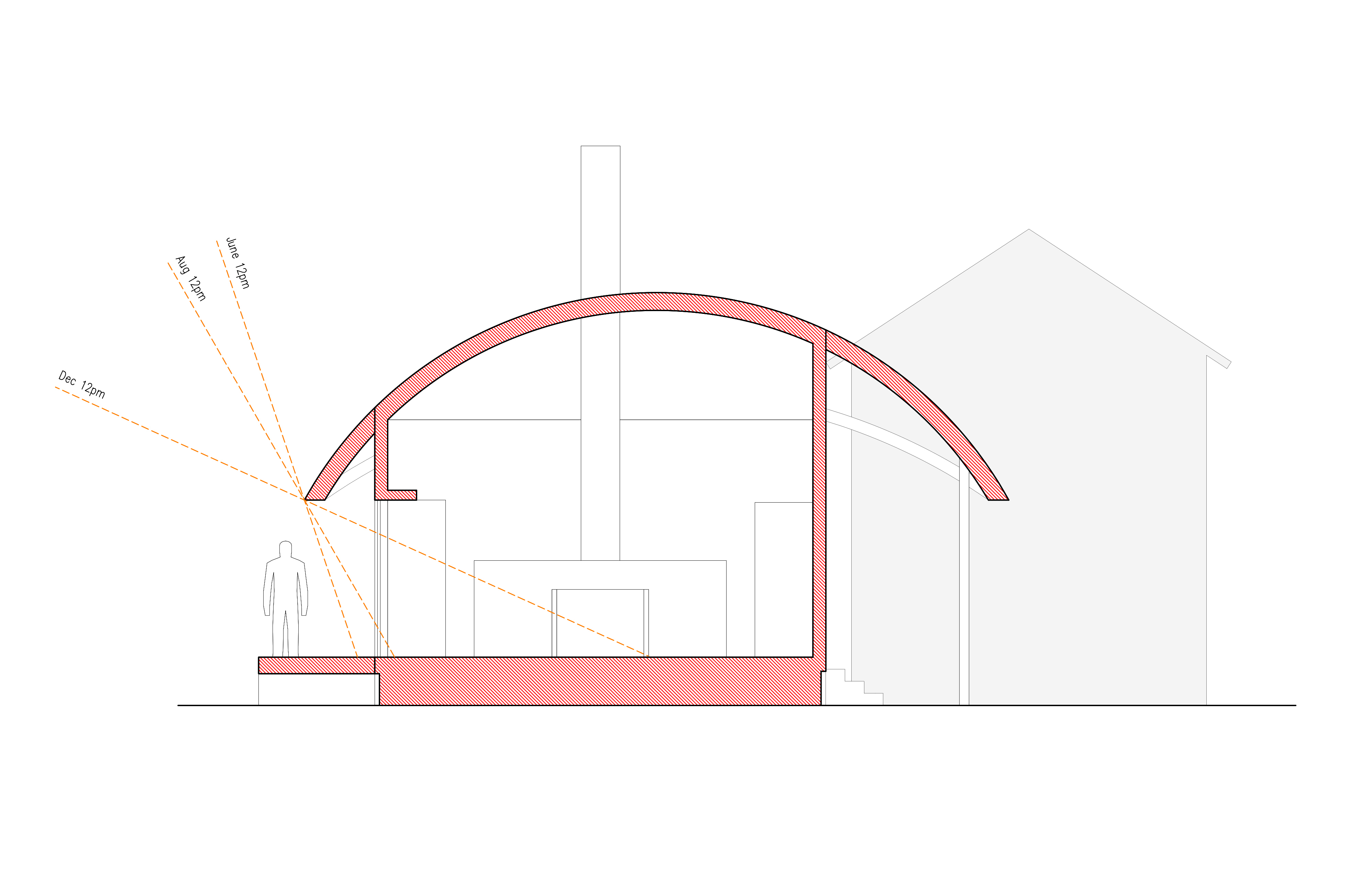
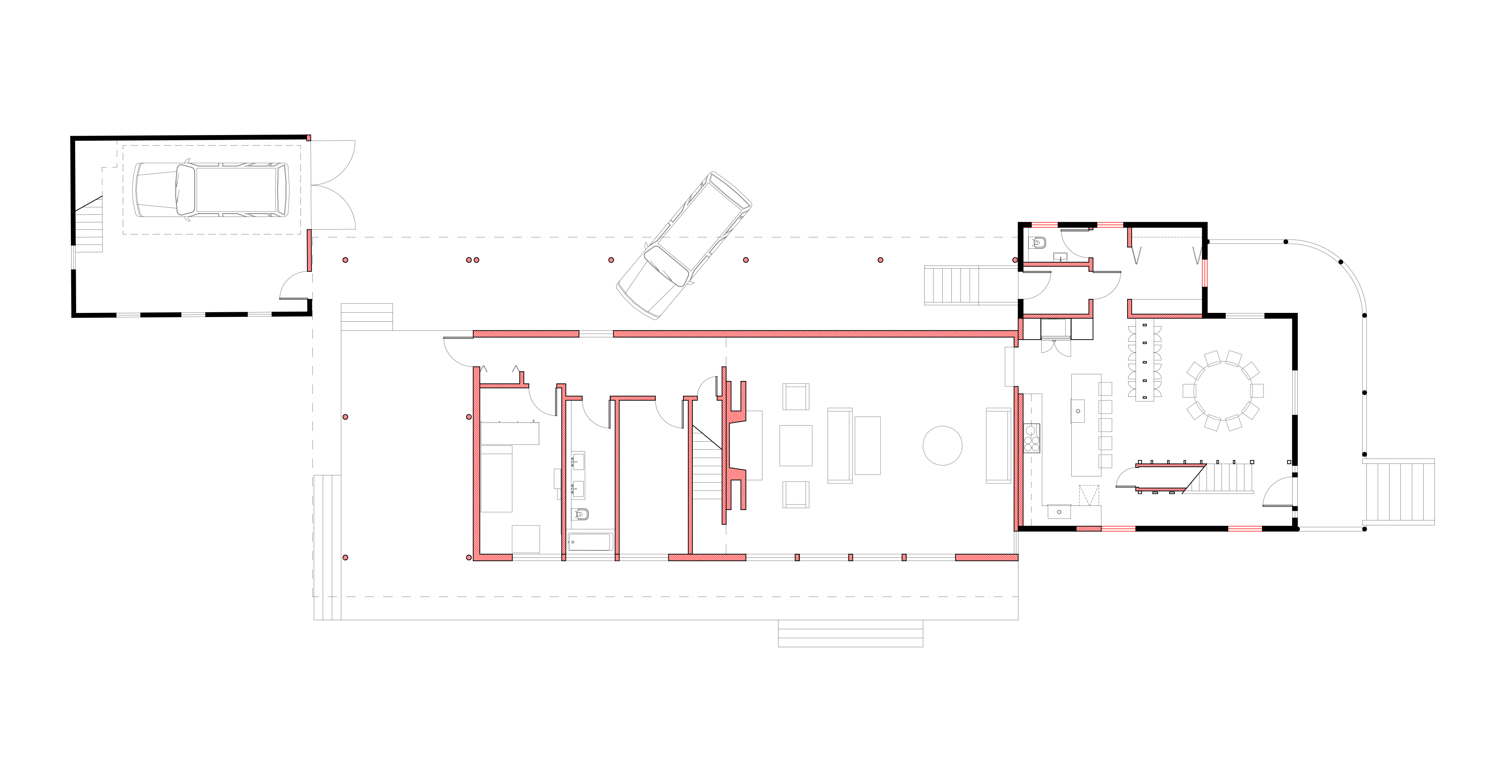
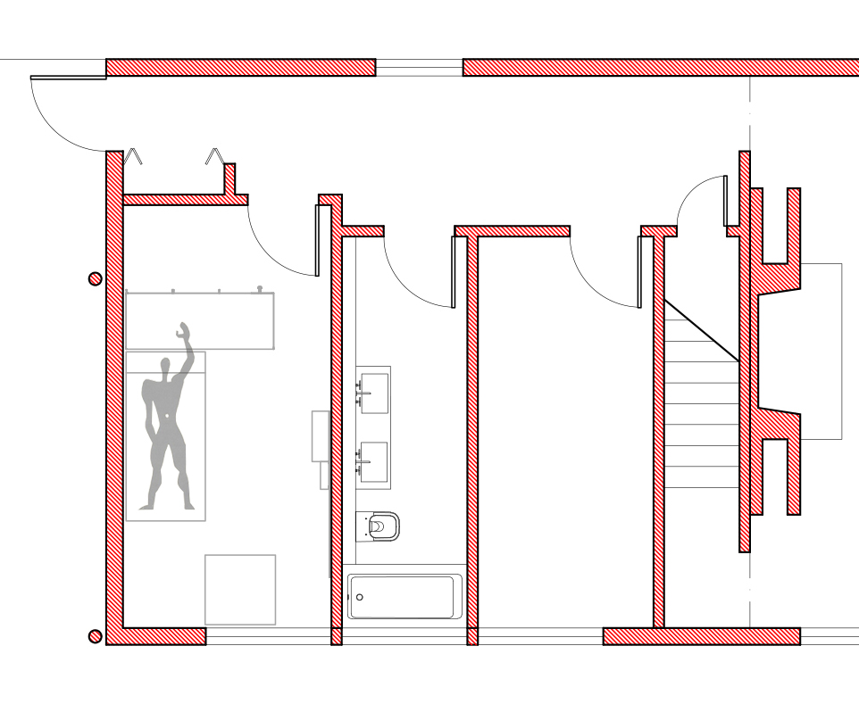
Inspired by the incremental growth of connected farm buildings in America’s Northeast, this project uses an addition to link renovations of an 1890s house and 1930s barn, interweaving old and new. While programs are logically connected, each has its autonomy as a distinct space, such as a new outdoor room linking to the surrounding landscape. Responding to a location with heavy snowfall, the barrel-vaulted roofs for the new construction effectively shed snow while also contrasting with the existing gabled roofs. Inside, the curved geometry creates better head height for a mezzanine study.
A unique feature of the addition is a guest bedroom furnished with 1959 dormitory equipment designed by Charlotte Perriand and Le Corbusier for the Maison Du Brésil student housing in Paris. In deference to these historic pieces of furniture, the bedroom is designed to the exact Modulor dimensions of the original dorm rooms.
A unique feature of the addition is a guest bedroom furnished with 1959 dormitory equipment designed by Charlotte Perriand and Le Corbusier for the Maison Du Brésil student housing in Paris. In deference to these historic pieces of furniture, the bedroom is designed to the exact Modulor dimensions of the original dorm rooms.
bigideas
Big Ideas for Small Lots
New York, NY, 2019
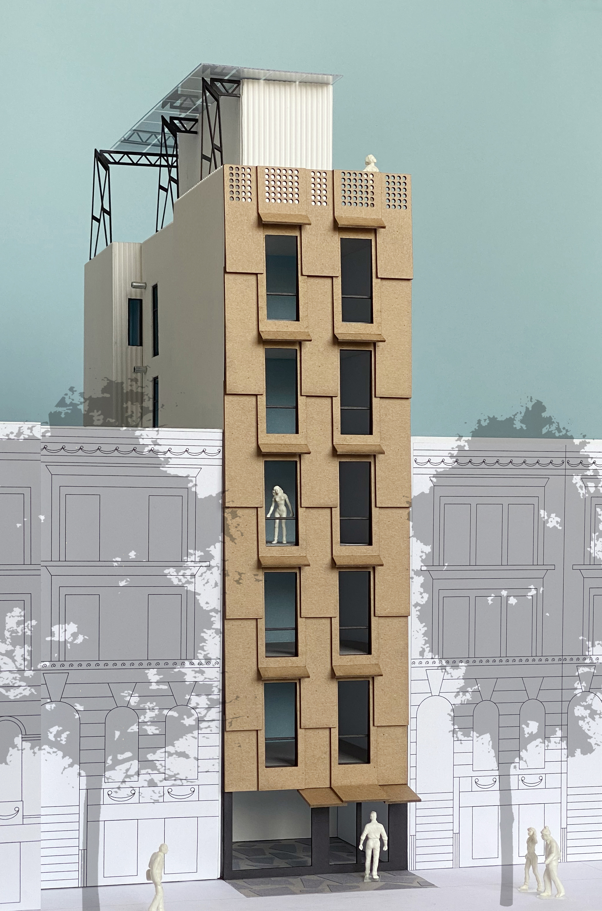

Instead of constructing apartments and then finding people to fit them, to what degree could a building attract people first, and then make them apartments? Our proposal, for the New York City Department of Housing and Preservation and the American Institute of Architects, engages this question through the design of “incre-rental” housing for a narrow site on West 136th Street in Harlem. Composed of two units of equal size per floor, these units can be either separate or combined. With a minimum of means, this flexibility creates on a small lot a maximum variety of apartment types, ranging from studios to one- and two-bedrooms. The design assumes a lottery process where households applying for the building are able to choose the apartment type needed prior to the apartment being built. Due to the building’s simple shell, interiors can be easily constructed to meet specific demands.
Typologically, the design revisits the value of the historic New York “dumbbell” tenement. As with this type, the incre-apartments benefit from natural light and ventilation from a shaft notched into the building volume. However, unlike its predecessor, there are never more than two units per floor. If these units are combined, the corridor along the shaft is absorbed as part of a one- or two-bedroom configuration, with its five-foot width useful for more than just passage. Also, unlike the old dumbells, the six-story building has an elevator, making all floors accessible. With a maximum occupancy load of twenty people, the building is able to reduce its core size with only a single stair.
Ultimately, the project acknowledges that New York City’s housing shortage is a shortage in large part for singles and small households. Addressing this demographic through a robust multiplicity that escapes the limitations of micro apartments is the design’s ambition.
koenig
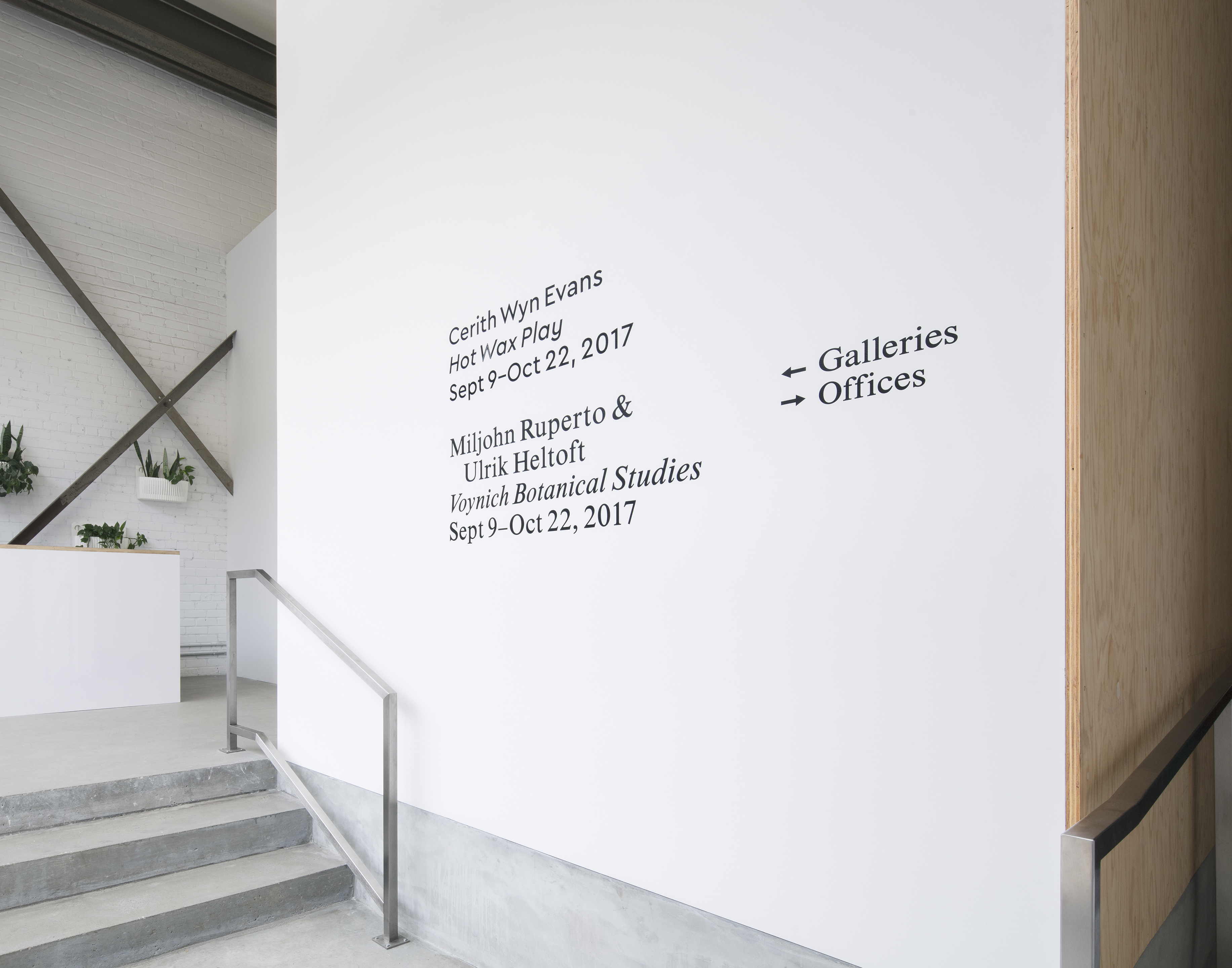
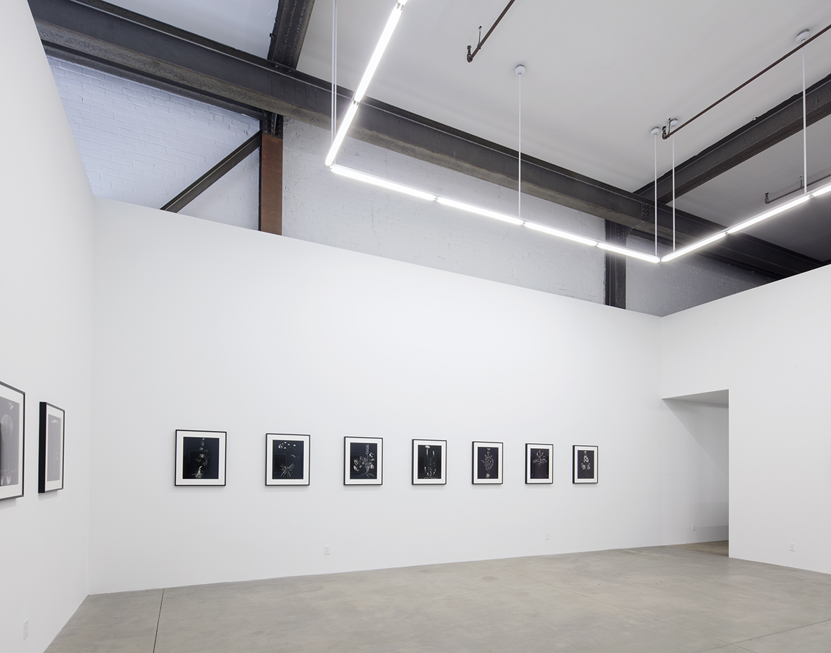
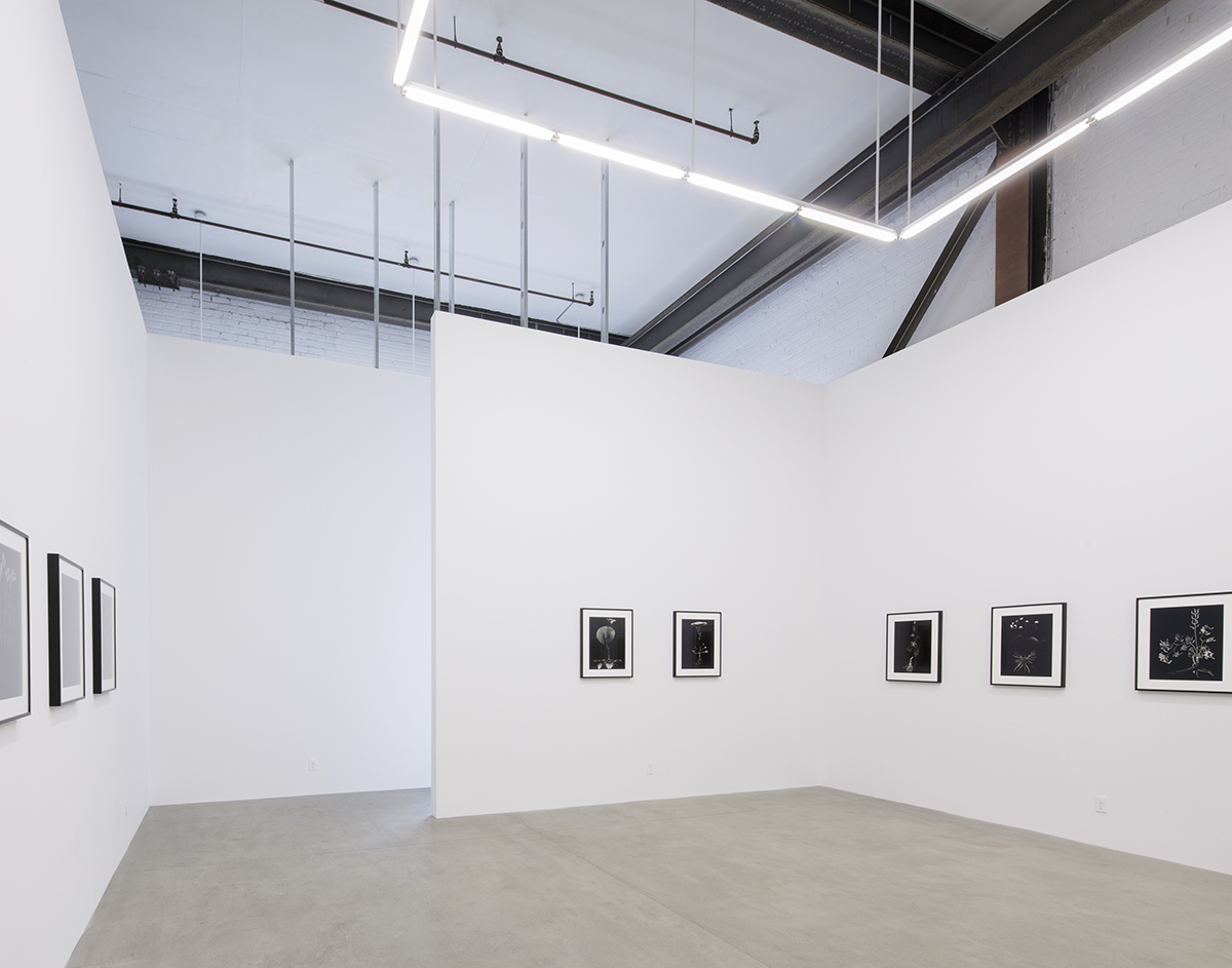
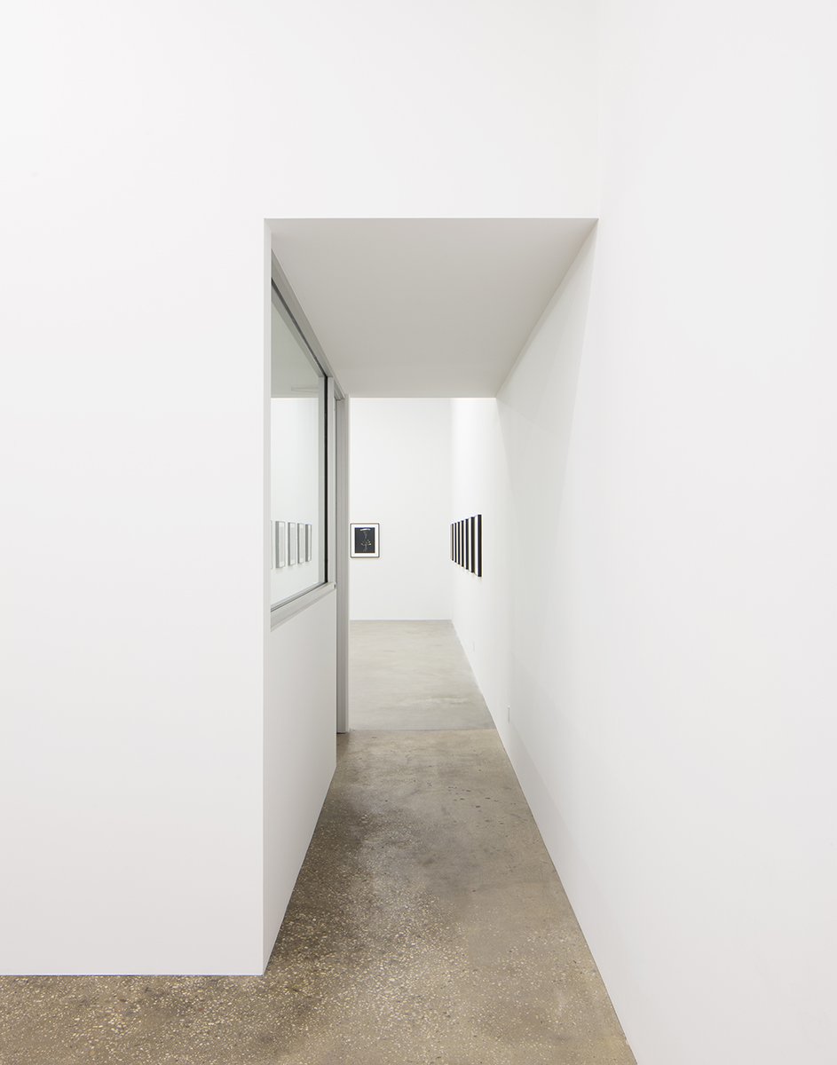
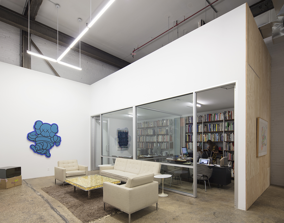
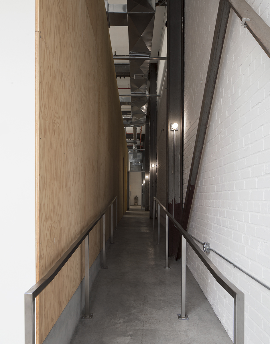
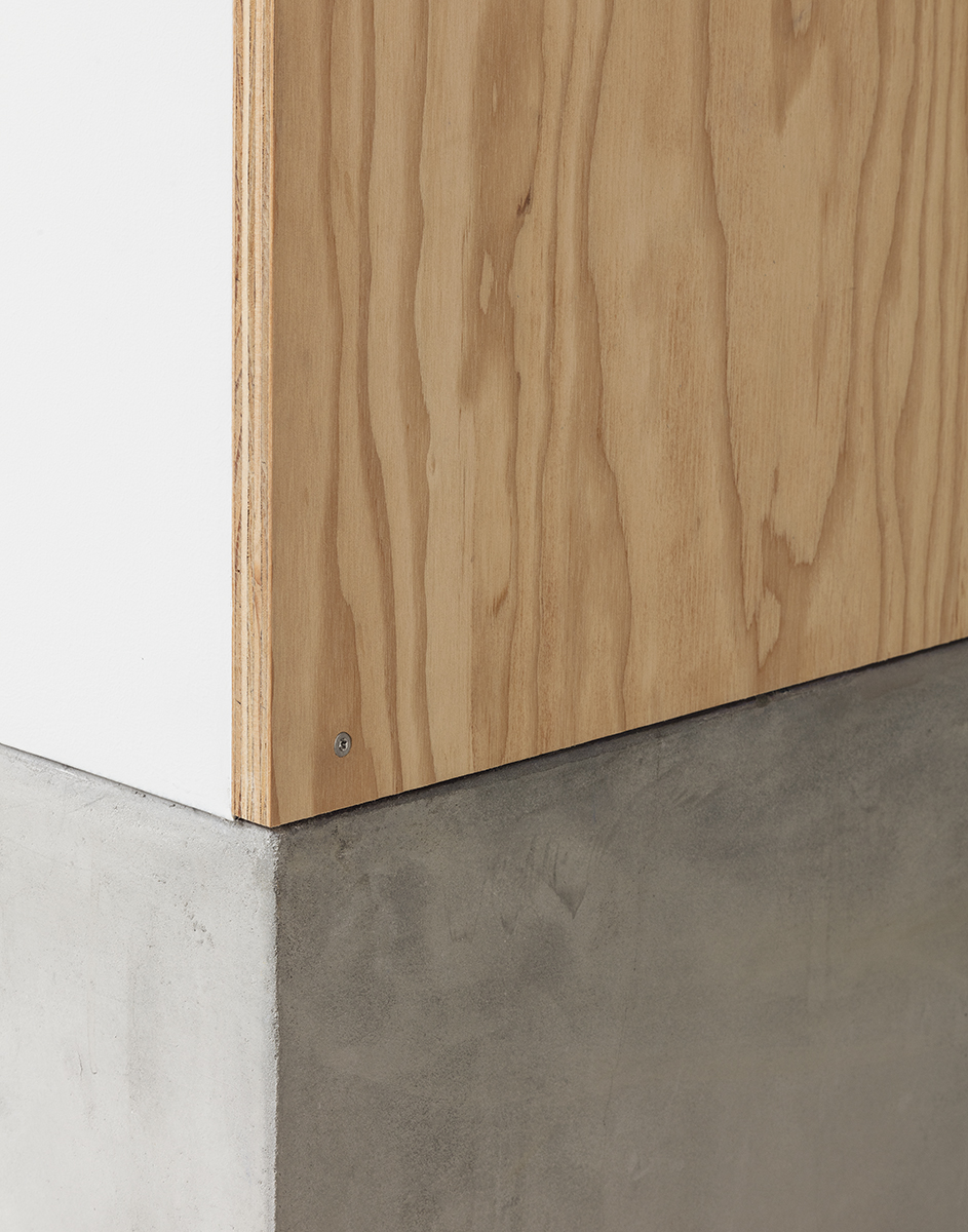
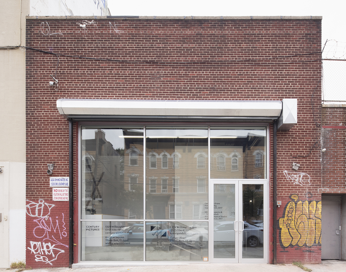

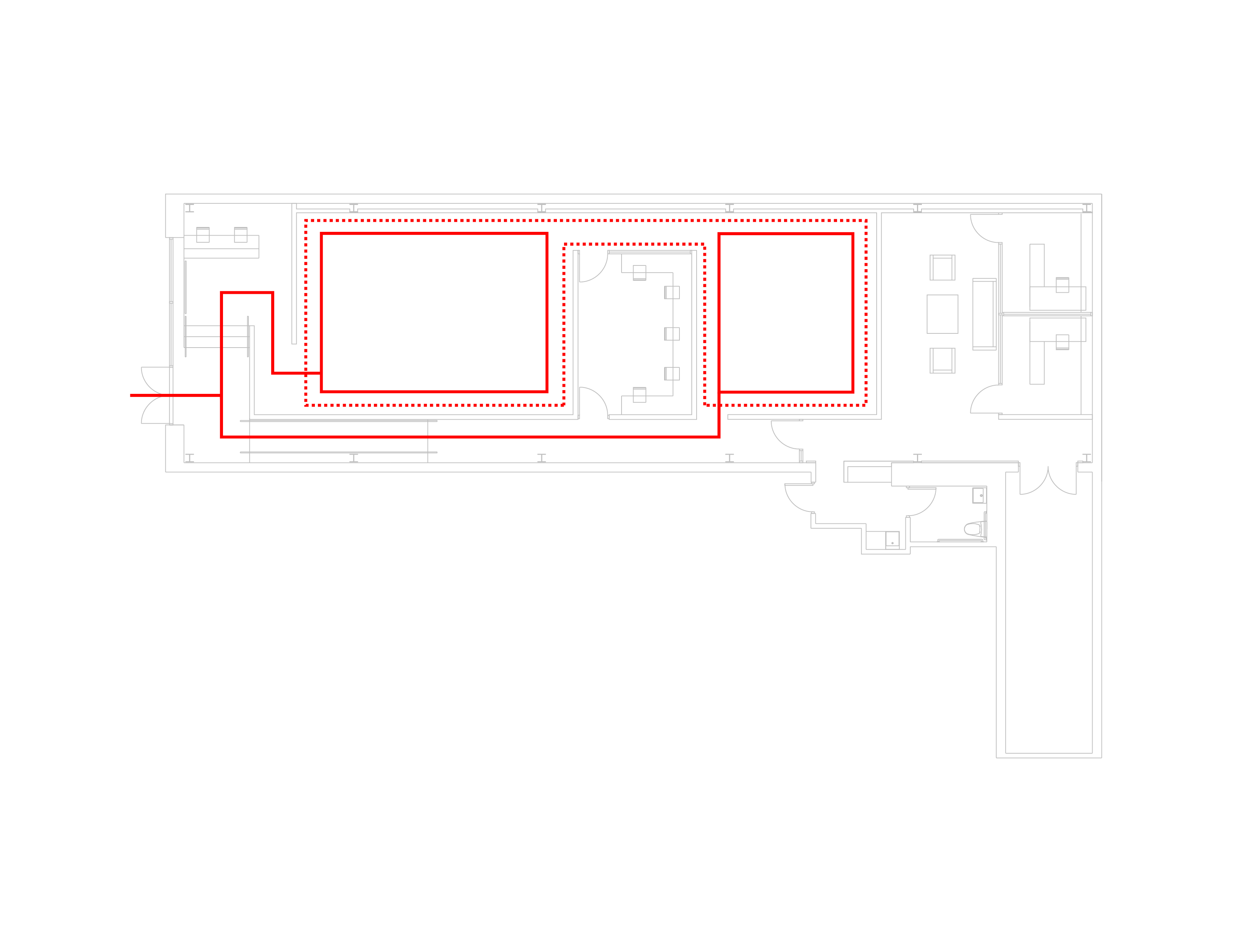
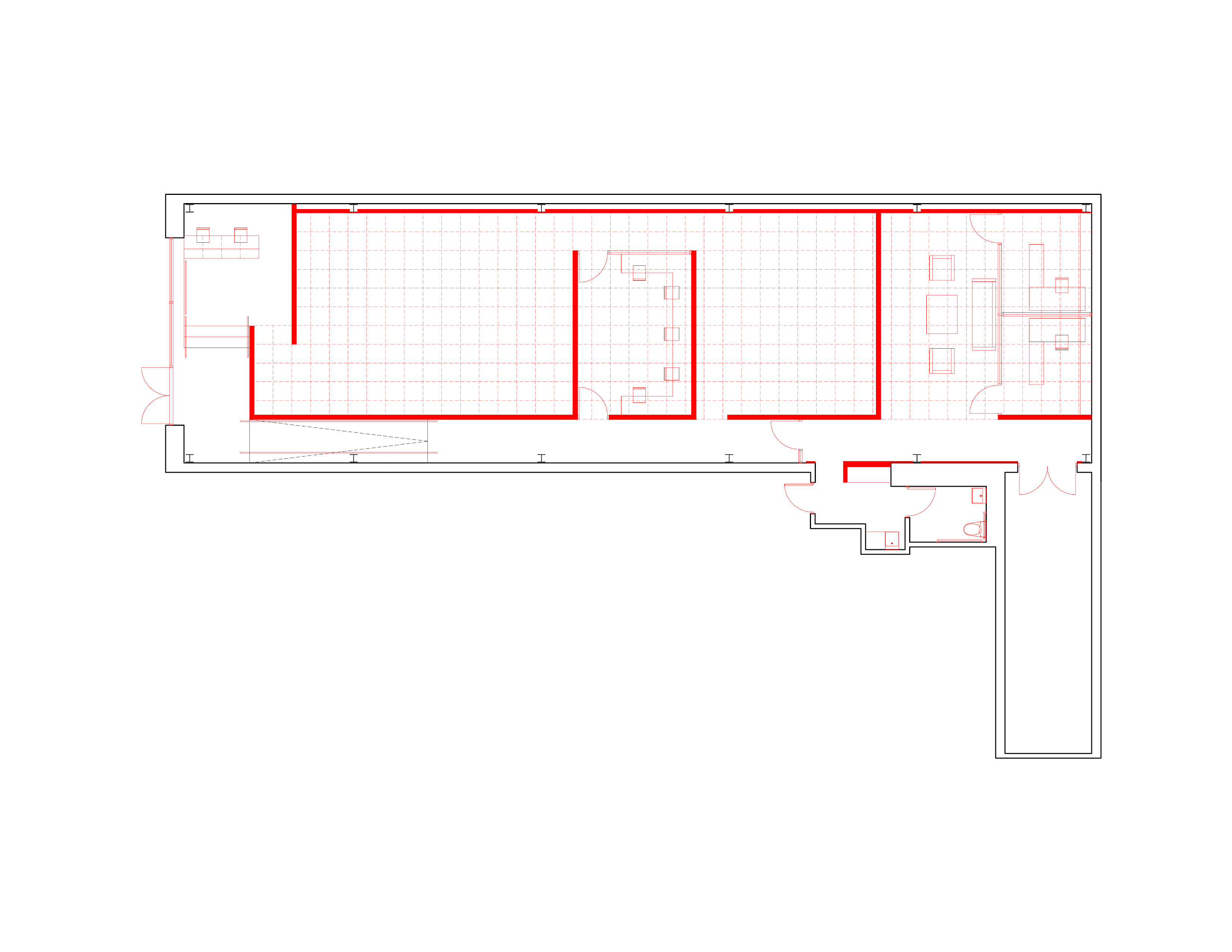
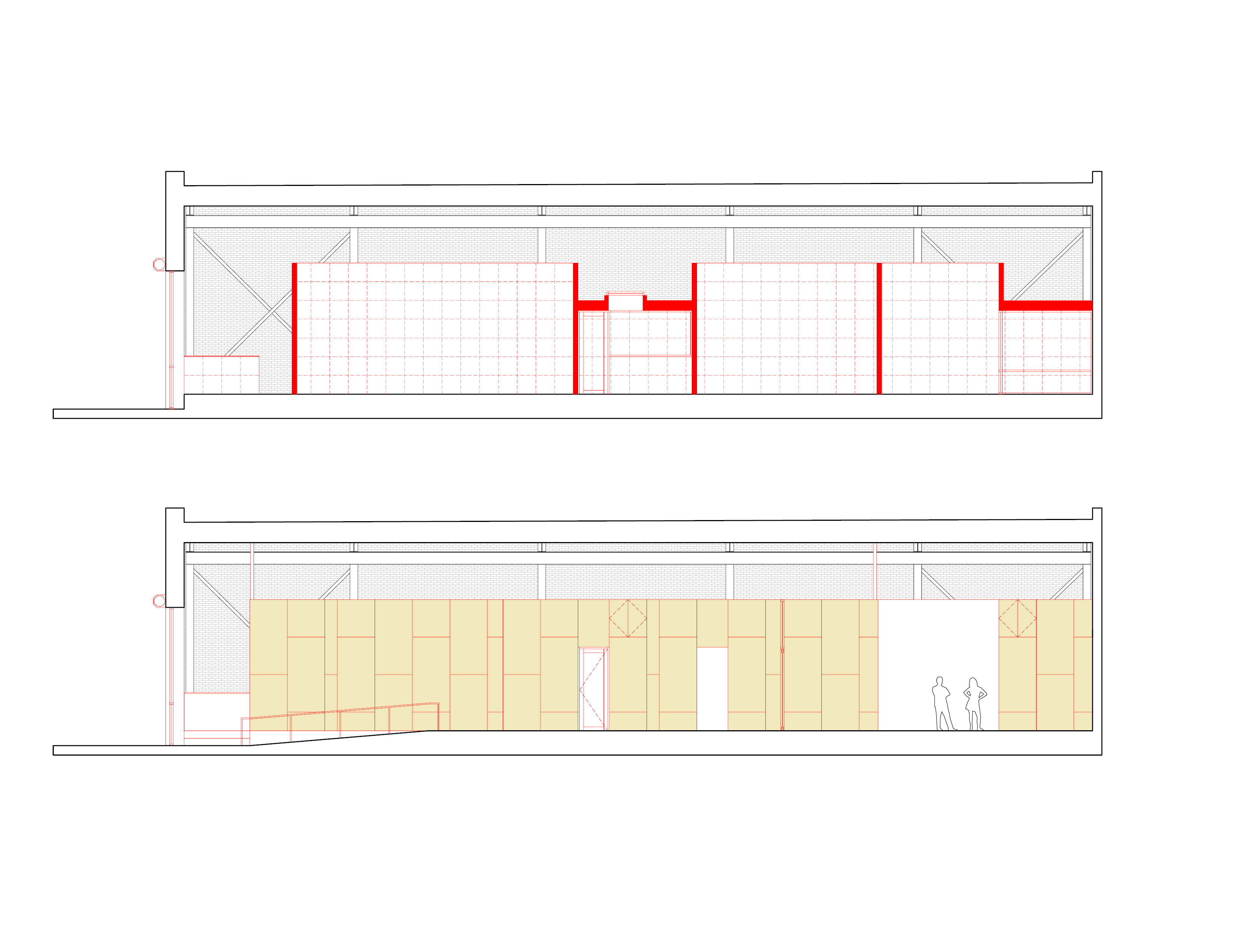
Located in a brick industrial building from 1929, the design for Koenig & Clinton and Century Pictures draws on the different but complimentary programs of the two galleries. Their desire to balance shared and independent activities under one roof is addressed through two forms of circulation: one more public and sociable passing through the main gallery rooms, and the other more private, allowing bypass by way of a corridor that expands at its end into a private viewing room and offices.
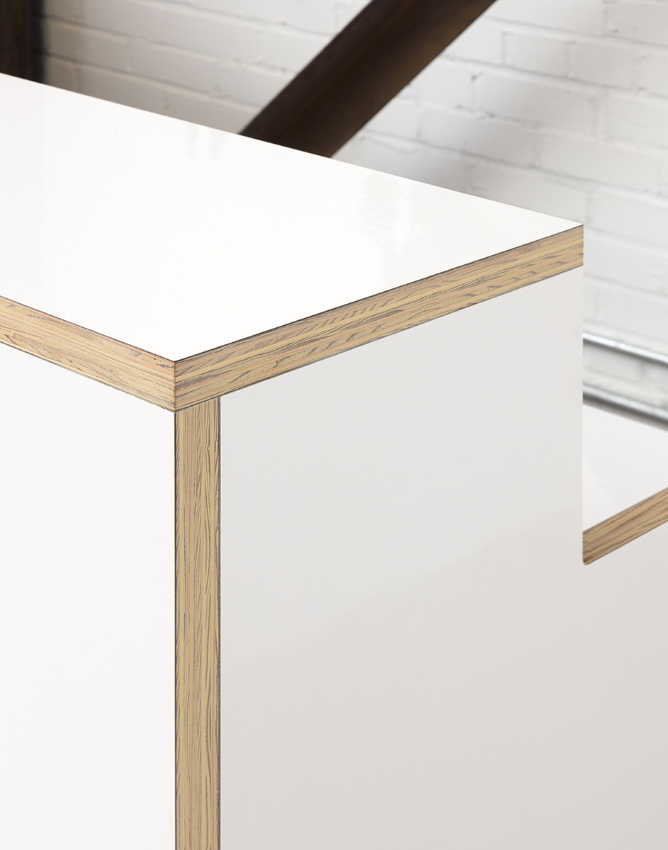
The 3,000-square-foot project uses a 2x2-foot module in plan and elevation, reducing offcut waste and creating a subtle modular harmony by using the given dimensions of the materials of the “white cube” gallery: 4x10 sheets of plywood and drywall. With all new walls 14-feet high, the insertion dramatizes an existing 20-foot-high gantry crane, a handy leftover from the building’s previous life as a steel shop, now useful for hanging art. Along the corridor, a marine plywood wall, able to take a hit from a constant stream of shipping crates, faces off against the gantry’s steel columns, transformed into structural light fixtures.
Photos: Naho Kubota
urbanspace
Urbanspace cocktail bar
New York, NY, 2016
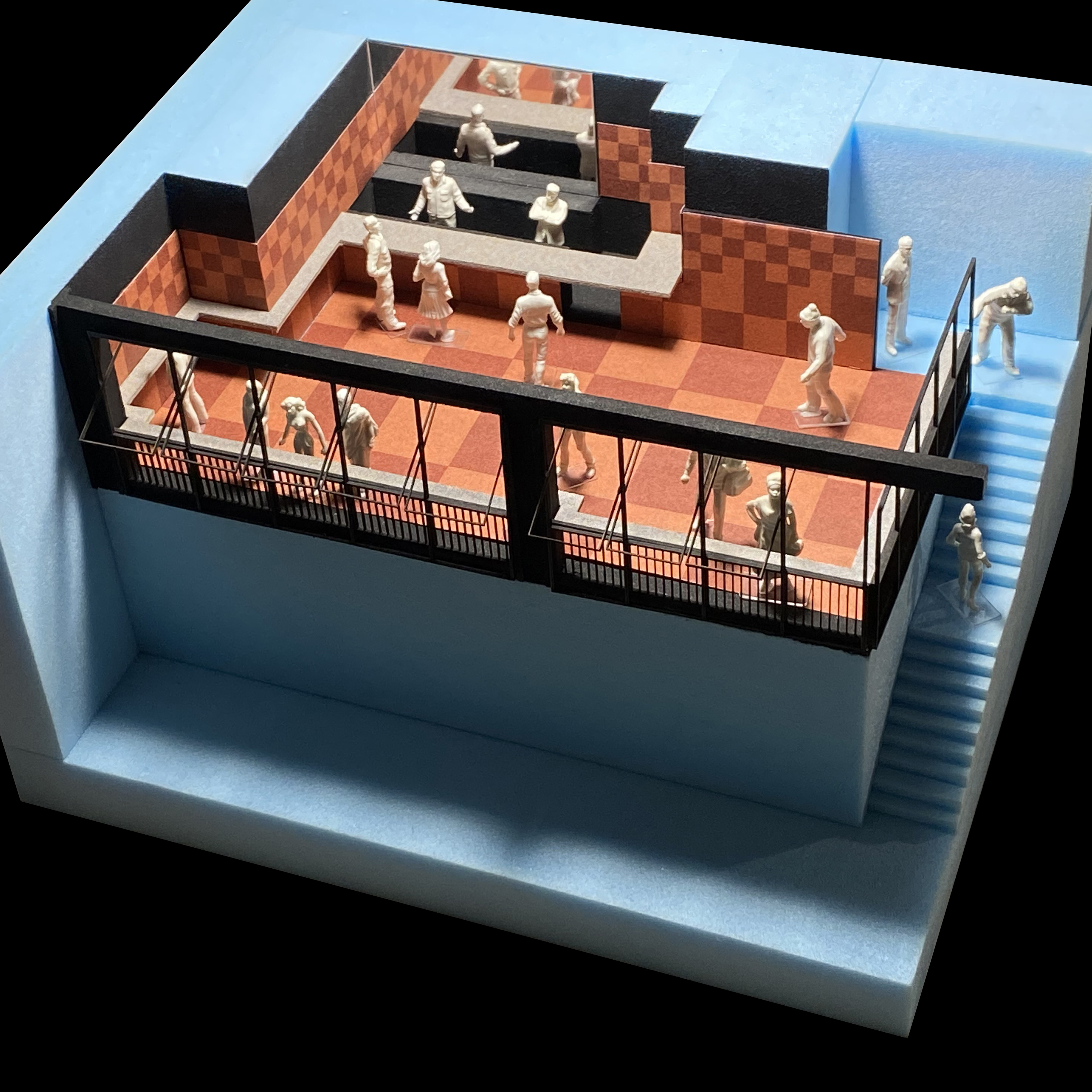
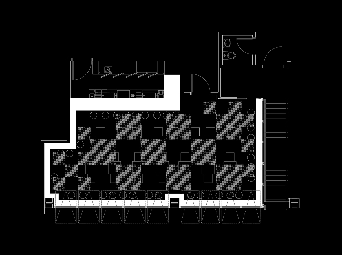

On a mezzanine overlooking Urbanspace Vanderbilt—“New York City’s original food hall”—and just north of Grand Central Terminal, this design for a reservation-only cocktail bar interprets architecturally an essential of most every serious bar: a take on the classics. How do you make a Manhattan? Drawing on the checkboard tile floors often seen in old New York bars, the design modulates and folds this pattern, using warm cork tiles to animate both floors and walls. Meanwhile, a zinc bar morphs into an intimate drink rail wrapping the entire space, giving it cohesion and communal élan.
camphale
Camp Hale
Sandwich, NH, 2016
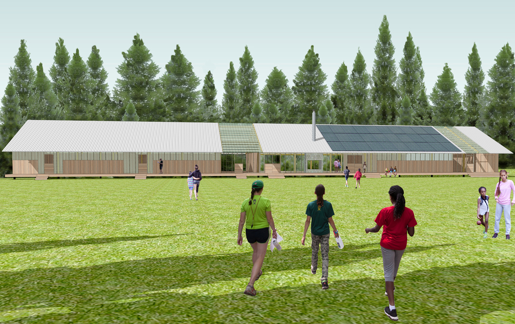

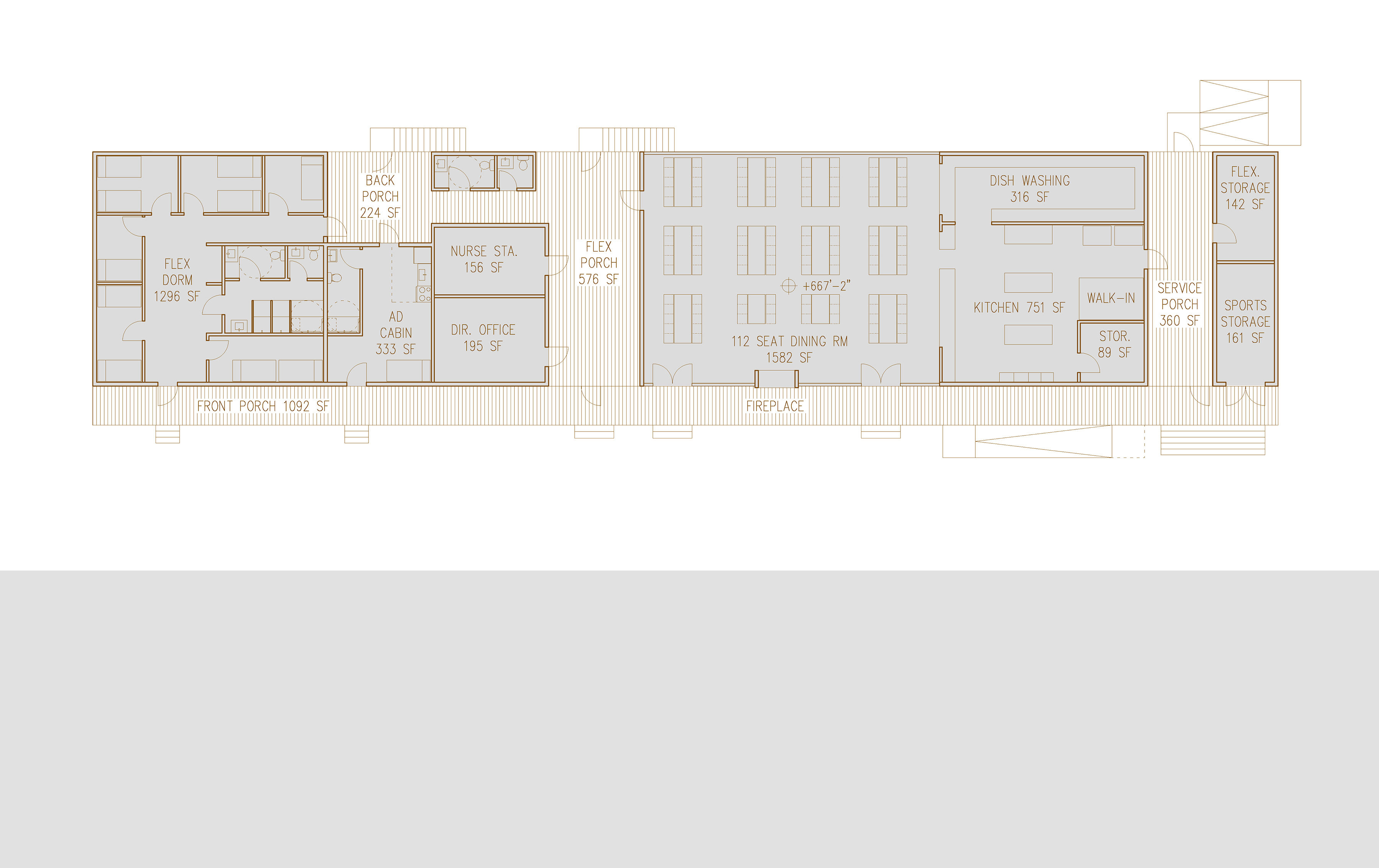
Camp Hale was founded in 1900 on New Hampshire’s Squam Lake as a camp for boys from underprivileged neighborhoods in Boston. In 2013, the camp was in need of a master plan to provide new and renovated facilities as well as reorganization to support new offerings, such as a girls’ program and three-season usage. The core part of the master plan is a new dining hall and community building, replacing an undersized and non-compliant structure from the 1930s that had been at the heart of the camp. POPA provided the concept design for the new building, in a new location at the edge of the camp’s ball field, near the entrance to the property.
POPA’s design takes the ball field location as a primary inspiration to structure the dining hall as a linear bar, fronted by a continuous porch. Offering an ample shaded location for watching games, the porch is also the main circulation for the dining hall and other administrative and guest programs that were part of the brief. At right angles to this front porch are two smaller porches cutting through the mass of the building. Acting as informal meeting space and a kitchen service area, these secondary porches create breezeways that link to the surrounding landscape and break down the heft of the building. Oriented east-west, the gabled roof of the building provides great south-facing roof area for the installation of solar panels, part of the wider green initiatives that are part of the master plan.
In 2019, the dining hall was completed by a local architect using POPA’s concept design.
sunblanket
Sunblanket
Queens, NY, 2015
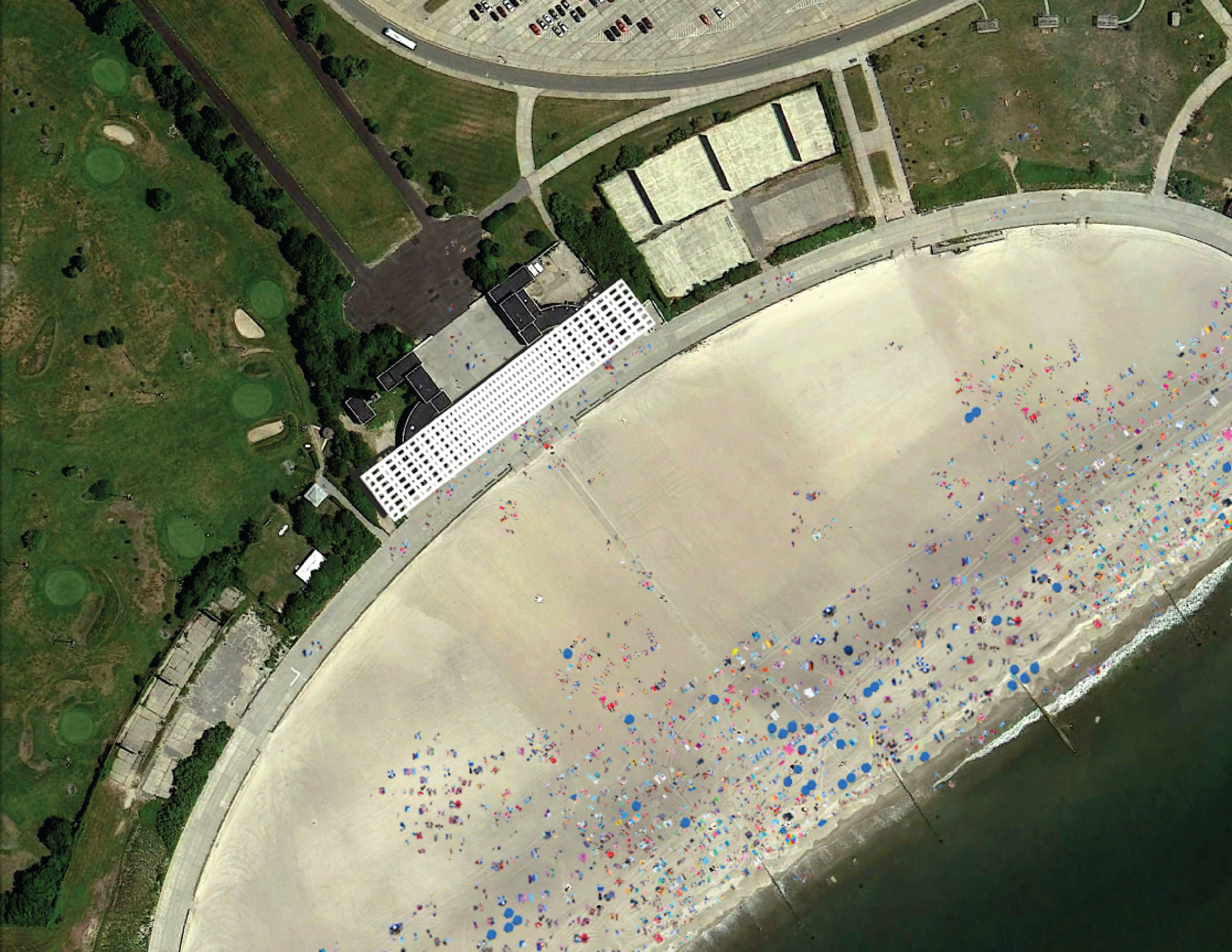
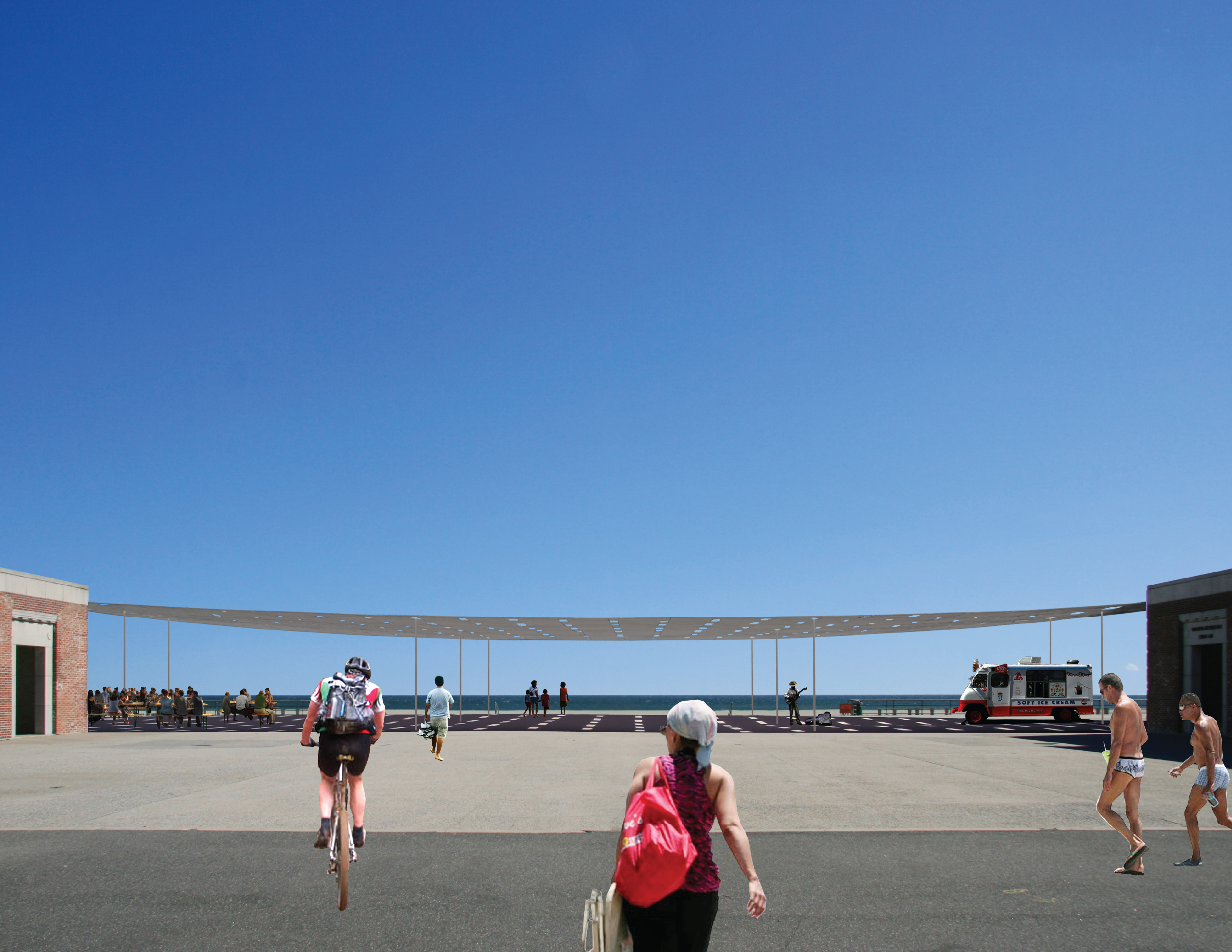
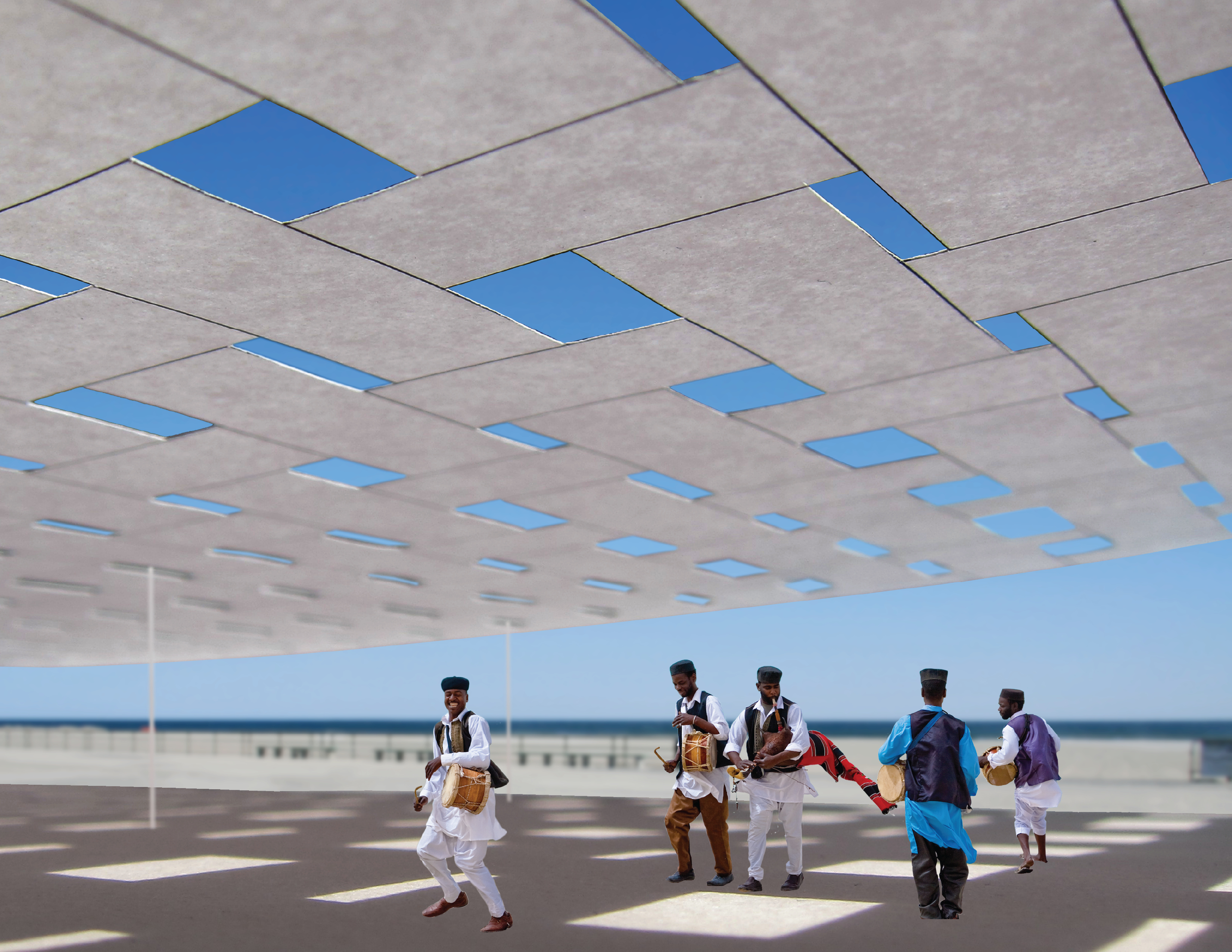
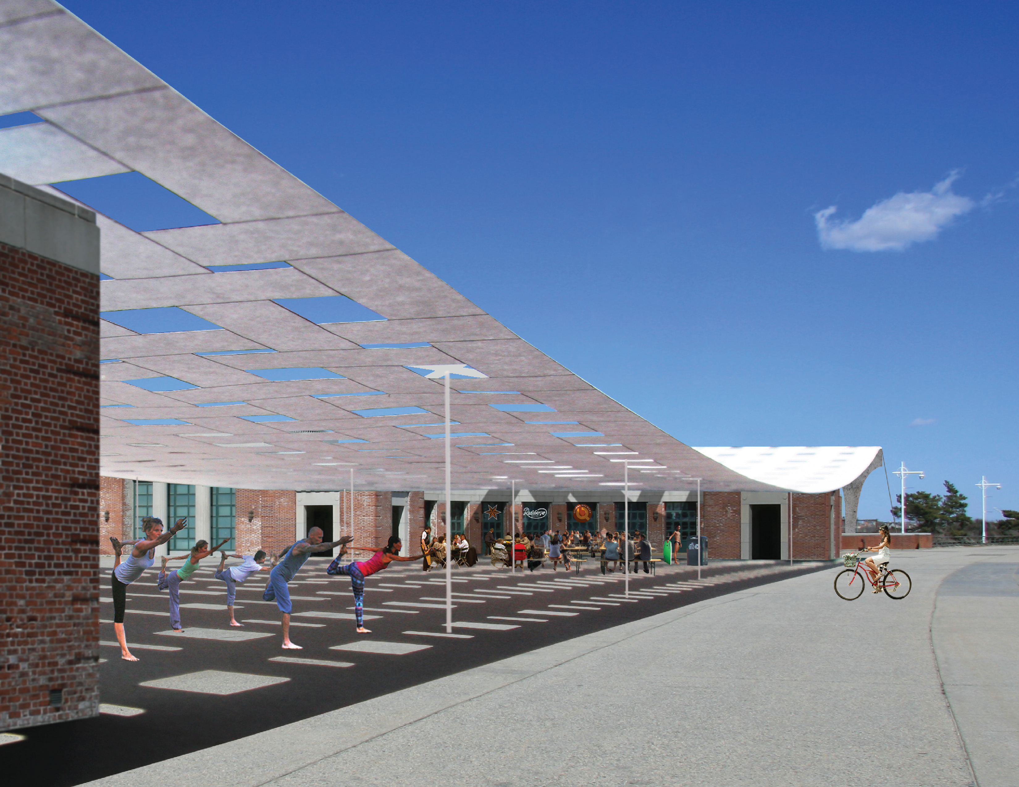

Like a beach blanket protects you from the sand, the Sun Blanket protects you from the sun. Woven from strips of Sunbrella Clarity fabric, the Sun Blanket measures 398x70 feet, a size determined by its site: the patio of the landmarked pavilions at Jacob Riis Park, the so-called “People’s Beach” in Rockaway, Queens. A New Deal project opened in 1937, the neoclassical pavilions house food concessions, a first aid station, and public bathrooms.
Old photos show an active patio with a pizzeria and beer garden. However, today the area suffers from a lack of updated programming. The park’s operator, the National Park Service, is seeking to change this. By adding the massive but minimal Sun Blanket, an infrastructure of shade creates new possibilities for the exposed patio through a more comfortable microclimate. People’s Shade for People’s Beach.
Structurally, the Sun Blanket takes a hands-off approach with little impact on the landmark by setting the blanket’s concrete piers outside the footprint of the pavilions. From the piers drape sixteen cables that support the fabric in a gentle catenary curve. The cables also facilitate easy removal of strips for replacement and off-season storage. The only elements touching the patio are thin tension rods to resist wind load.
Structural consultant: Werner Sobek New York, PC
marfa
Incre-rental Housing
Marfa, TX, 2014
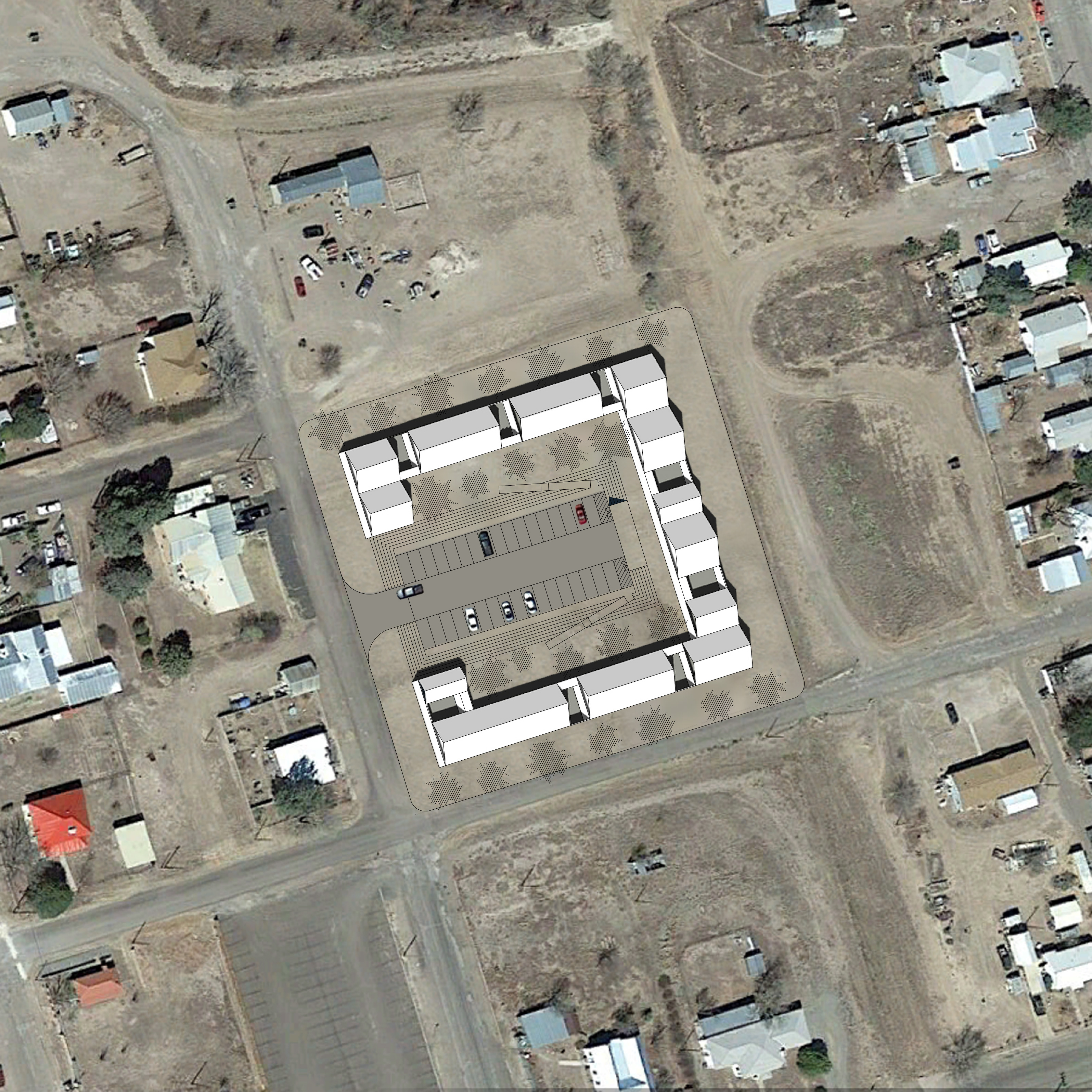
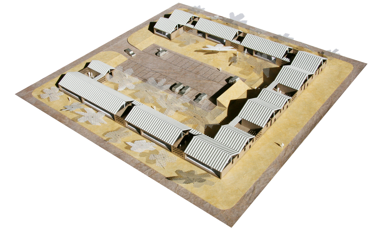

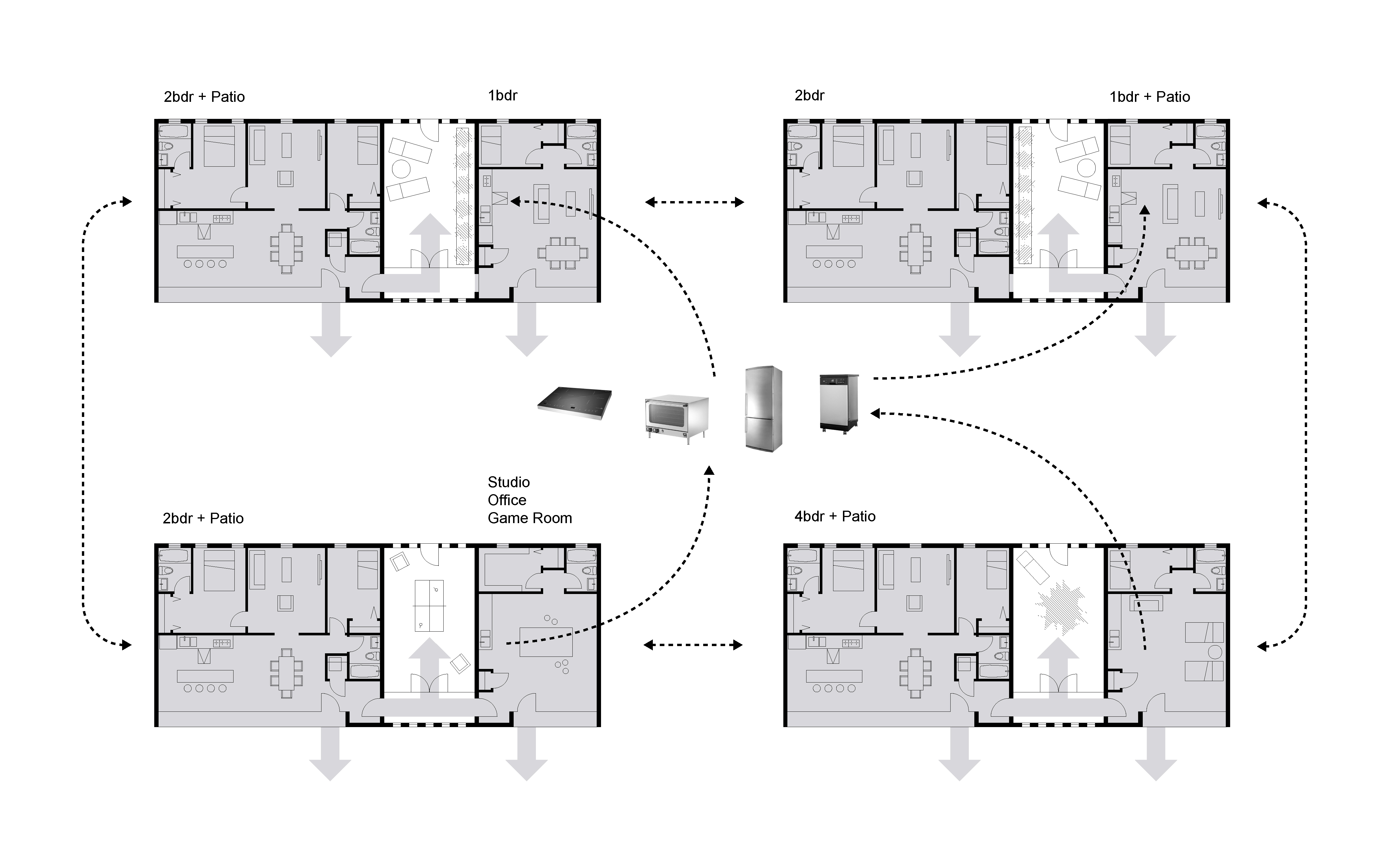

How big is a family? What should define one? Who might want to be a resident and renter in Marfa, and what kind of architecture could best serve their desire to live and work in close proximity? How much space do they need? Provoked by these questions, our proposal for the Design Marfa Multi-Family Housing Competition is an approach that can expand and contract for many different kinds of lifestyle. This “incre-rental” strategy is created through in effect splitting an apartment into two parts that can function independently. With this split made by a patio that provides a great place to hang out, as well as visual, acoustic, and psychological separation, the two parts can be rented separately or together depending on the needs of a given household. All kitchen equipment is electrical, allowing easy removal to facilitate alternative uses.
Casey Mack’s essay on the proposal, “From Bi-nuclear to Incre-rental,” has been published in the “Social Poetics” issue of OASE.
Casey Mack’s essay on the proposal, “From Bi-nuclear to Incre-rental,” has been published in the “Social Poetics” issue of OASE.
zagreb
Badel Block
Zagreb, Croatia, 2012

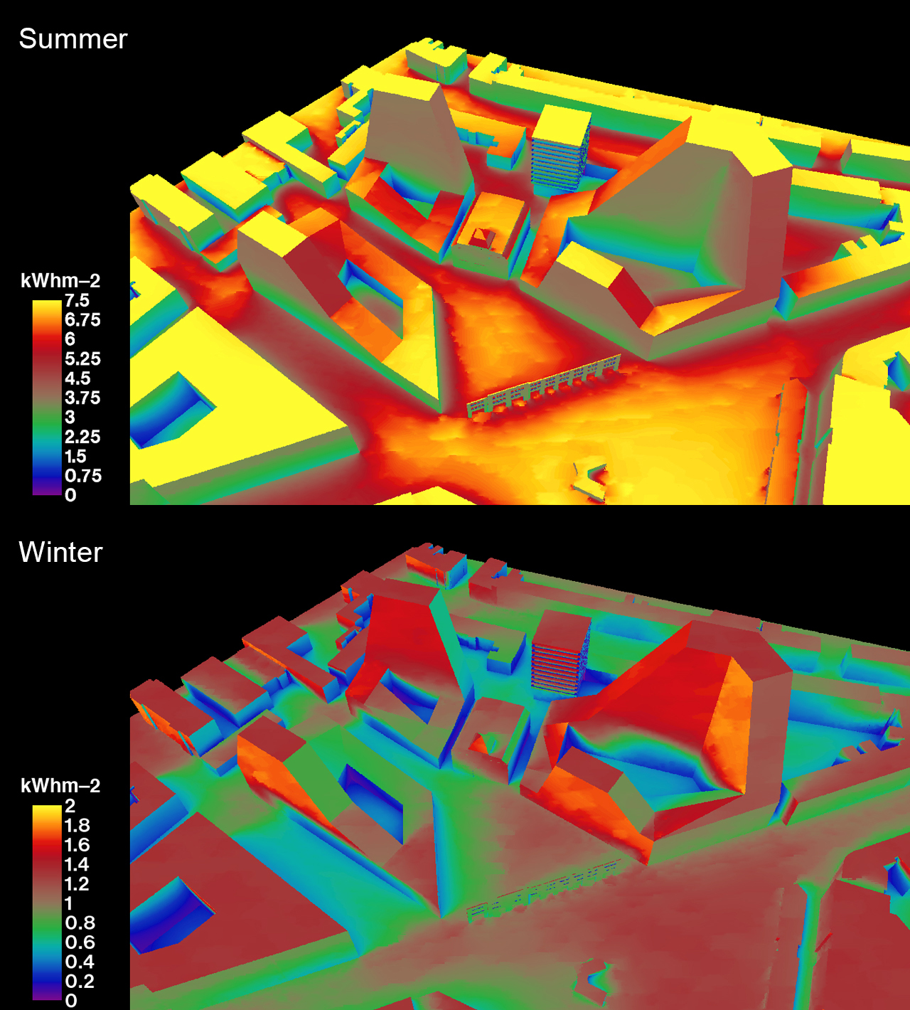
This competition proposal for the historic Badel Block in Zagreb restructures the old industrial site with a new massing plan. The new mixed-use massing is planned for commercial, cultural, office, and residential uses, and is shaped to intelligently densify the site through three grouped perimeter blocks that shrink the footprint of the city’s typical perimeter block. Through this shrinkage, the new “micro” blocks allow greater porosity through the site, connecting the new with existing features such as an old theater and an active street market. While small in footprint, the micro blocks grow in height compared to the norm of Zagreb, thereby mediating between the city’s typical block form and the competition’s desired gross floor area. This strategy of negotiation is conditioned further by a zoning that gives appropriate passive solar gains to the lower and upper sections of the massing, imagined for greater and lesser densities of occupants respectively.
Competition sponsor: City of Zagreb, Croatia
Climate consultant: Transsolar
Competition sponsor: City of Zagreb, Croatia
Climate consultant: Transsolar
stowe
Ski House
Stowe, VT, 2012
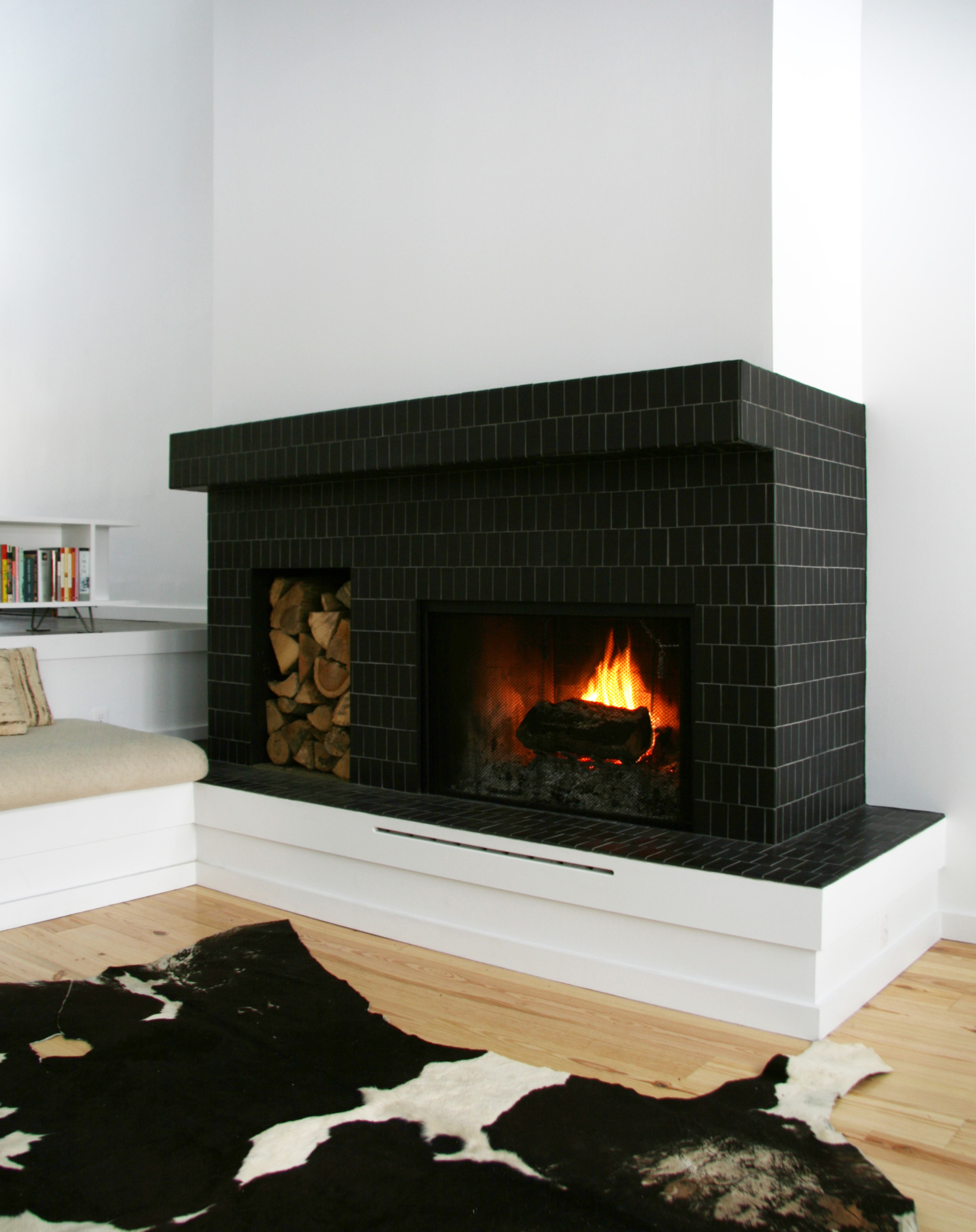
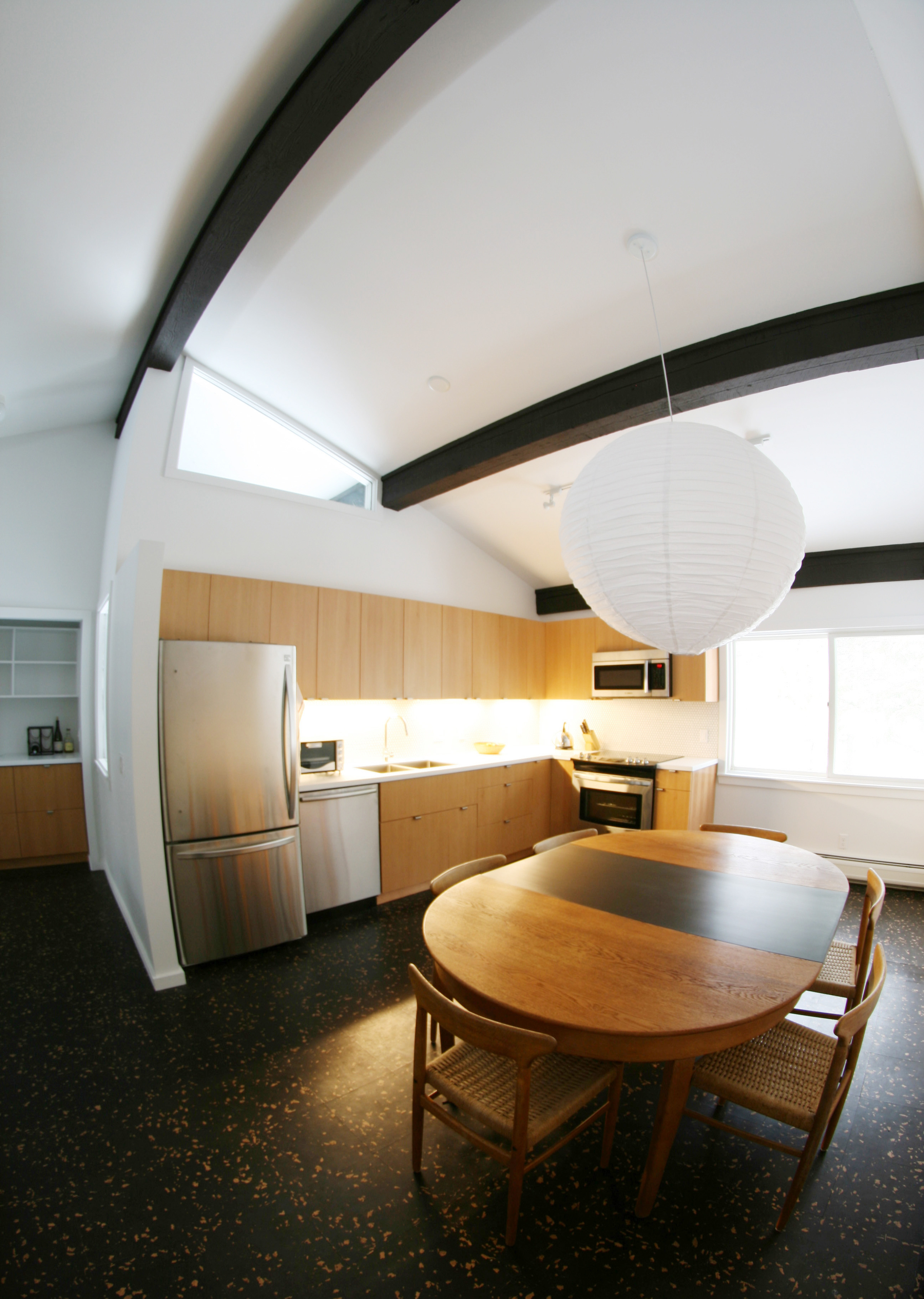
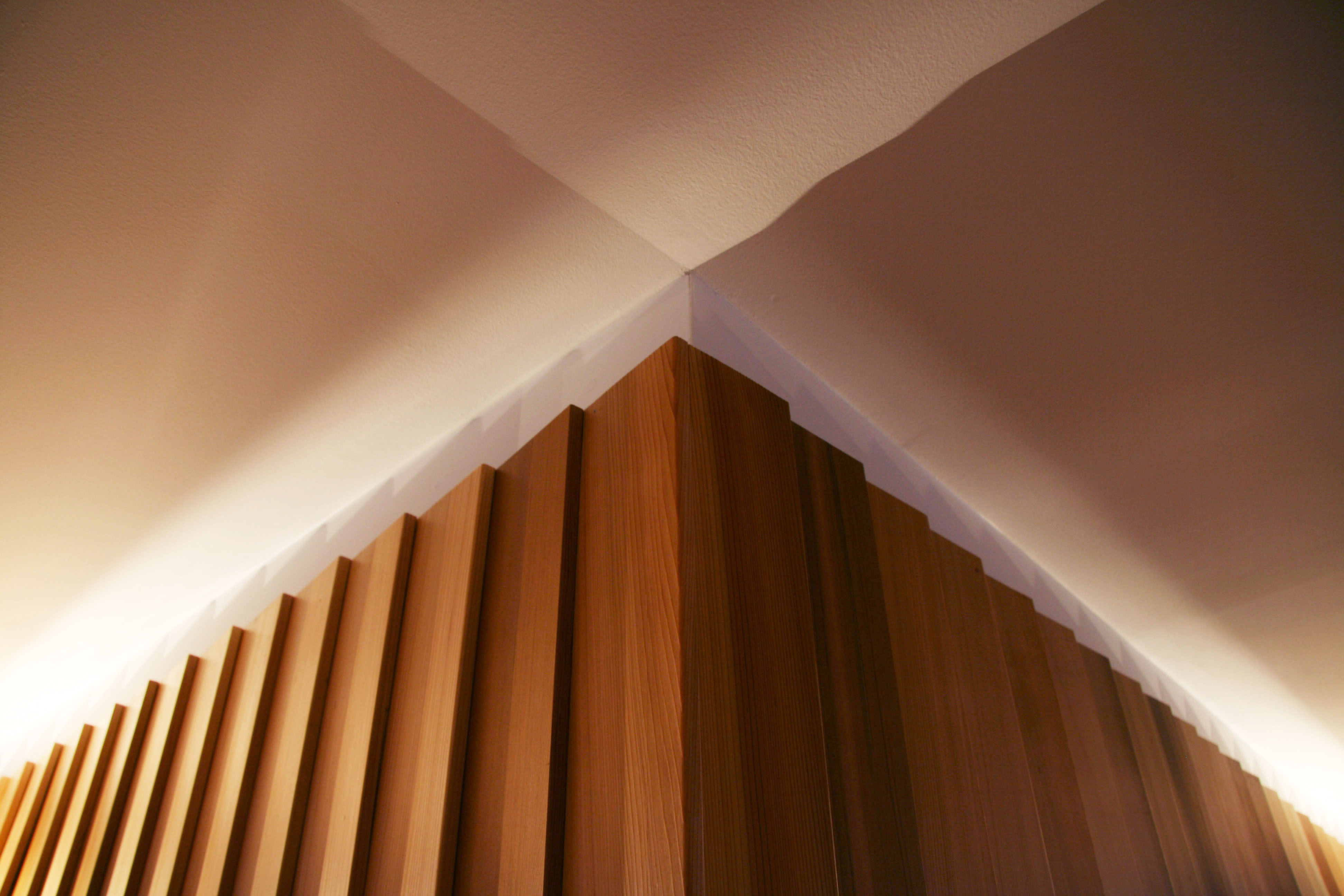
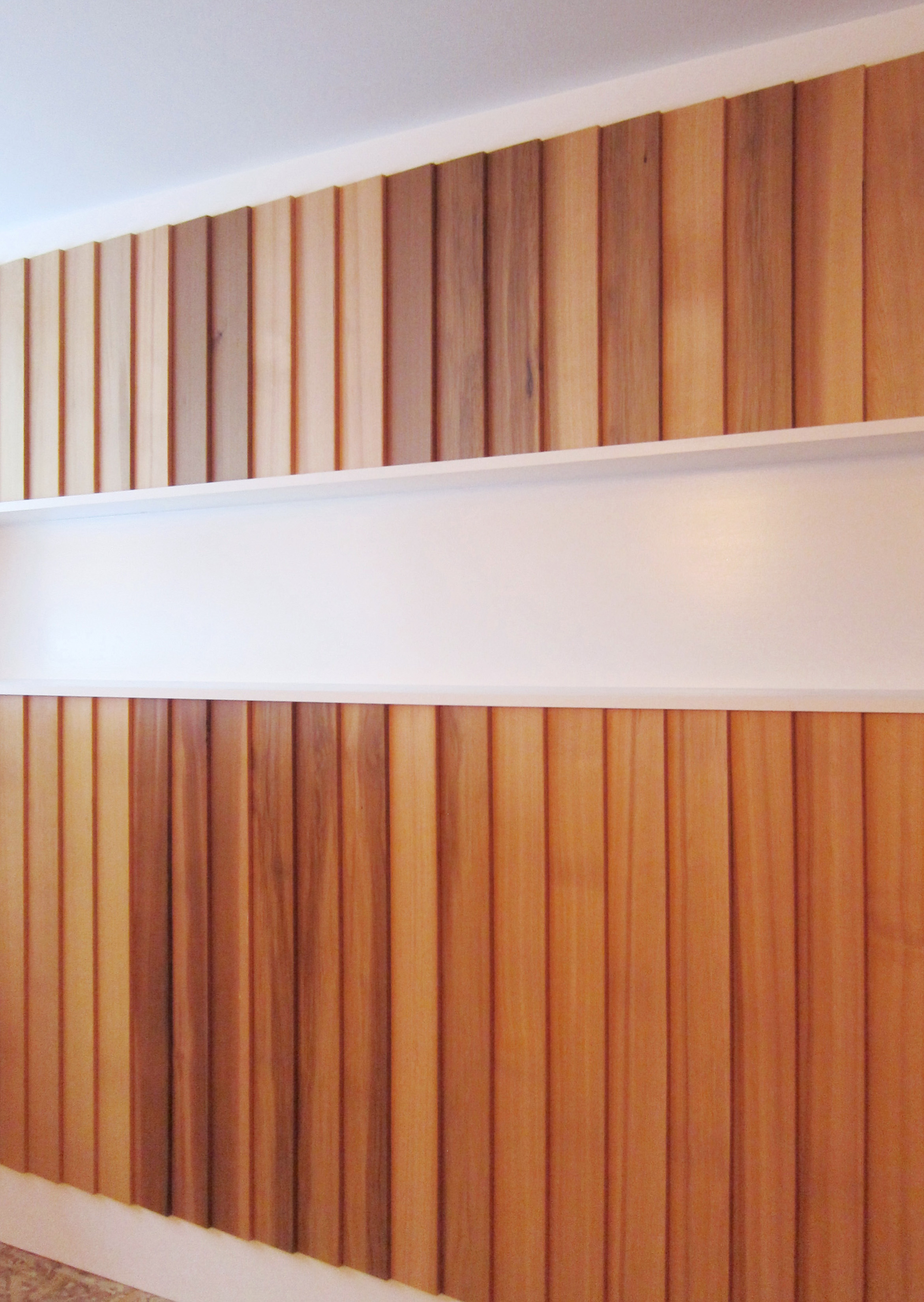
Untouched by any renovation work since being built in the 1970s, this ski house was in dire need of an update. But it had good bones in the form of exposed timber beams and a cathedral ceiling for the second-floor common spaces. Referencing what could be called New England modernism—a modernism in sympathy with older vernaculars—the redesign strives to bring winter coziness and more natural light into what was a gloomy interior. This was achieved through a new skylight and warm, tactile materials with formal clarity, like vertical cedar clapboards and cork flooring. Key areas of work were the kitchen, living room fireplace, a basement bedroom, and bathrooms.
cinema
Glass Curtain
Moscow, Russia, 2011
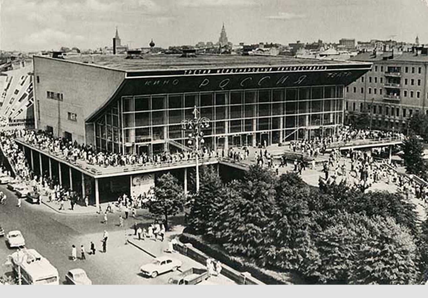


Once a symbol of Khrushchev’s modern vision for the USSR, Moscow’s famous Cinema Pushkinsky, completed in 1961, has over the last fifty years fallen into disrepair. Tasked with using DuPont’s laminated glass products, our renovation proposal—a competition finalist—extends the cinema’s programmatic possibilities using a pleated structural glass façade. Free of metal framing, the new glass curtain increases the cinema’s floor area to make space for a cafe, winter garden, and gallery that extend the adjoining Pushkin Square, creating mediation between inside and out. Aside from the glass, the building is skinned in LED metal mesh, a surface able to cleanly integrate a diversity of advertising and information without compromising the architecture.
Competition sponsor: DuPont SentryGlas
Façade consultant: Front
Renderings: David Huang
Competition sponsor: DuPont SentryGlas
Façade consultant: Front
Renderings: David Huang
J
Jugaad Urbanism
New York, NY, 2011
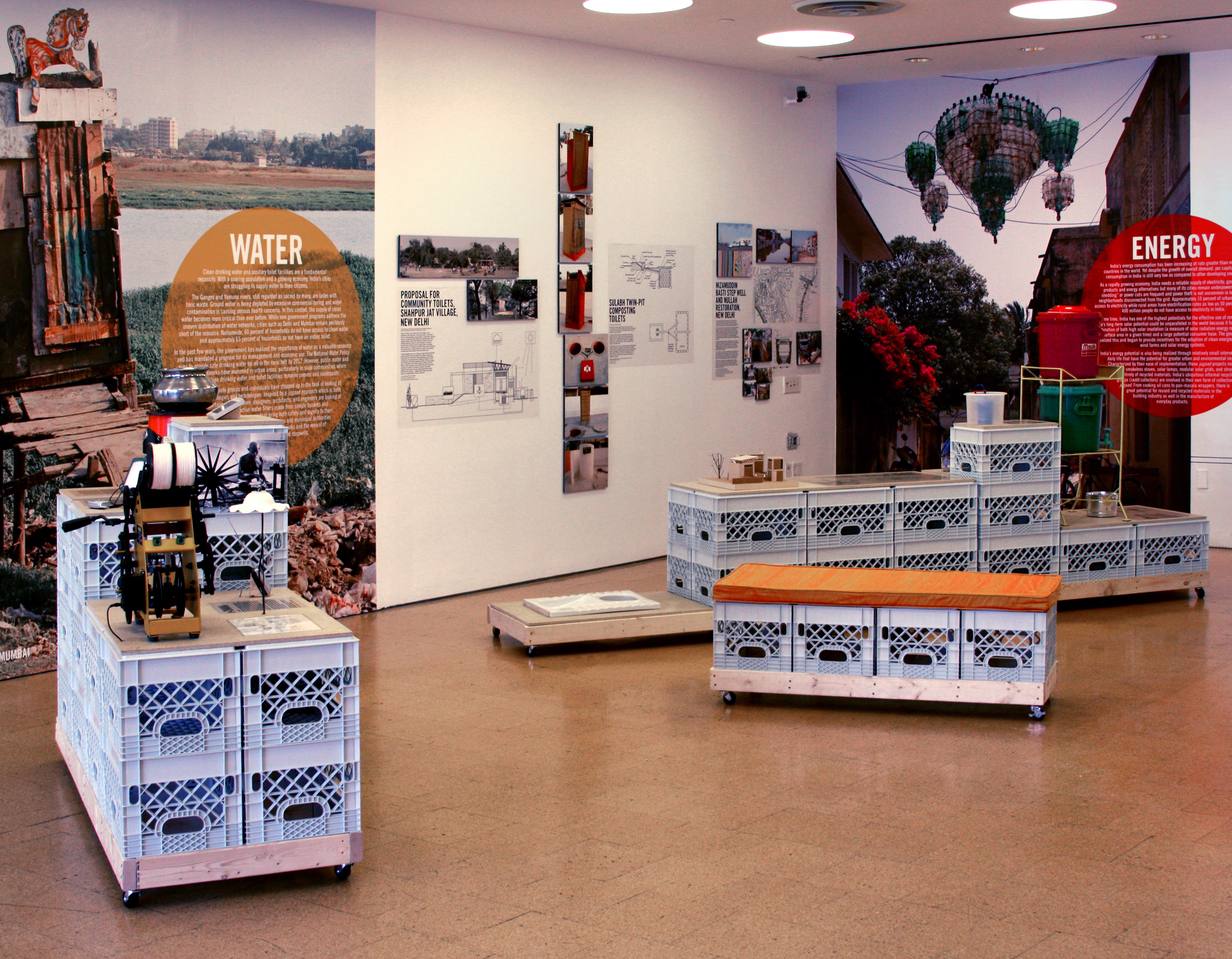
Held at the Center for Architecture, Jugaad Urbanism: Resourceful Strategies for Indian Cities presented examples of the incremental “hacks” improving urban life in India. A colloquial word in Hindi, jugaad is defined by the show’s curator, Kanu Argawal, as a “resourceful and innovative bringing together of disparate parts” to find fixes to megacity problems—in ways that are the exact opposite of top-down master planning.
The show was organized by the resource categories of water, energy, land, and transportation. As the Center writes, “each project featured in the exhibition is a result of dialogue between the everyday efforts of urban residents to deal with resource scarcity and design interventions by architects, planners, artists, and activists.” Examples of projects range from incremental housing strategies for upgrading existing areas to the “e-Charka,” a machine that makes electricity from yarn spinning to power a lamp and a transistor radio, providing both a means of income and public information.
POPA’s exhibition design, conceived in close collaboration with Argawal and Omnivore, used plastic milk crates as a building block for multiple functions for the show, such as vitrines, benches, and shelves. The flexibility of this found module spoke to the jugaad spirit, with the crates used after the show’s closure for reorganizing storage for the Center.
Client: Center for Architecture
Curator: Kanu Argawal
Graphic design: Omnivore
mancave
Man Cave
Queens, NY, 2010
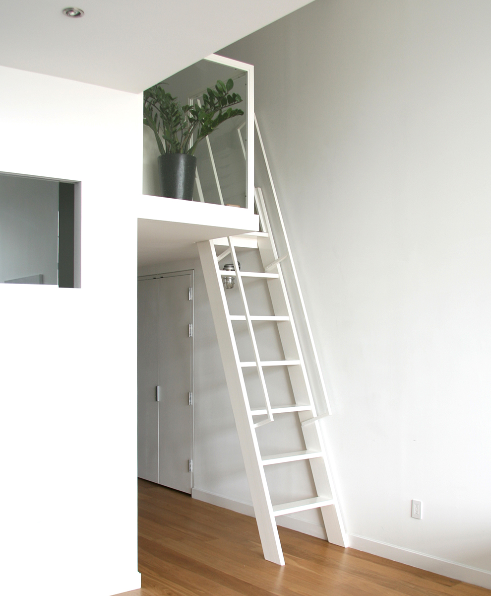
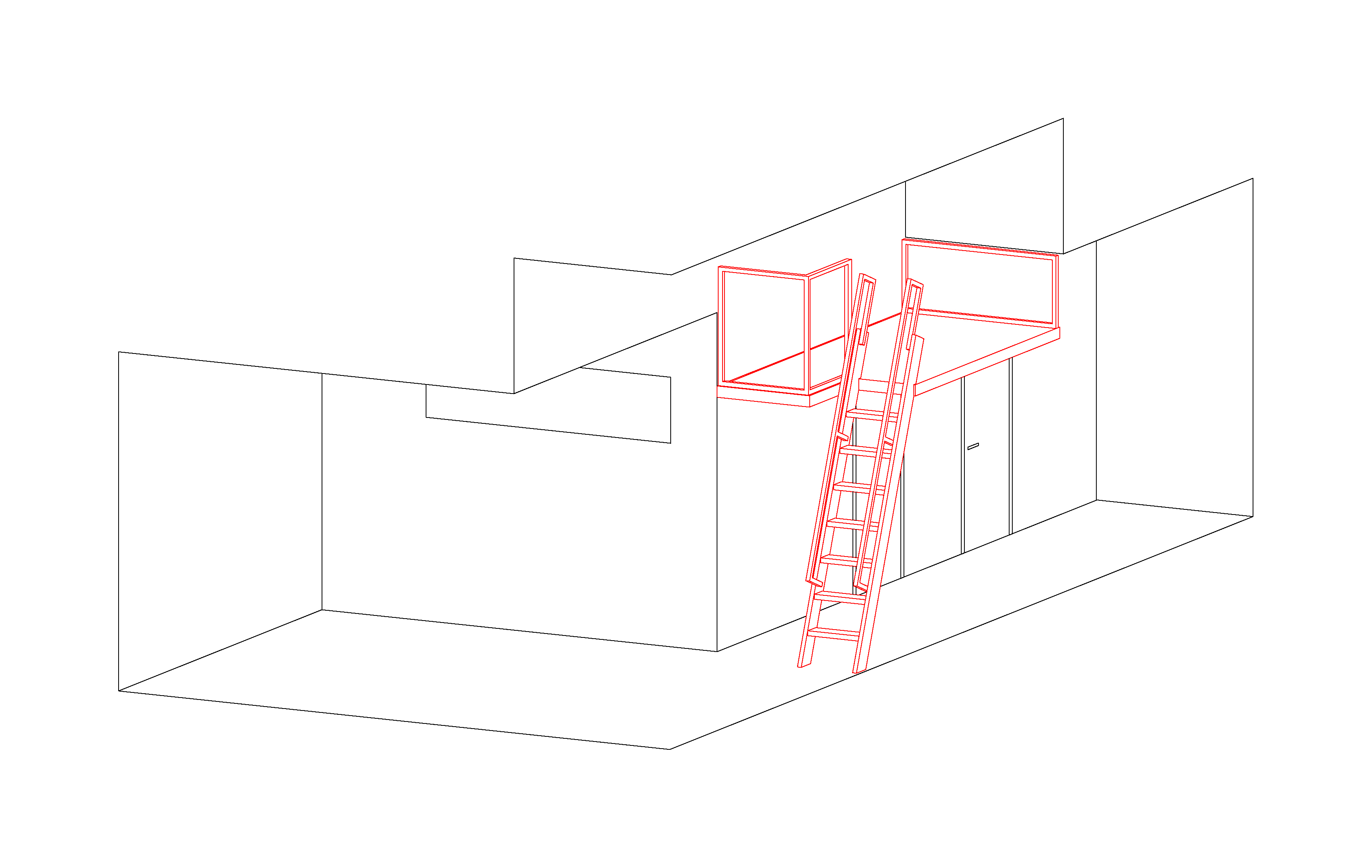
Located in an old factory building converted to residential, this micro project takes advantage of a high-ceilinged space in a two-bedroom apartment to add a 60 square-foot office/refuge mezzanine.
fargo
Fargo Plug-In
Fargo, ND, 2010
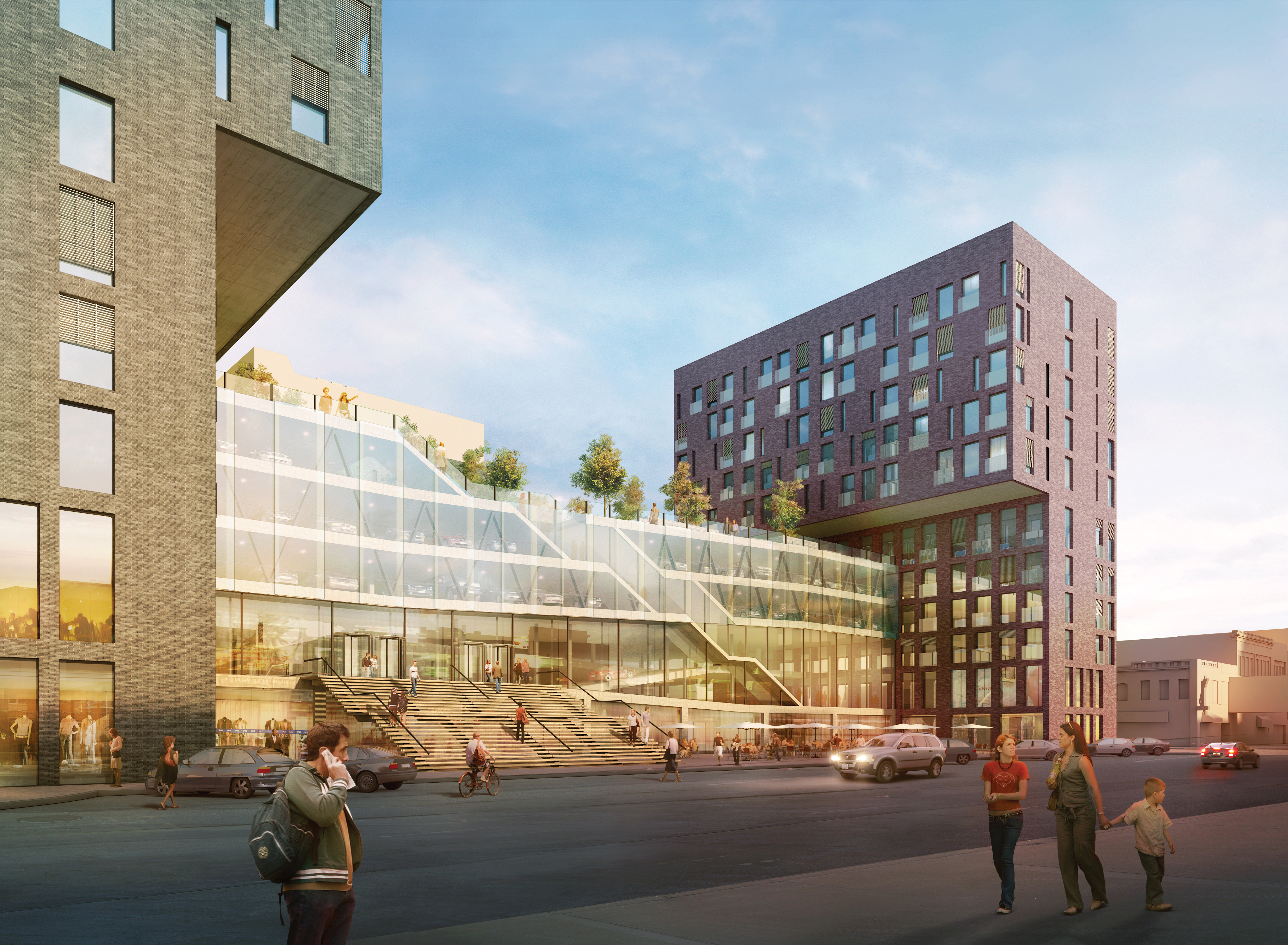

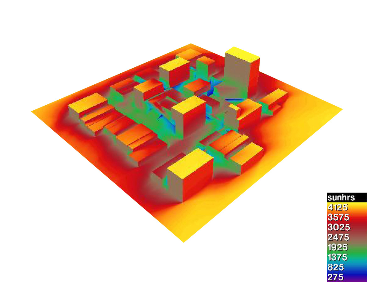
Rather than try to hide it, the 500-car parking ramp required in this competition for a mixed-use development is placed at the center of the site. This location frees the site’s perimeter and creates a strong connection to the city’s existing Skyway pedestrian system, introduced for North Dakota’s frigid winters. Four small “plug-in” towers, varied in height according to solar access, attach to the ramp’s multilevel circulation for people and cars. Together with the ramp, the buildings define three plazas serving different public uses. The top of the ramp is programmed as a park, transitioning from the public to the private realm of the residential floors of the towers.
Competition sponsor: Kilbourne Group
Environmental engineer: Arup New York
Graphic design: Omnivore
Rendering: David Huang
Competition sponsor: Kilbourne Group
Environmental engineer: Arup New York
Graphic design: Omnivore
Rendering: David Huang
pixel
Pixel Field
Phoenix, AZ, 2009
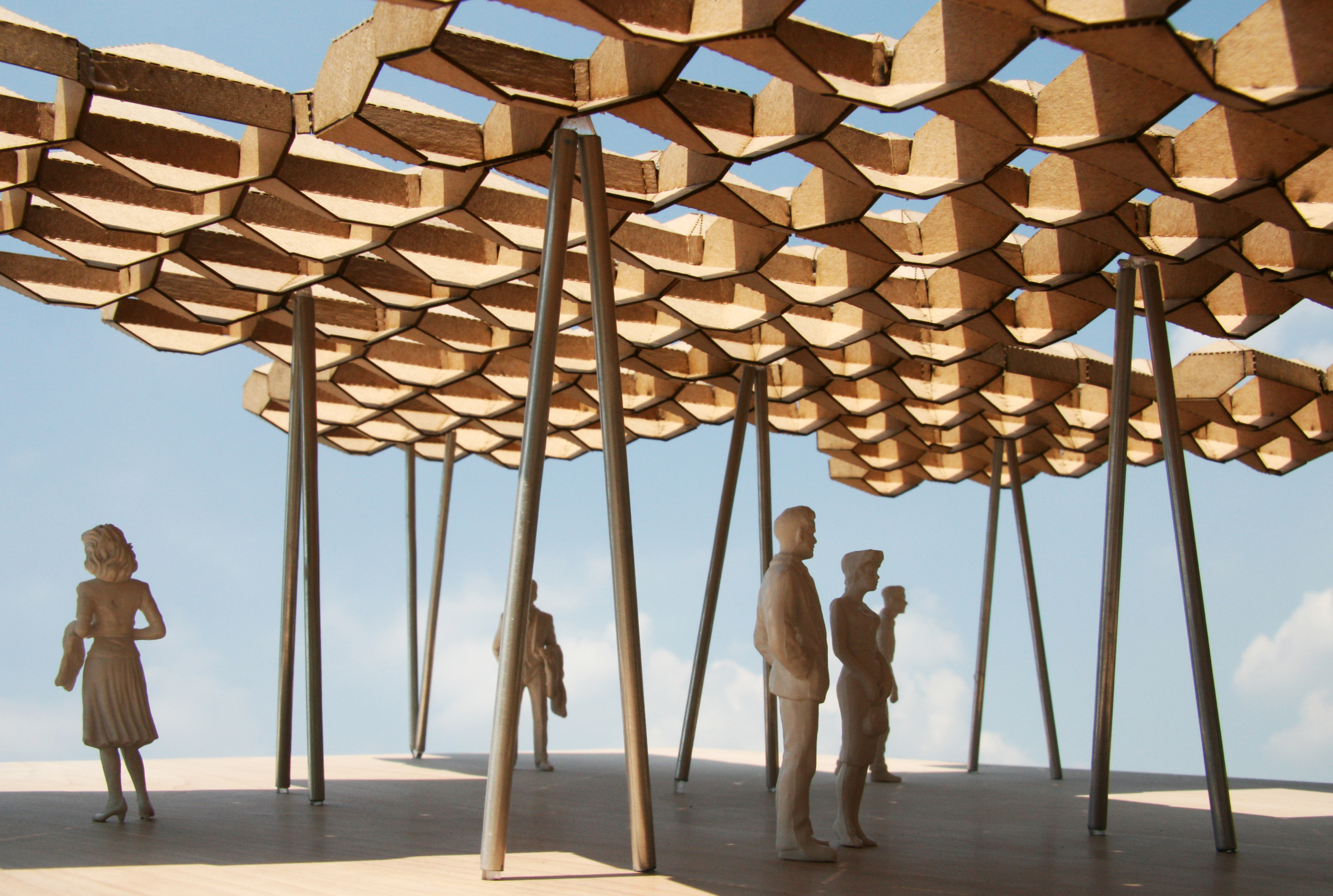

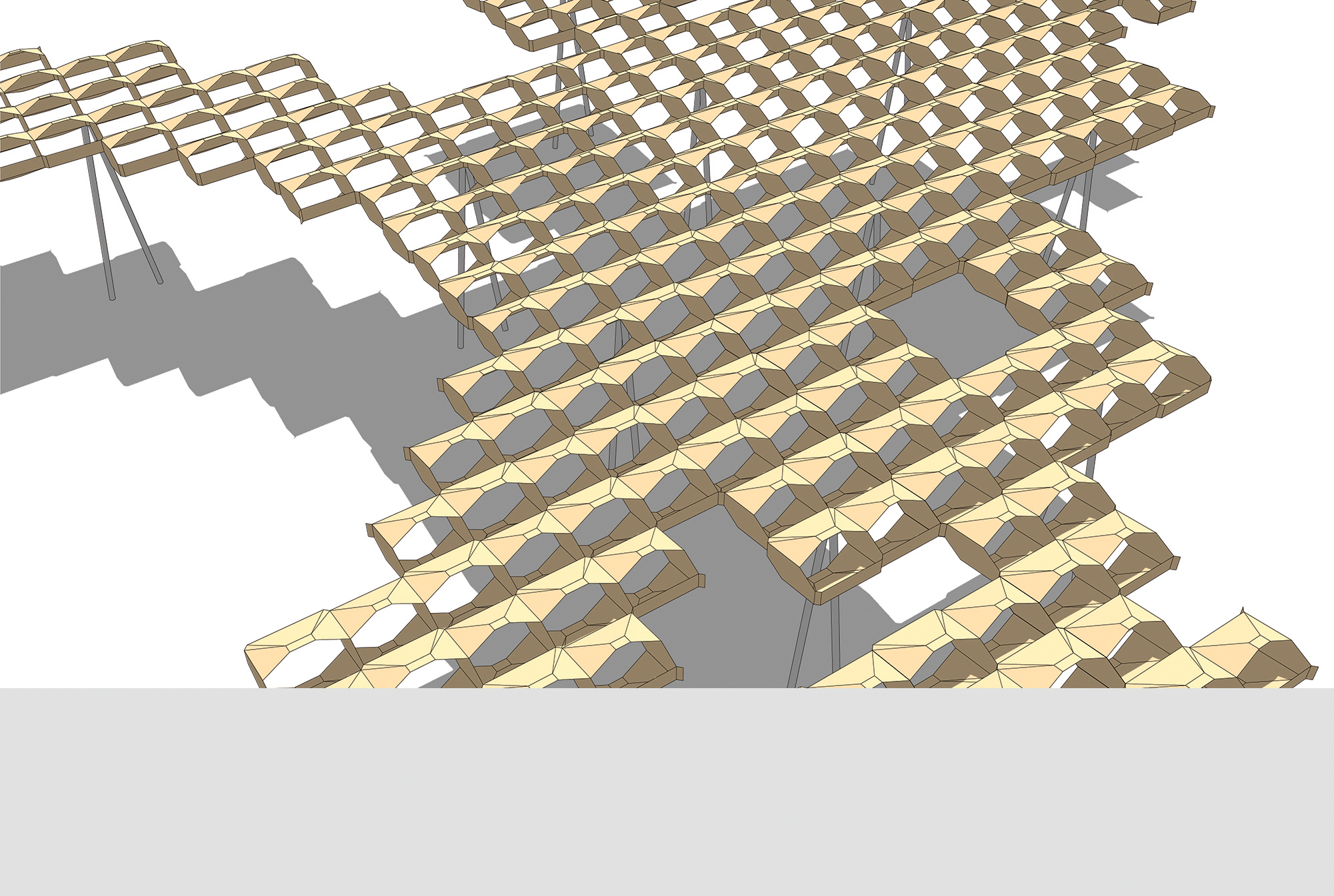

Pixel Field is a proposal for a modular sun shade system adaptable to many conditions in Phoenix, able to transform the city’s scorching outdoor public spaces into a connected oasis of shade. The geometry of each Pixel module is shaped for Phoenix’s latitude of 33.29 degrees, with its highest sun altitude of 79.9 degrees on the June 21st solstice. Bolted together incrementally as needed, the Pixels are made of folded sheet metal due to its high strength-to-weight ratio, reduction of urban heat island effect, and excellent recyclability.
Competition sponsor: The Phoenix Office of Cultural Affairs
Competition sponsor: The Phoenix Office of Cultural Affairs
buildingchina
Building China: Five Projects, Five Stories
New York, NY, 2008
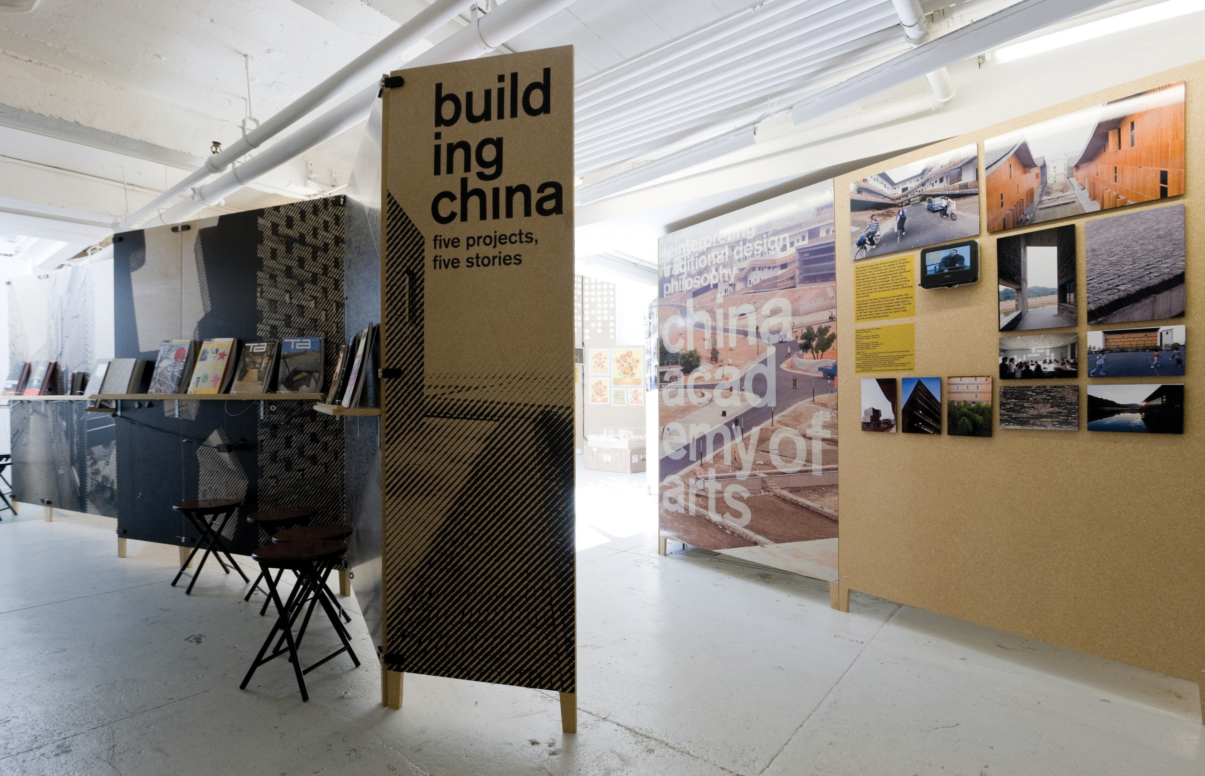
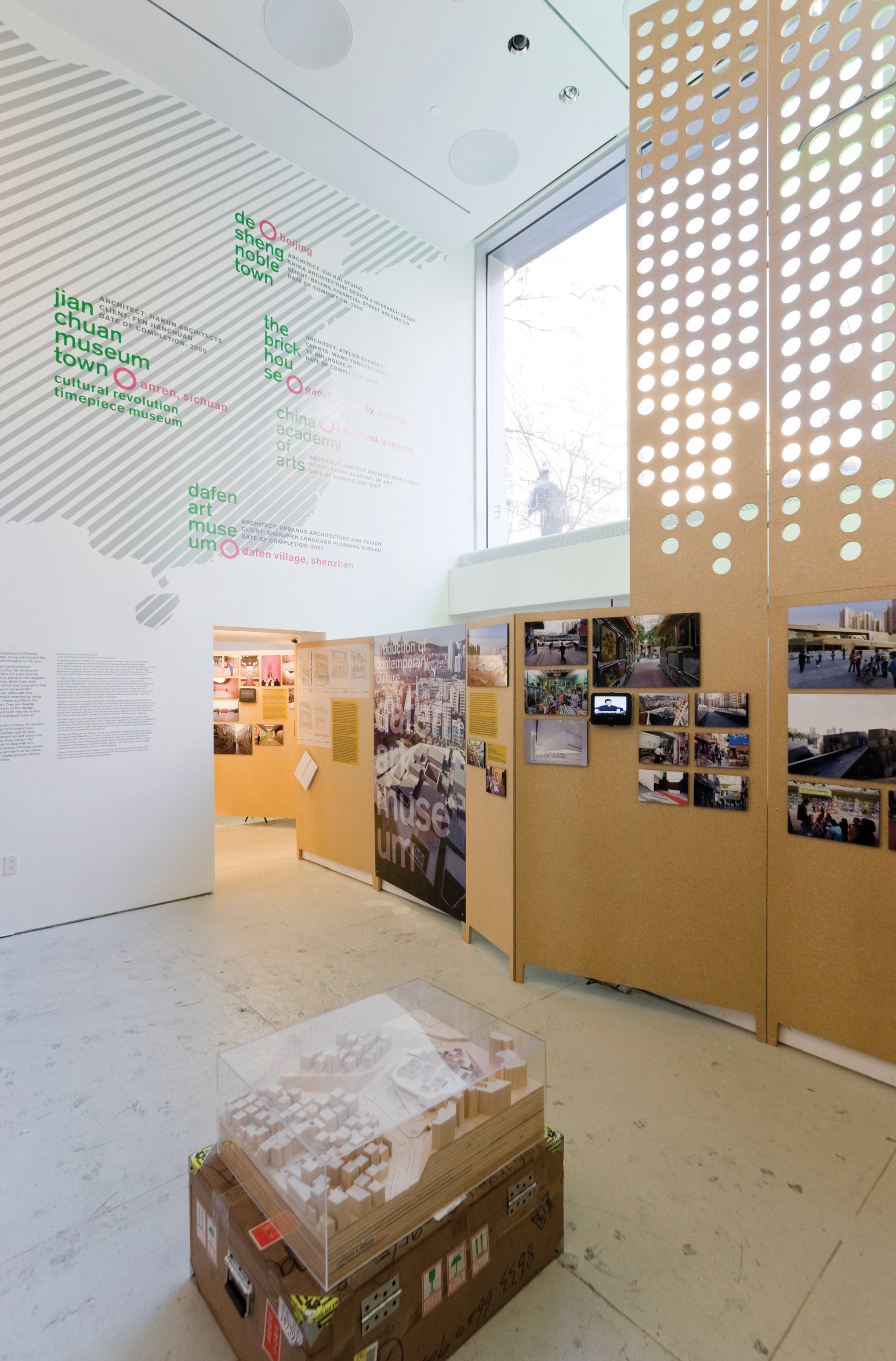
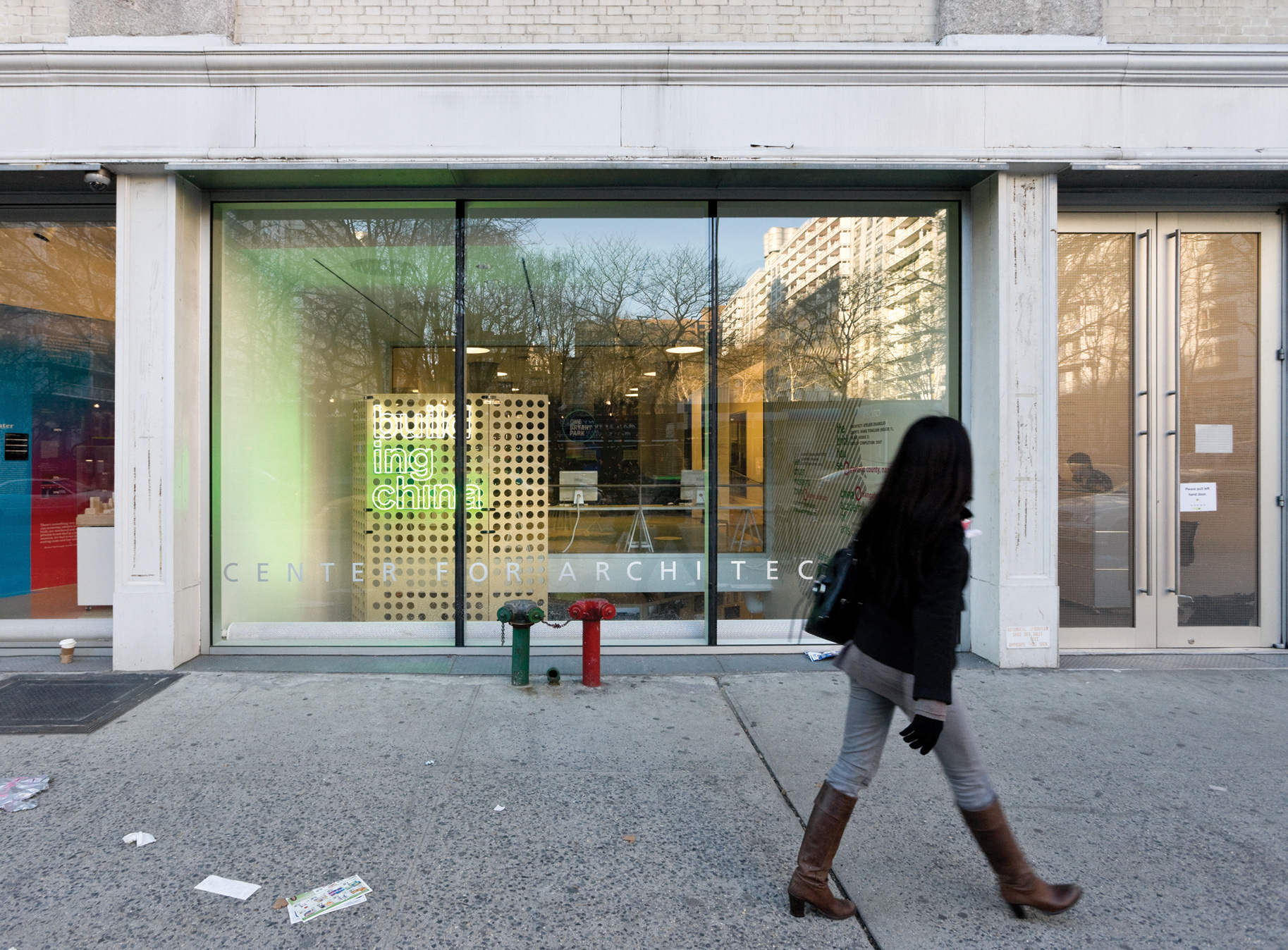
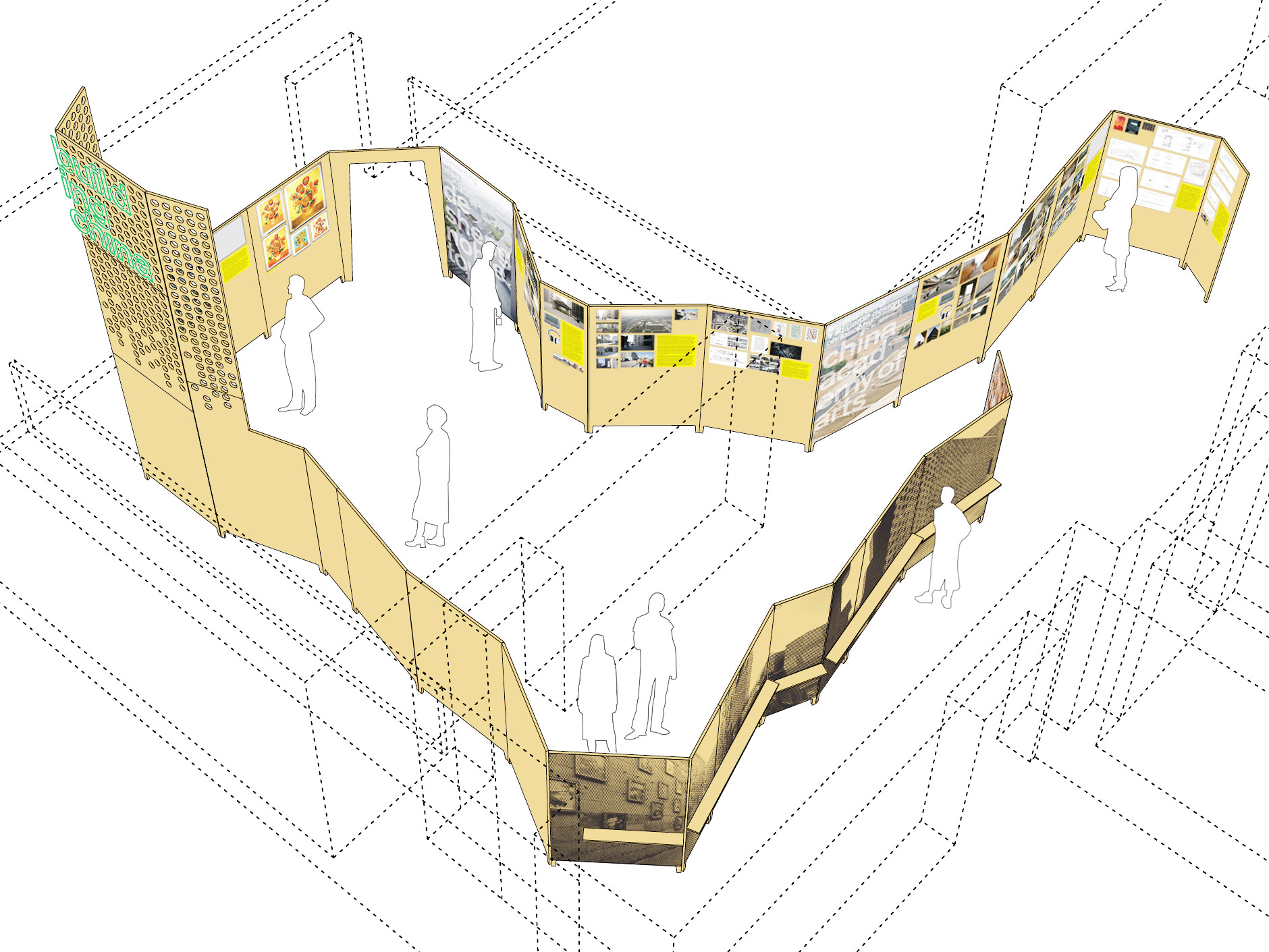
Building China, exhibited at the Center for Architecture, showed five unique architectural projects offering nuanced insight into China’s changing landscapes. Conceived, designed, and recently completed (as of 2008) by Chinese architects, the projects were presented primarily through photos by Iwan Baan. These photos and supporting material were displayed on a freestanding undulating wall inspired by traditional Chinese screens. Constructed of wheatboard, the continuous screen tied together different existing spaces into a coherent whole, while its hinged panels allowed fine-tuning during installation and adjustment to different events during the exhibition.
Client: Center for Architecture
Curator: Wei Wei Shannon
Photos: Iwan Baan
Graphic design: Omnivore
Client: Center for Architecture
Curator: Wei Wei Shannon
Photos: Iwan Baan
Graphic design: Omnivore
rsfa
Reena Spaulings Fine Art
New York, NY, 2006
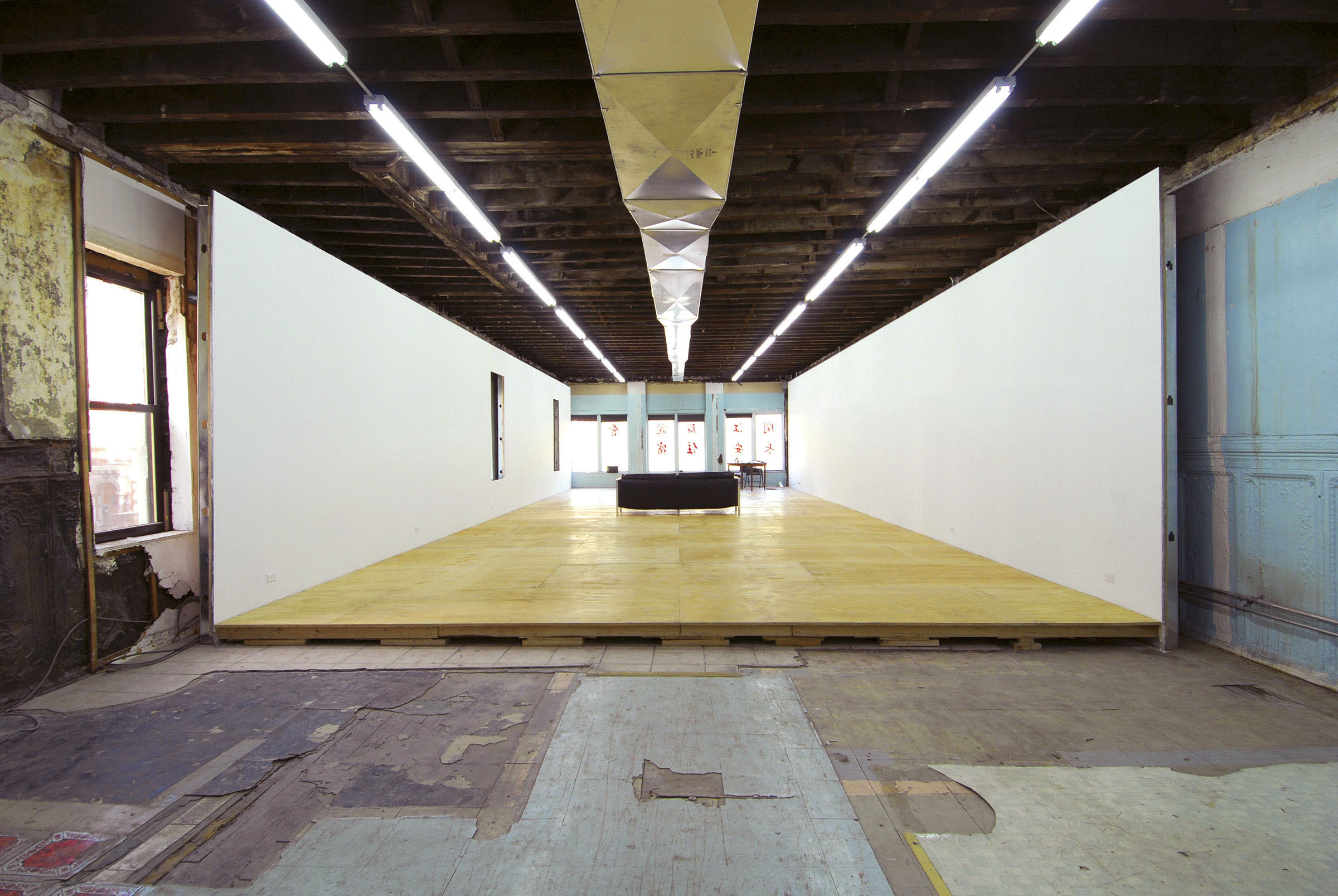
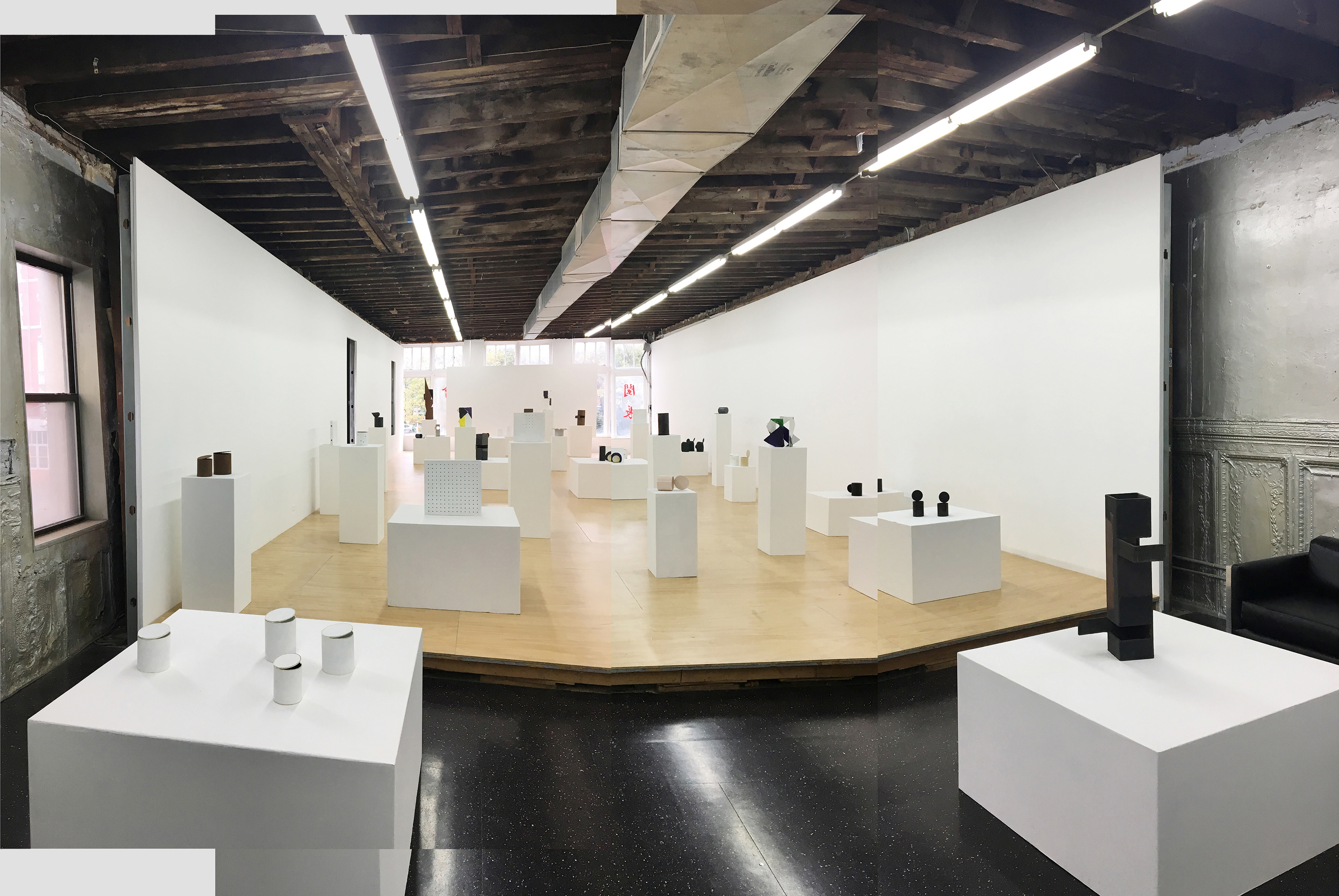
This design treats the generic “white cube” gallery as a set of rigid conditions to collage with maximum contrast into the decrepit interior of a former illegal hotel. Serving as both studio and exhibition space, the inserted gallery’s length and height are generated by uncut 4x10-foot modules of gypsum wallboard. Built for a modest budget, the project over the following years has slowly changed from “raw” to “cooked” as fresh paint, new flooring, etc. have been incrementally added.
thickstoolf
Thick Stool F
2025
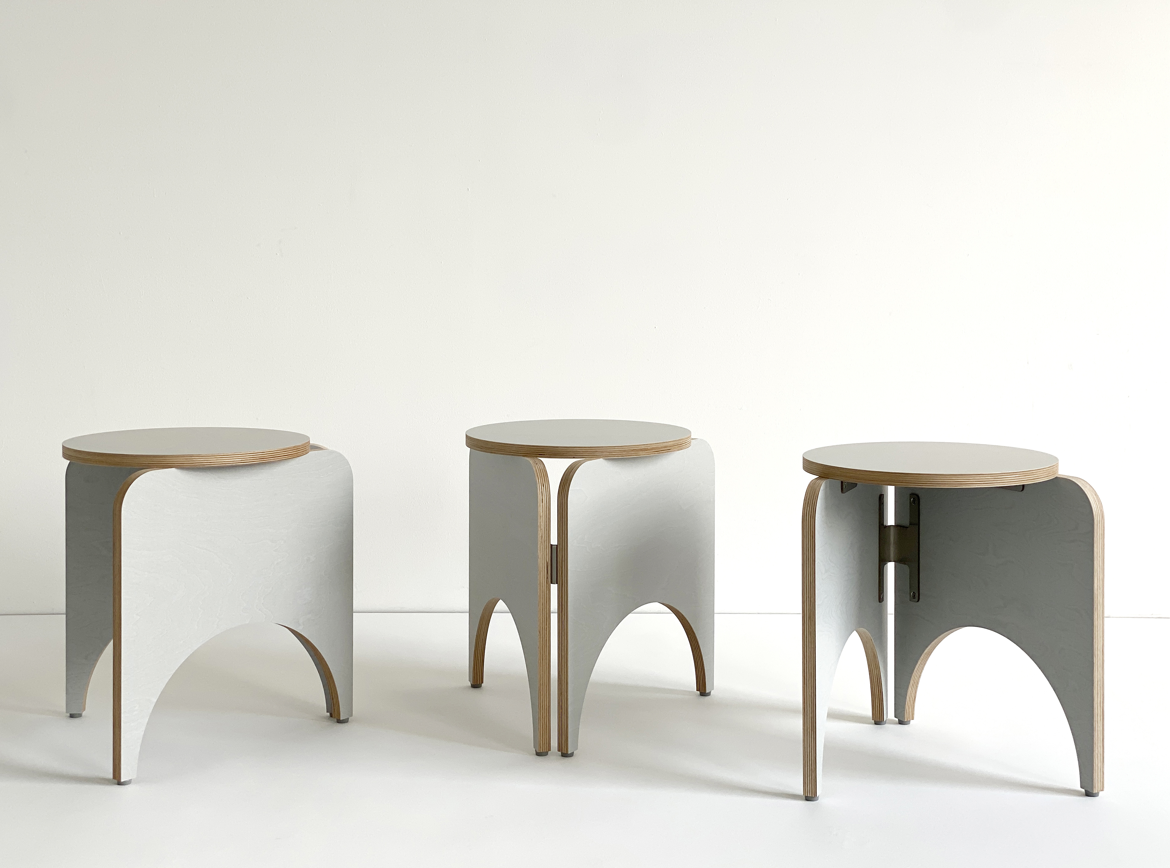

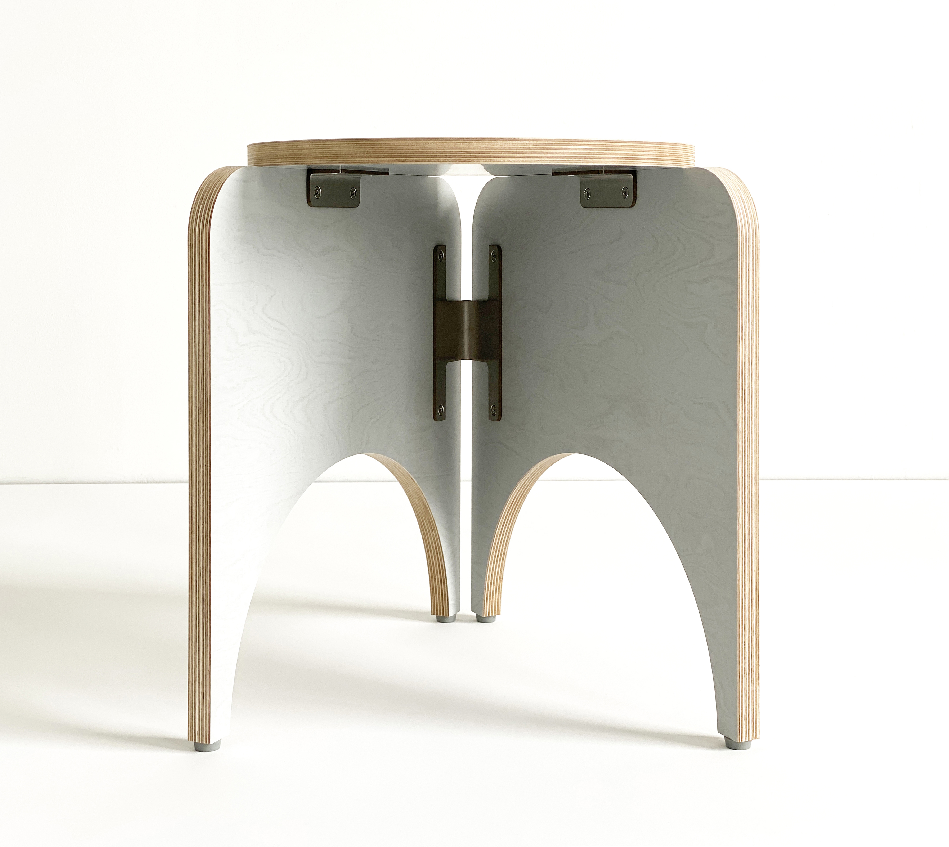
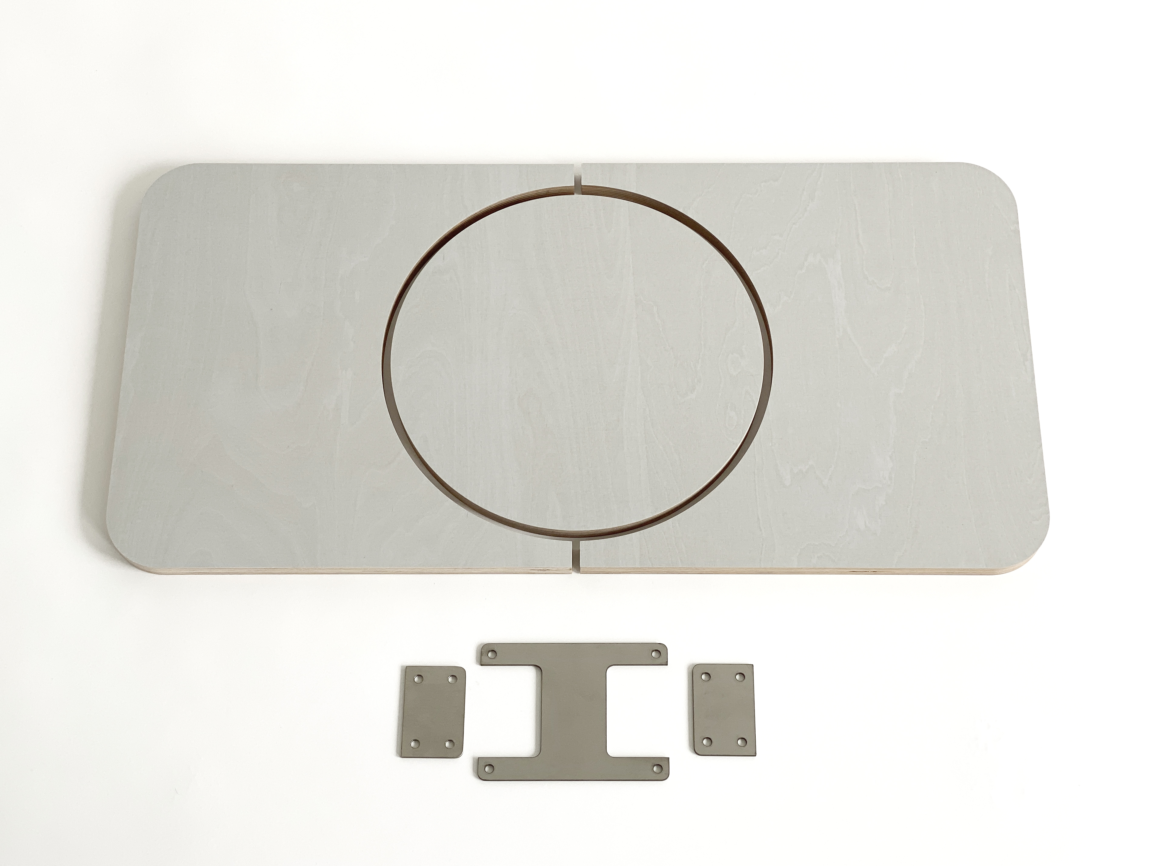
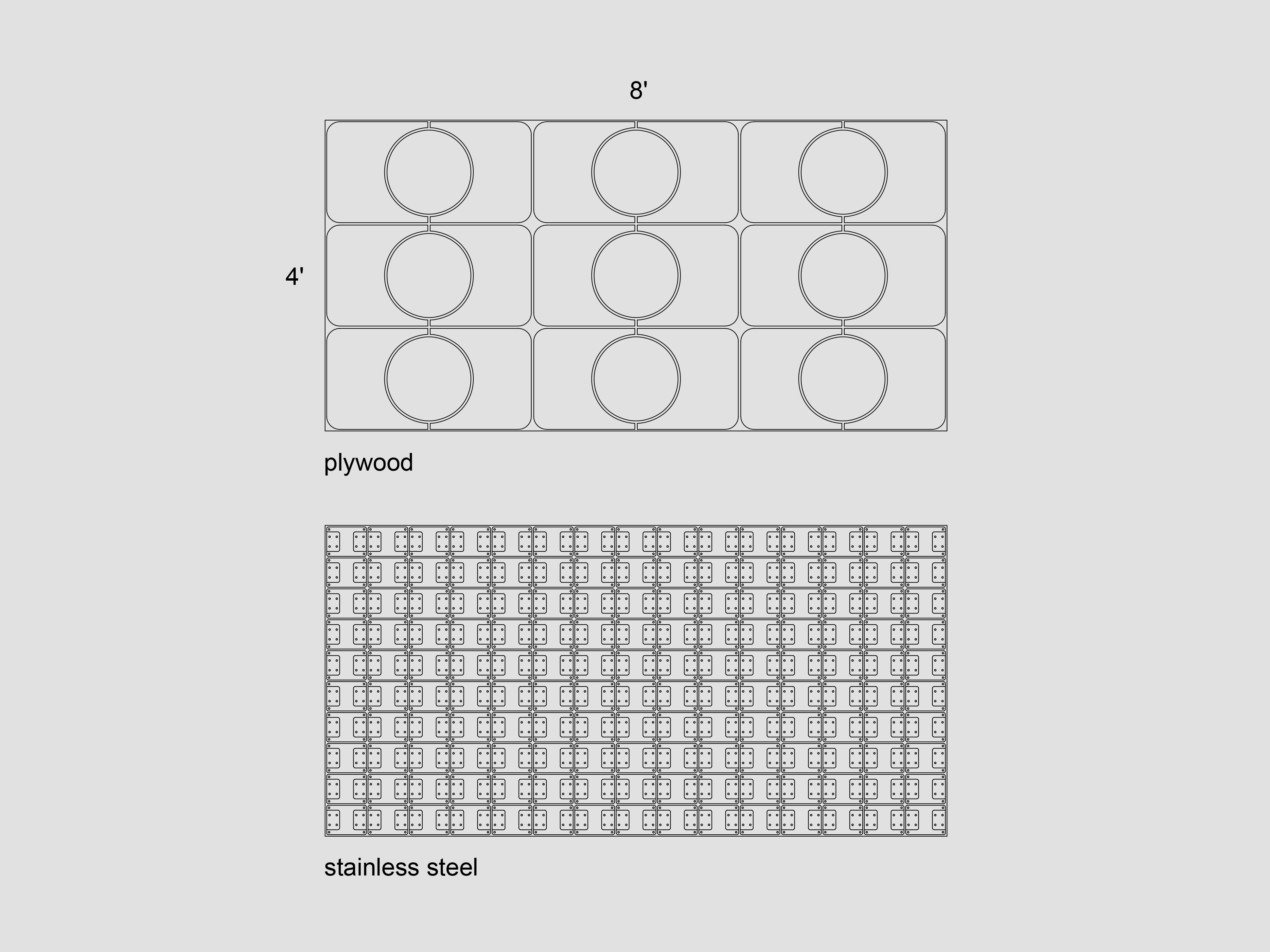
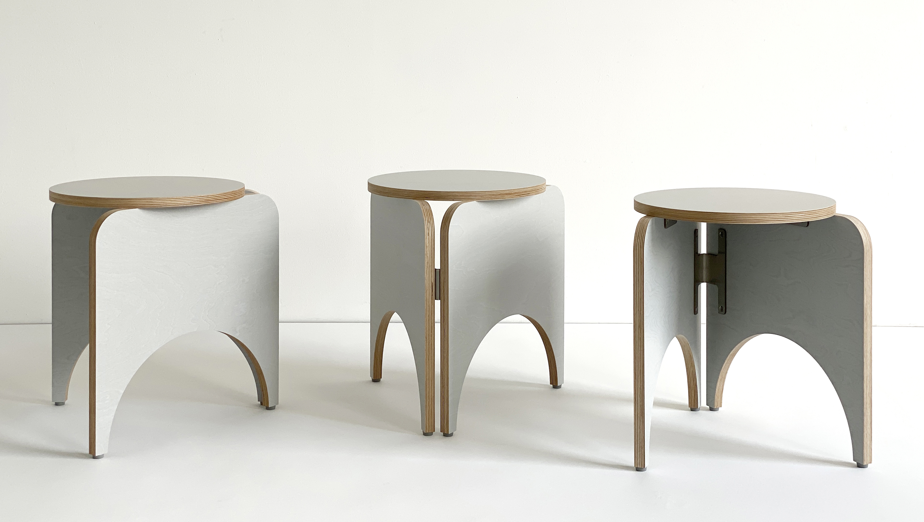
Thick Stool F is made by cutting 4x8-foot sheets of plywood and stainless steel so as to maximize use of the materials. This approach to form finding balances beauty, utility, structural logic, and material economy. The design uses a self-similar fractal concept for the seat and hardware, a reciprocal logic where one part nests in the other. It also works very well as a side table.
16.5″h x 15.75″w x 13″d
Stain-resistant FSC-certified plywood with gray phenolic faces and stainless steel
Other colors available for custom orders
$310 ea. (local pickup only from Brooklyn NY)
︎︎︎ Purchase
16.5″h x 15.75″w x 13″d
Stain-resistant FSC-certified plywood with gray phenolic faces and stainless steel
Other colors available for custom orders
$310 ea. (local pickup only from Brooklyn NY)
︎︎︎ Purchase
thickstool2
Thick Stool 2
2023
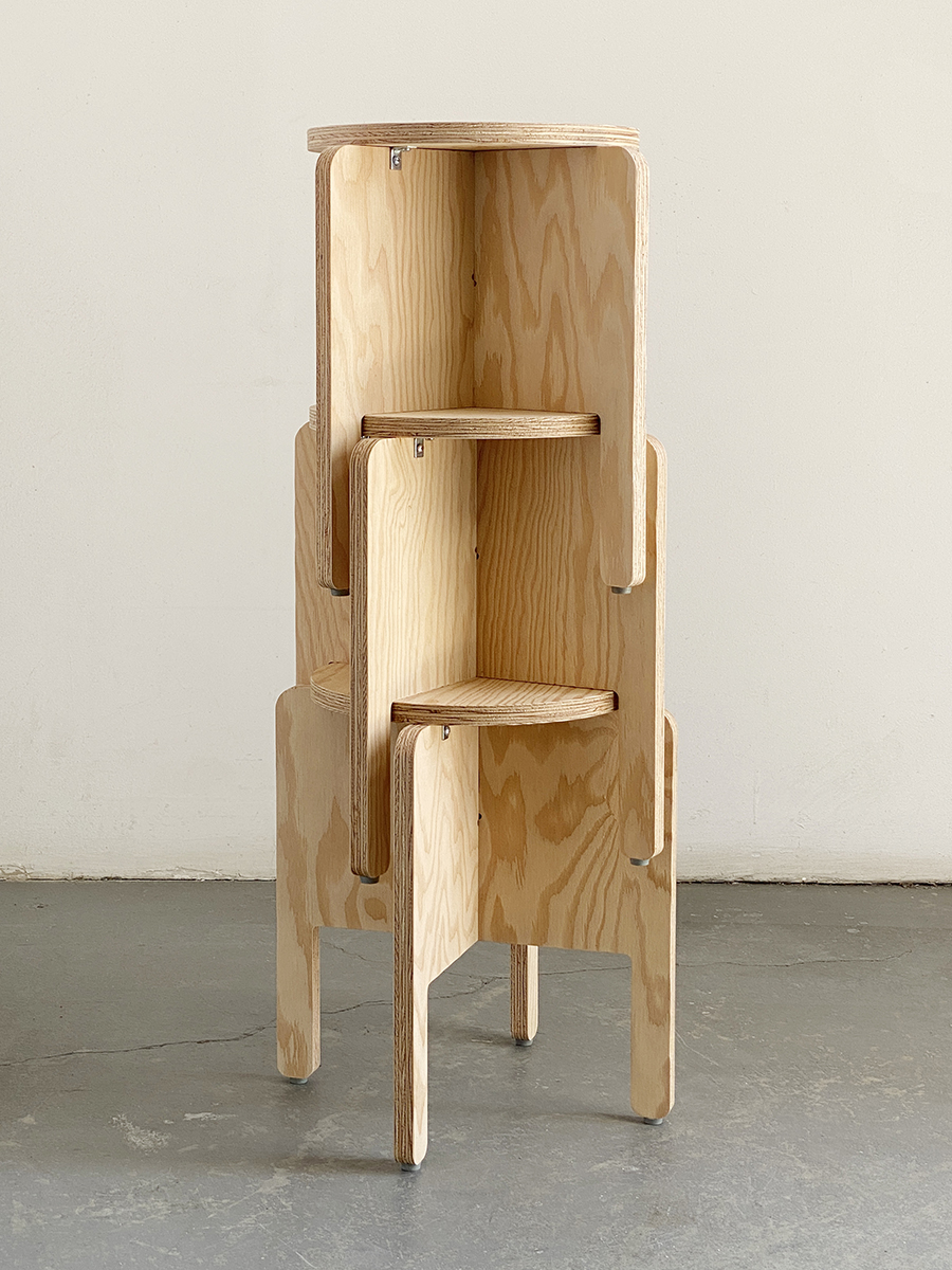

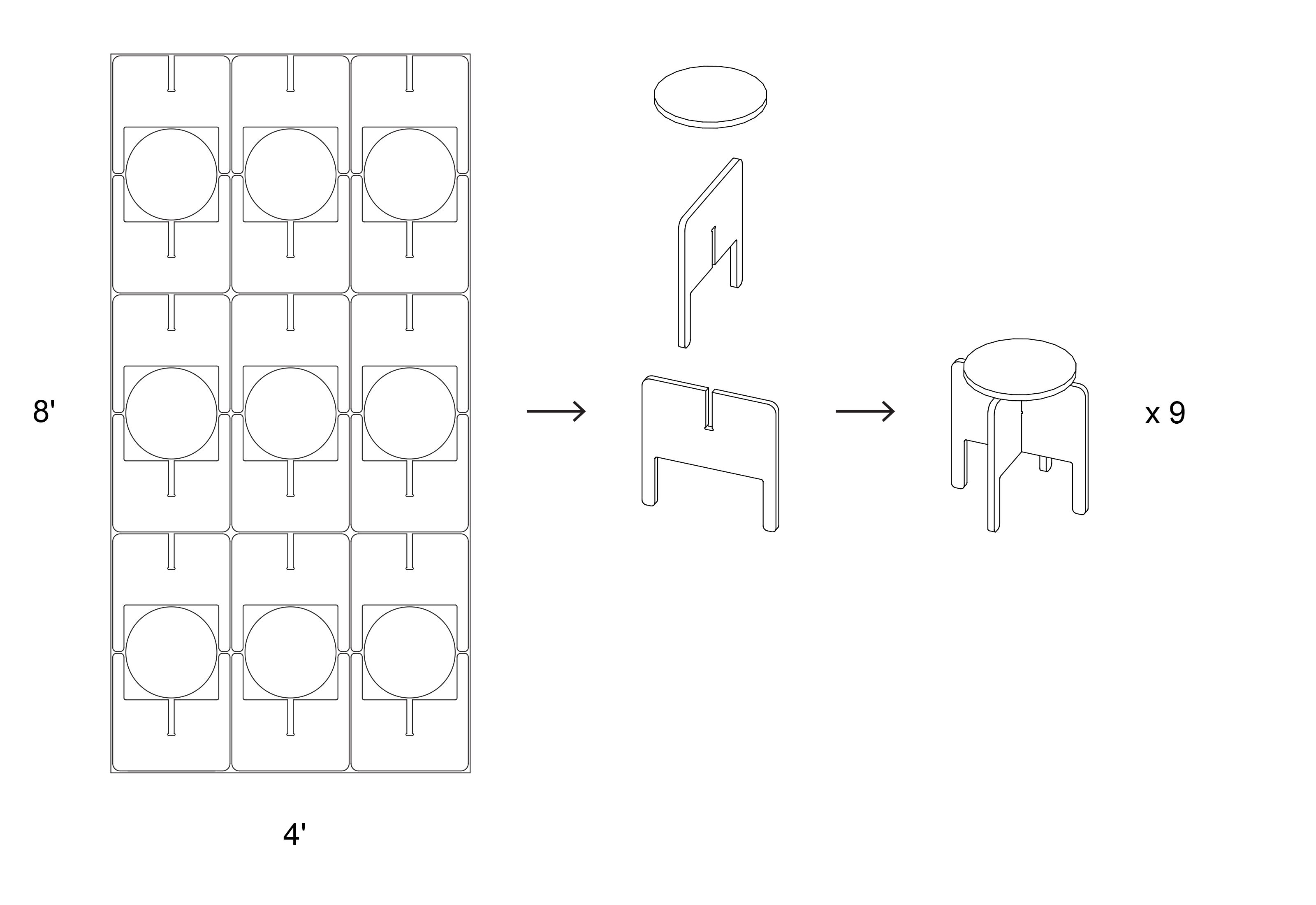
Designed for the Yale Graphic Design department, the Thick Stool 2 is part of the Fullsheet family of products, made by strategically cutting plywood to balance beauty, utility, structural logic, and material economy. A development of our Thick Stool from 2022, this stacking version also works great as a side table.
17″h x 16″w x 12″d
Marine or Koskisen birch ply
$100-$150 ea. (free shipping within the U.S.)
︎︎︎ Purchase
17″h x 16″w x 12″d
Marine or Koskisen birch ply
$100-$150 ea. (free shipping within the U.S.)
︎︎︎ Purchase
aplatilamp
Aplati Lamp 3
2018/2023
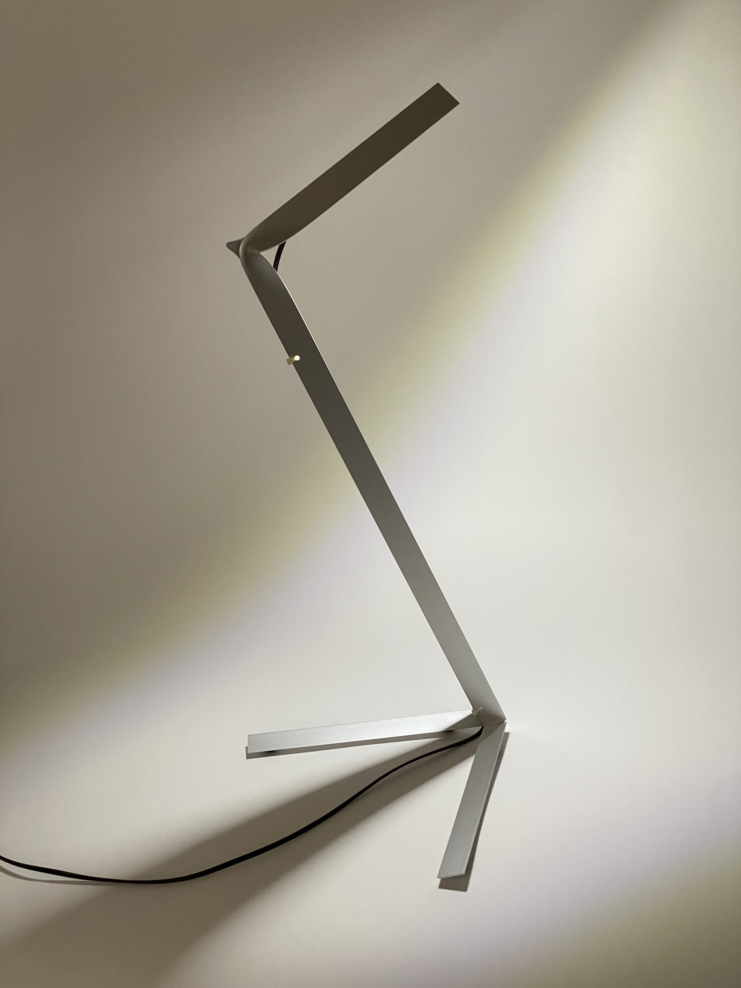

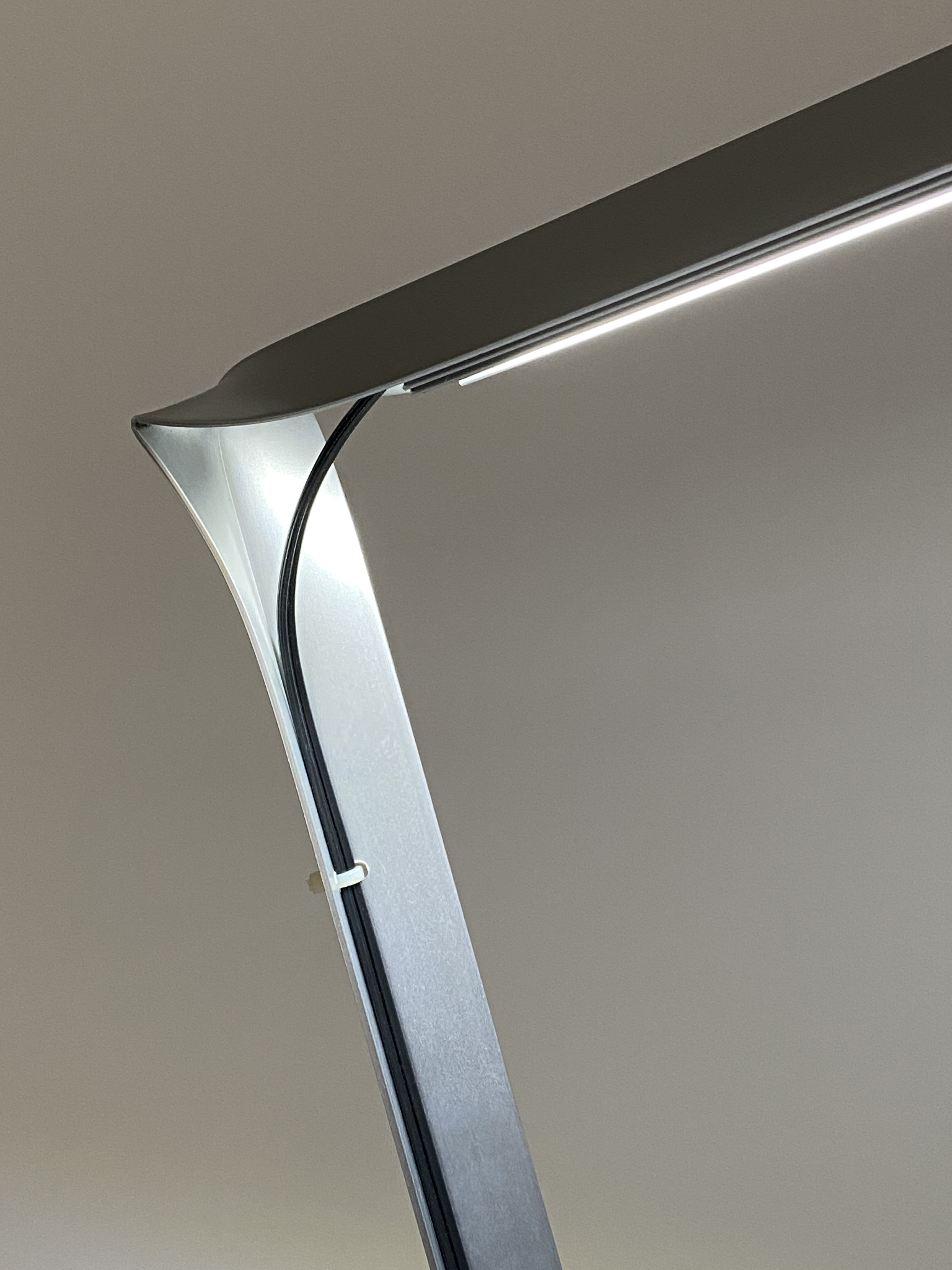
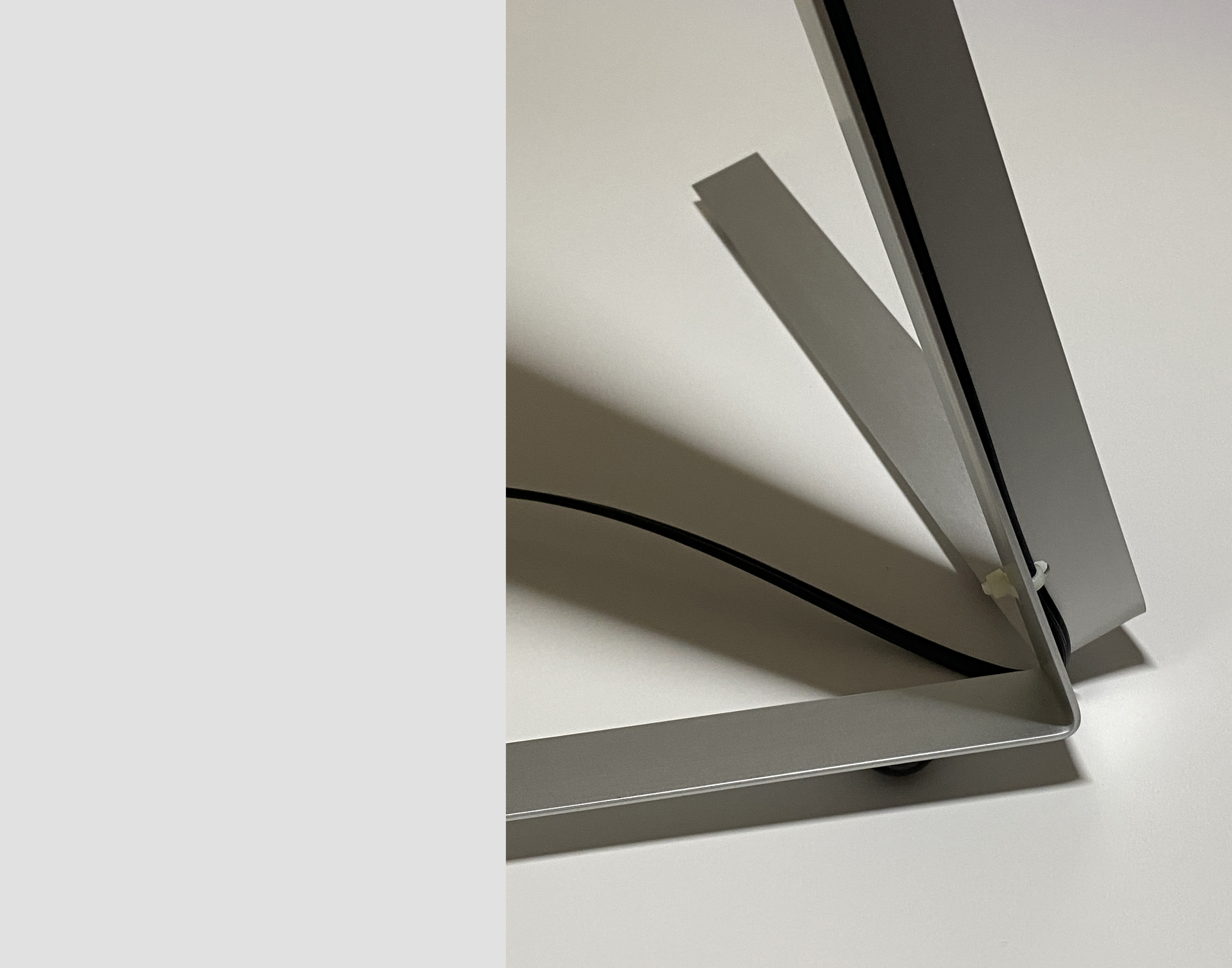
This lamp is one of a family of products made with a hydraulic press used to precisely crush stock metal extrusions, in this case, an aluminum angle from a local hardware store. The family explores the unexpected and integrated functions possible through minimal transformations of a basic geometry. In 2023, the lamp was selected for Head Hi’s Lamp Show, a cult event on the Brooklyn design scene.
24″h x 13″w x 9″d
Aluminum, rubber, plastic, 5000K LED
$320
Available exclusively through Head Hi
24″h x 13″w x 9″d
Aluminum, rubber, plastic, 5000K LED
$320
Available exclusively through Head Hi
thickstool
Thick Stool
2022
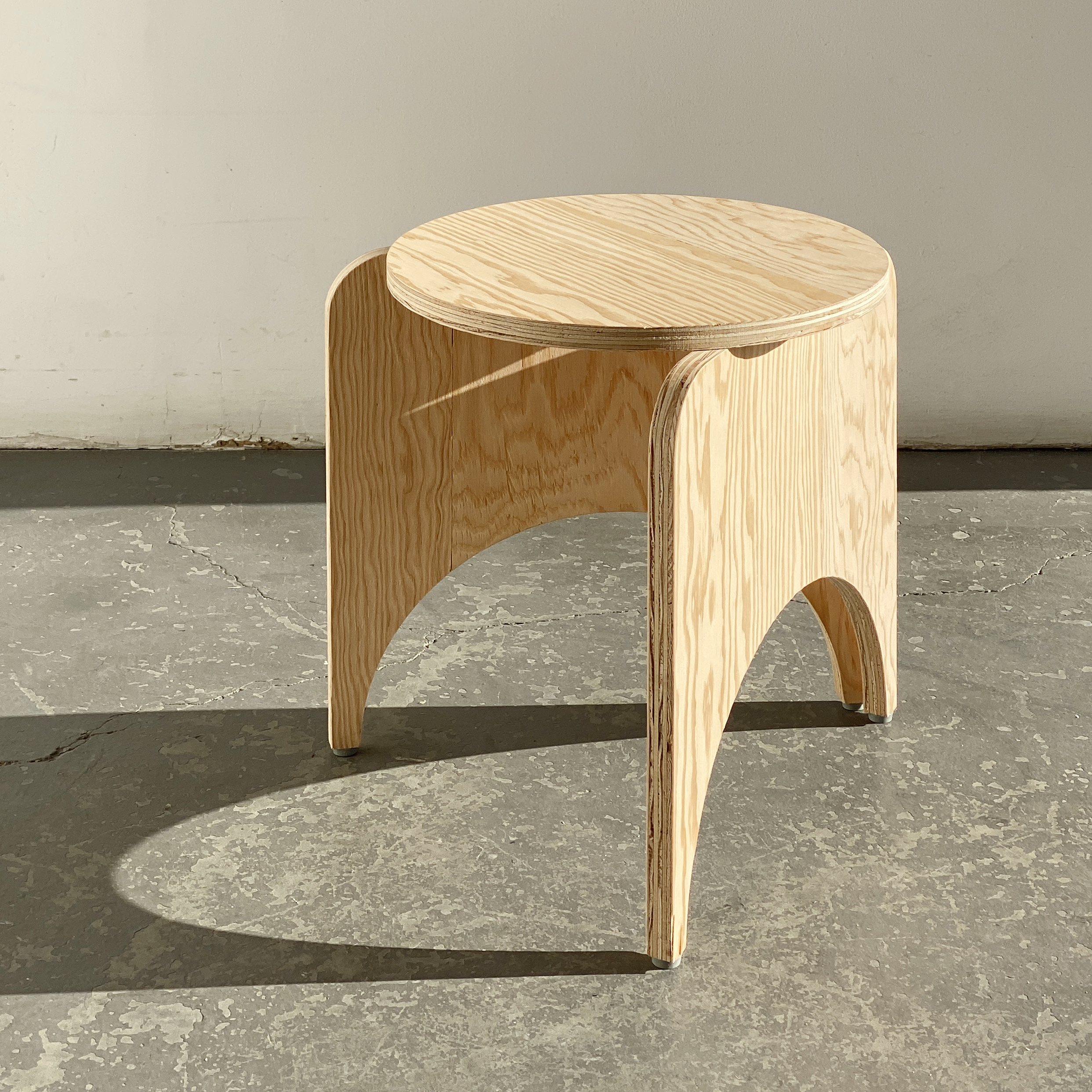

The Thick Stool is part of the Fullsheet family of products, made by strategically cutting plywood to balance beauty, utility, structural logic, and material economy. For this design, one 4x8-foot sheet is CNC-milled to create 9 stools, designed in a reciprocal way were the form of the seat makes the form of the legs. The design was developed thanks to Thick Press, for debut at the publisher’s project space at the 2022 New York Art Book Fair. It also works great as a side table.
16.625″h x 18″w x 13.5″d
Plywood
For availability and pricing, please inquire at info@populararchitecture.com
16.625″h x 18″w x 13.5″d
Plywood
For availability and pricing, please inquire at info@populararchitecture.com
thicktable
Thick Table
2022
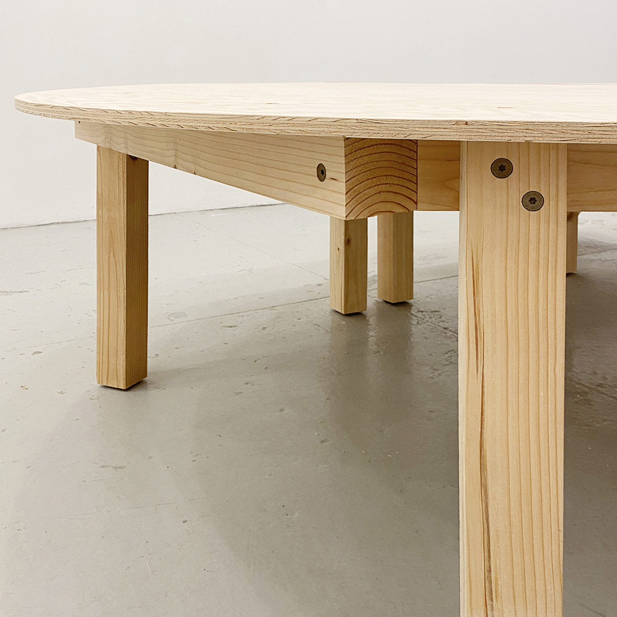
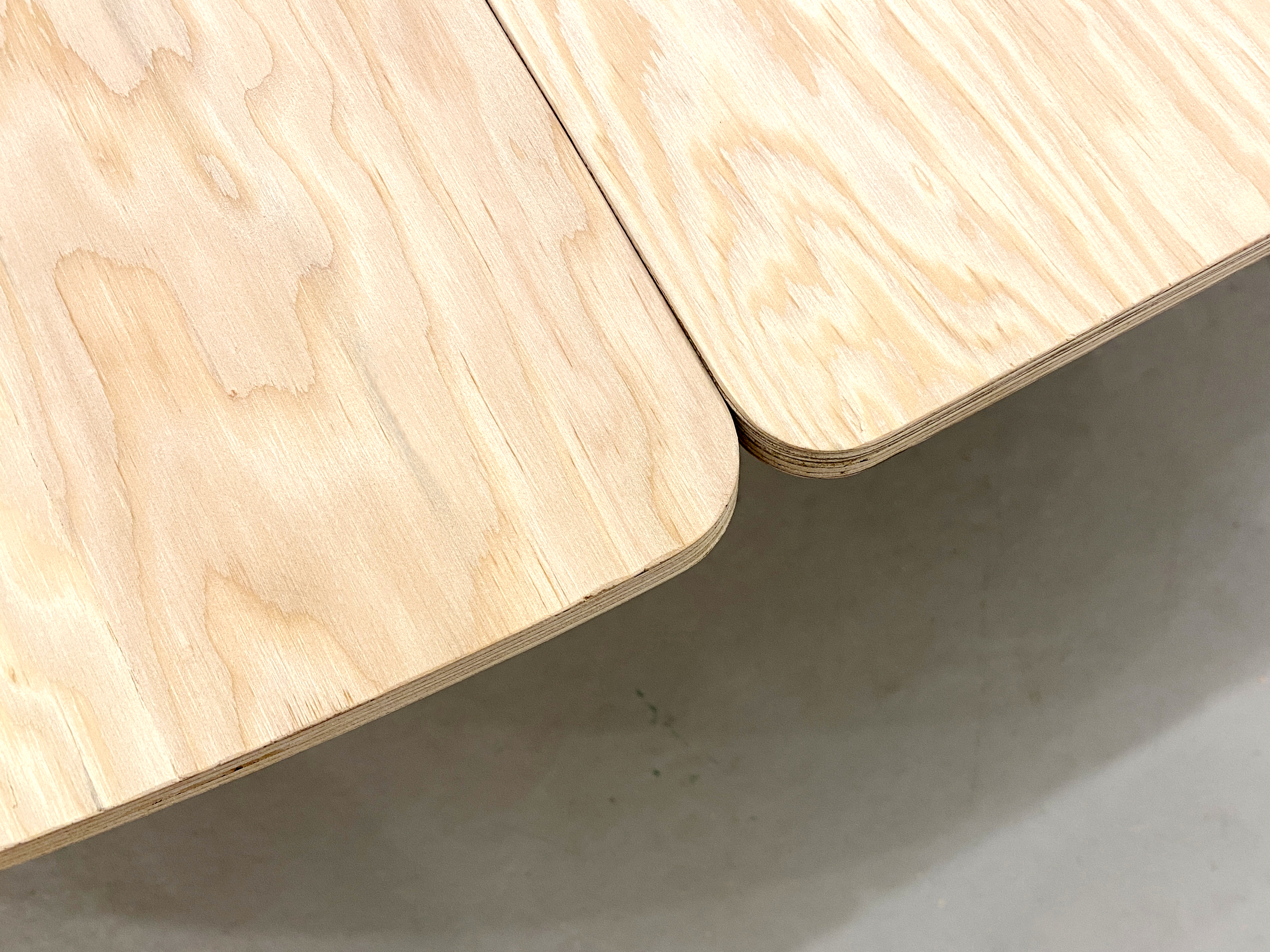
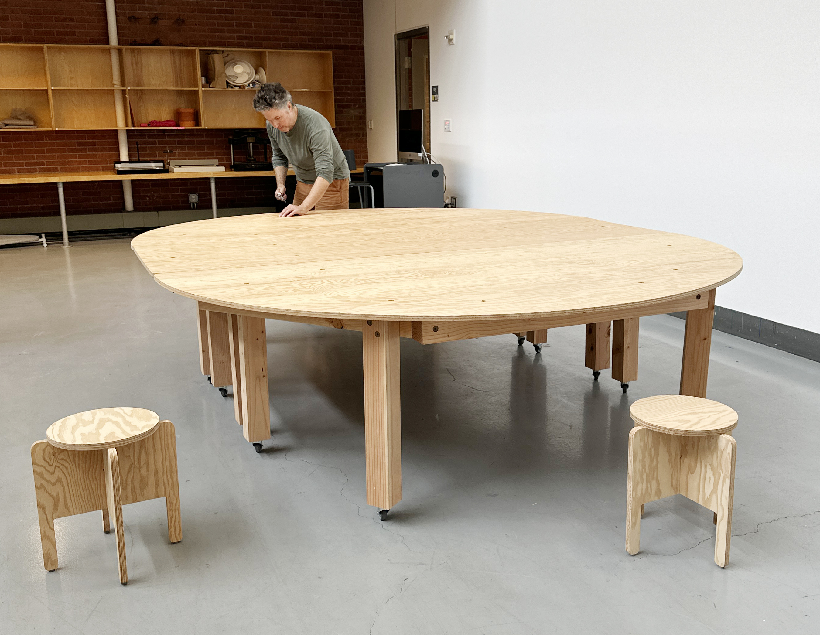
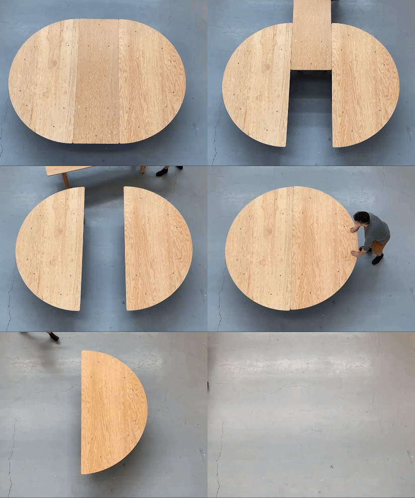
The Thick Table was designed-built for Thick Press’s project space at the 2022 New York Art Book Fair. The flexible design finds its form partly through the educational philosophy of a Harkness table and the conviviality of an Asian banquet. Recently re-assembled in its new home in the Yale Graphic Design department, the table continues to support people talking, showing, and making in various ways.
30″h x 95″w x 125″l
Douglas fir timber and plywood
Plans for self-construction available.
Please inquire at info@populararchitecture.com
![]()
30″h x 95″w x 125″l
Douglas fir timber and plywood
Plans for self-construction available.
Please inquire at info@populararchitecture.com
org
Wall Friends
2021

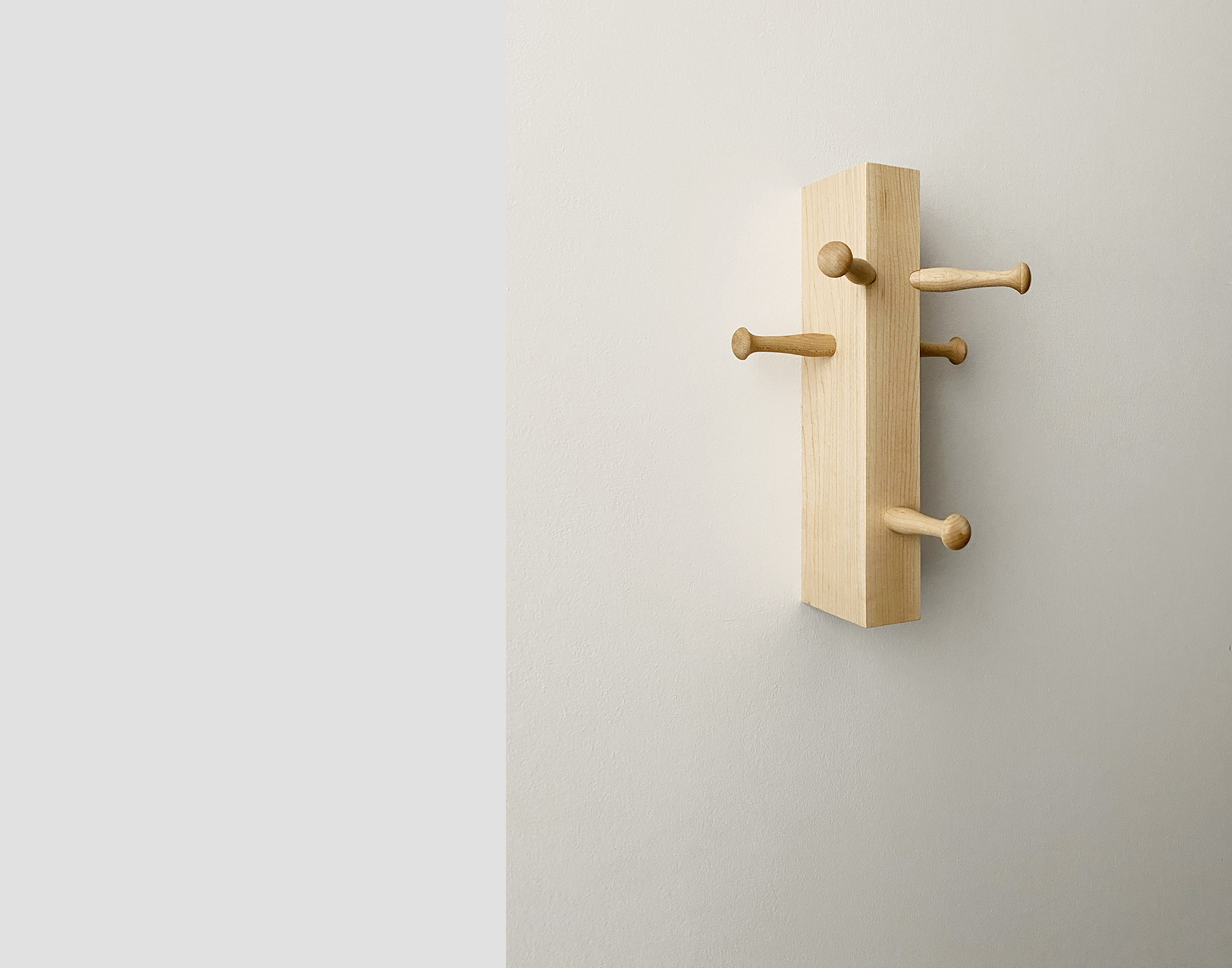


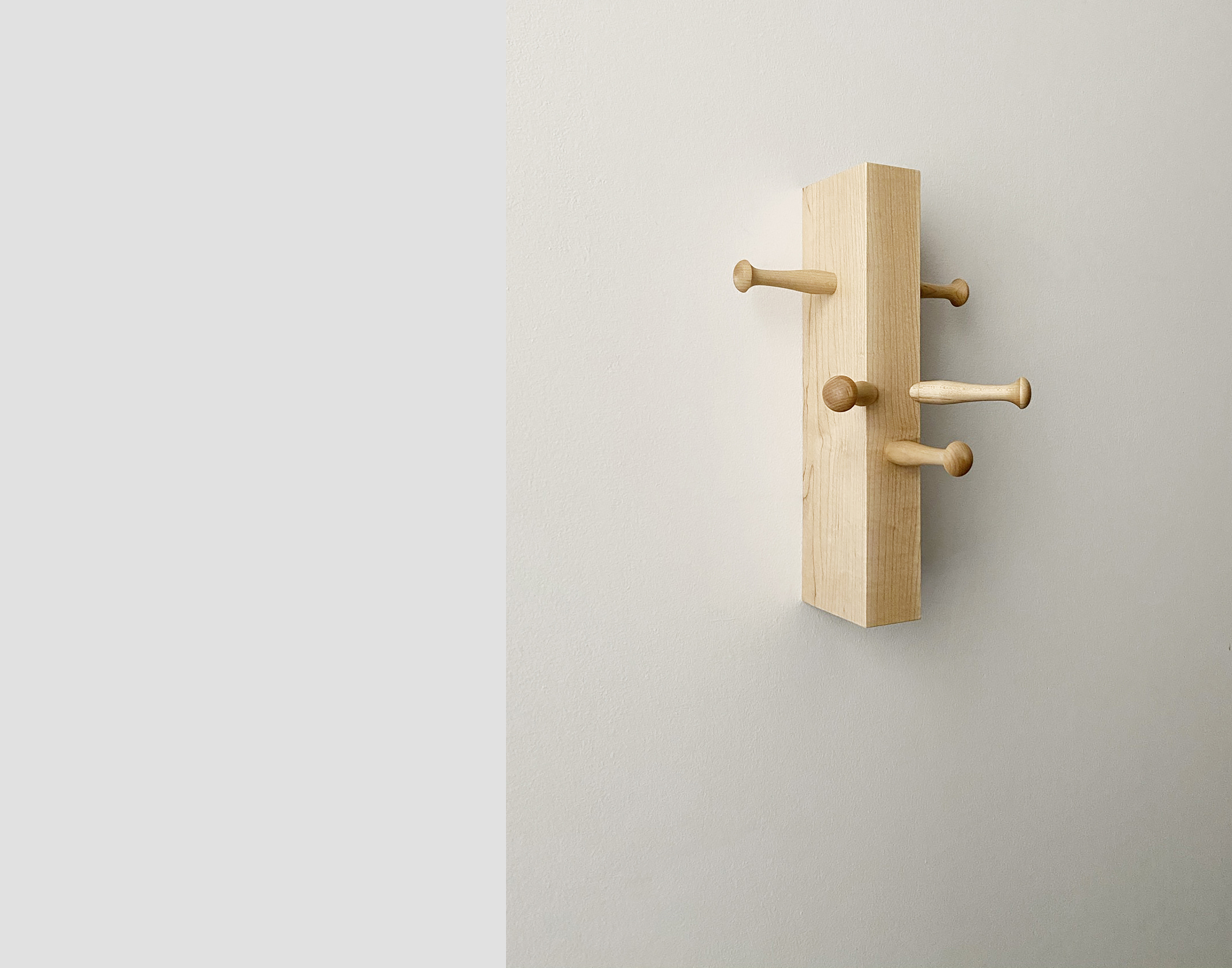

Wall Friends use Shaker pegs in a pagan fashion to suggest various creatures, who make themselves useful by providing a unique place to hang the important things we have for coming and going.
12”h x 8”w x 7”d
Solid maple block and pegs
$120 ea. (free shipping within the U.S.)
︎︎︎ Purchase
12”h x 8”w x 7”d
Solid maple block and pegs
$120 ea. (free shipping within the U.S.)
︎︎︎ Purchase
eggcrate
Eggcrate Shelving
2021


Eggcrate Shelving is part of the Fullsheet family of products,
made by strategically cutting plywood to balance beauty, utility, structural logic, and material economy.
For this shelving, one 4x8-foot sheet is CNC-milled into planks with lap joints that slot together, held rigid once mounted to a wall. While this iteration is sized for holding many common book sizes, other Eggcrate dimension are currently being investigated through a parametric method of sheet subdivision and joint location.
59″h x 36″w x 8″d
Plywood
In development
Please inquire at info@populararchitecture.com
59″h x 36″w x 8″d
Plywood
In development
Please inquire at info@populararchitecture.com
endless
Endless Bench
2019

Drawing on recent wood technology, this design uses cross-laminated timber (CLT) to create a chunky module able to aggregate into benches of many lengths. Inspired by the post-tensioning technique associated with concrete, where a steel cable is stretched to join separate castings, the bench modules are similarly linked with two cables passed through holes milled through each module. Suitable for seating or display, the system is currently in development.
CLT, steel
In development
Please inquire at info@populararchitecture.com
CLT, steel
In development
Please inquire at info@populararchitecture.com
aplatirest
Aplati Rest
2017
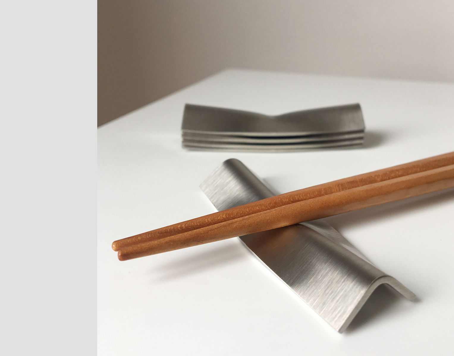
Aplati Rest is one of a family of products made with a hydraulic press used to precisely crush stock materials, in this case, stainless-steel angle. The products in the family explore the unexpected functions possible through this minimal and simple type of transformation. Dented just enough to securely hold chopsticks, the stackable rests are sold in sets of five. Dishwasher safe.
2.5″w x .375″h x .75″d
Stainless steel
Set of 5
$30
Currently available at populararchitecture.etsy.com
2.5″w x .375″h x .75″d
Stainless steel
Set of 5
$30
Currently available at populararchitecture.etsy.com
aplativase
Aplati Vase
2016



Aplati Vase is one of a family of products made with a hydraulic press used to precisely crush stock materials, in this case, common tubing. The products in the family explore the unexpected functions possible through this minimal and cheap type of transformation. Available in stainless steel or copper, the copper version will oxidize over time unless polished.
5″w x 7″h x 1.5″d
Copper or stainless steel
Pricing upon request
Please inquire at info@populararchitecture.com
5″w x 7″h x 1.5″d
Copper or stainless steel
Pricing upon request
Please inquire at info@populararchitecture.com
dsu
DSU
2016
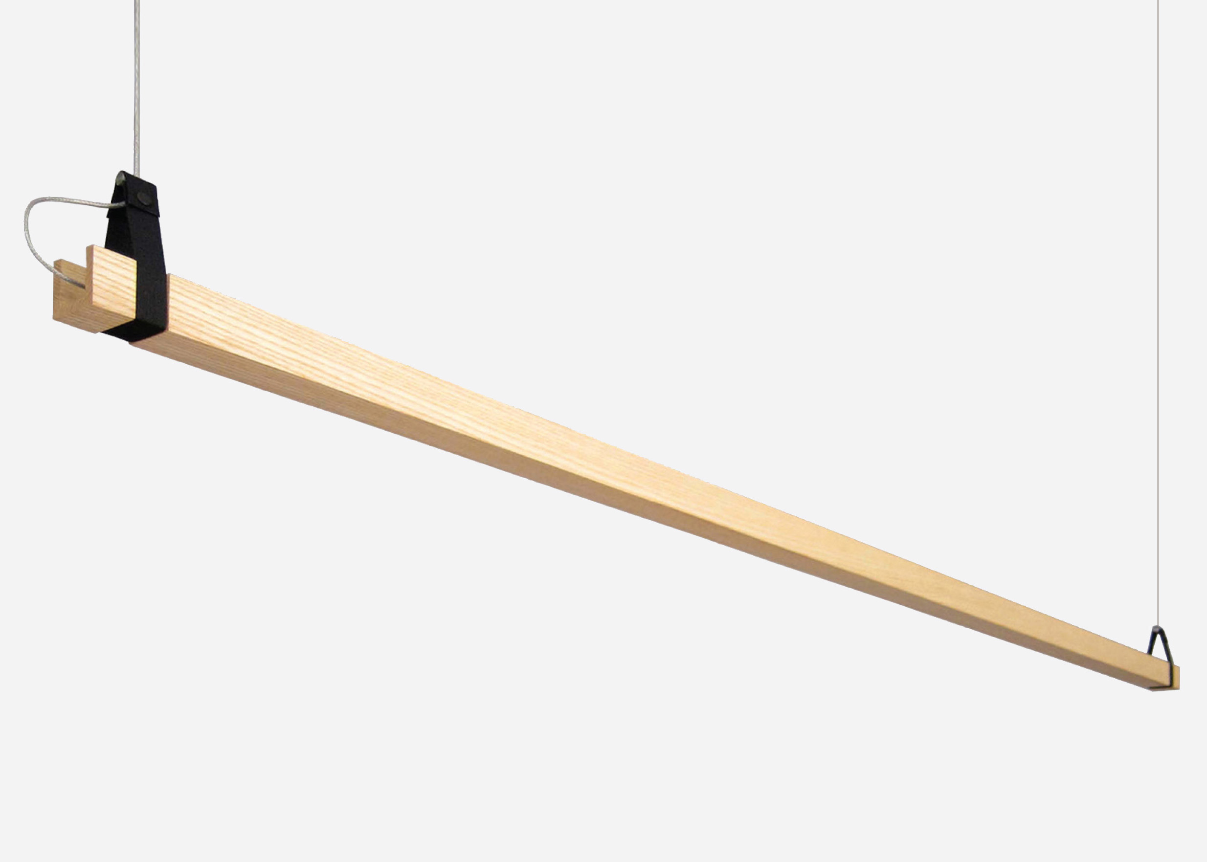
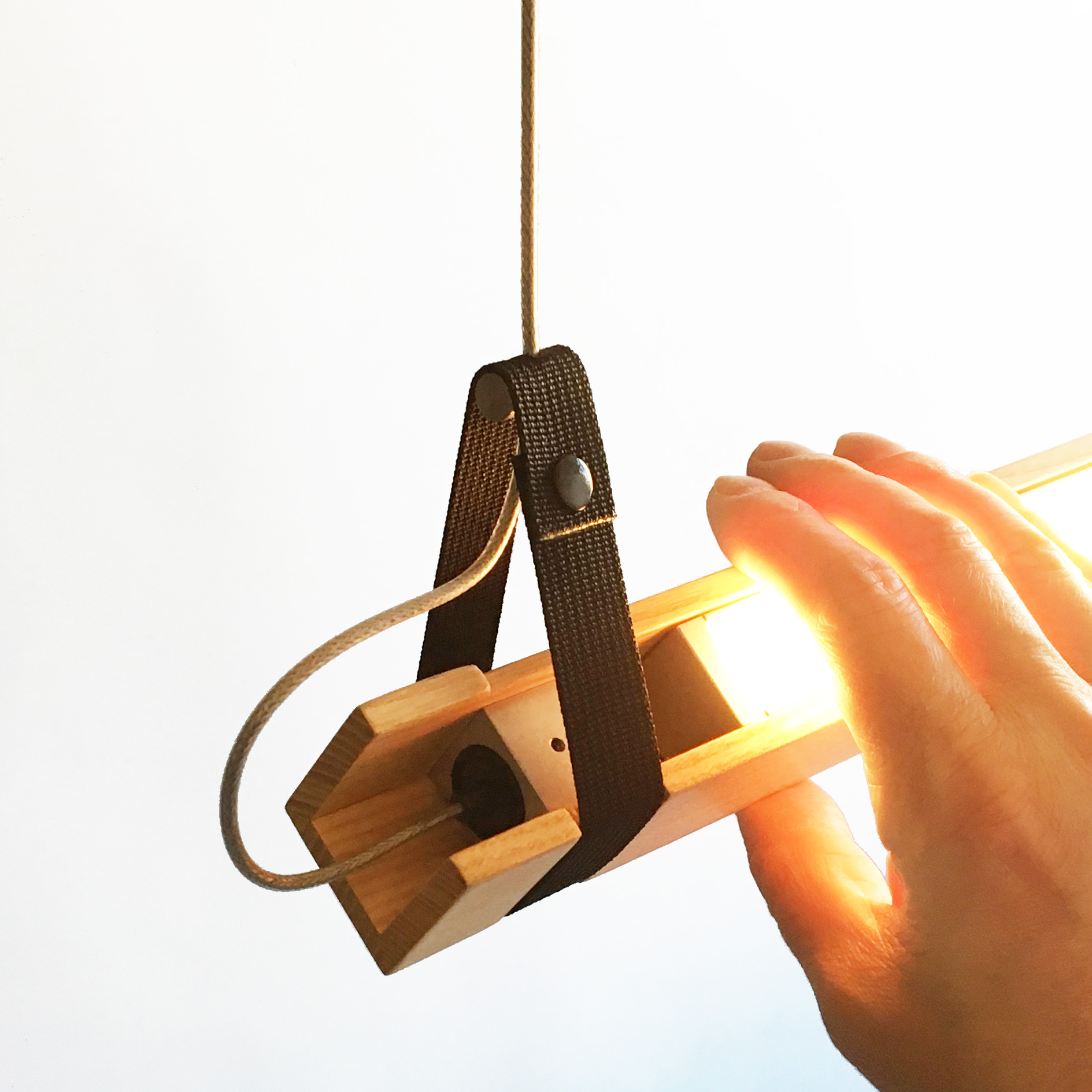
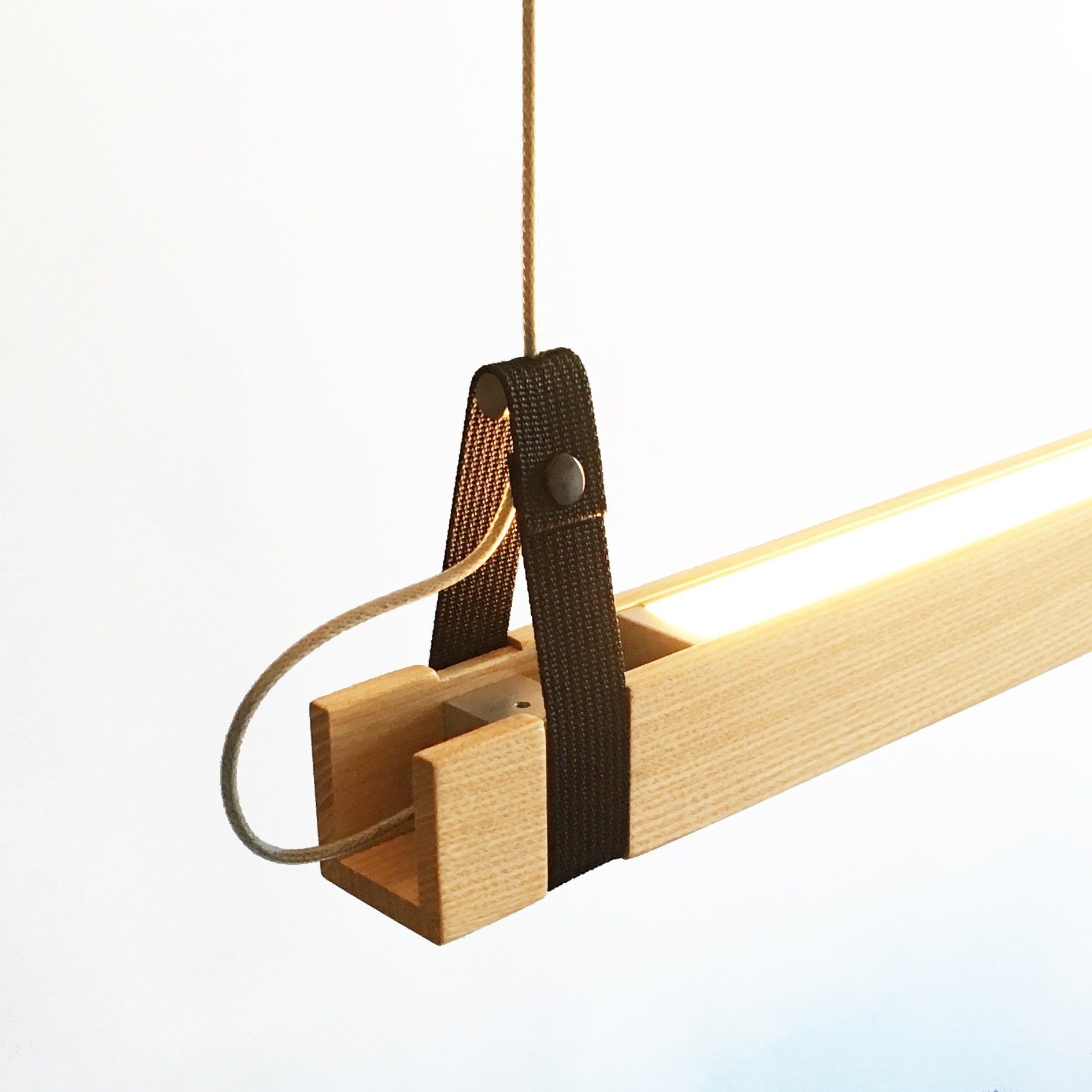
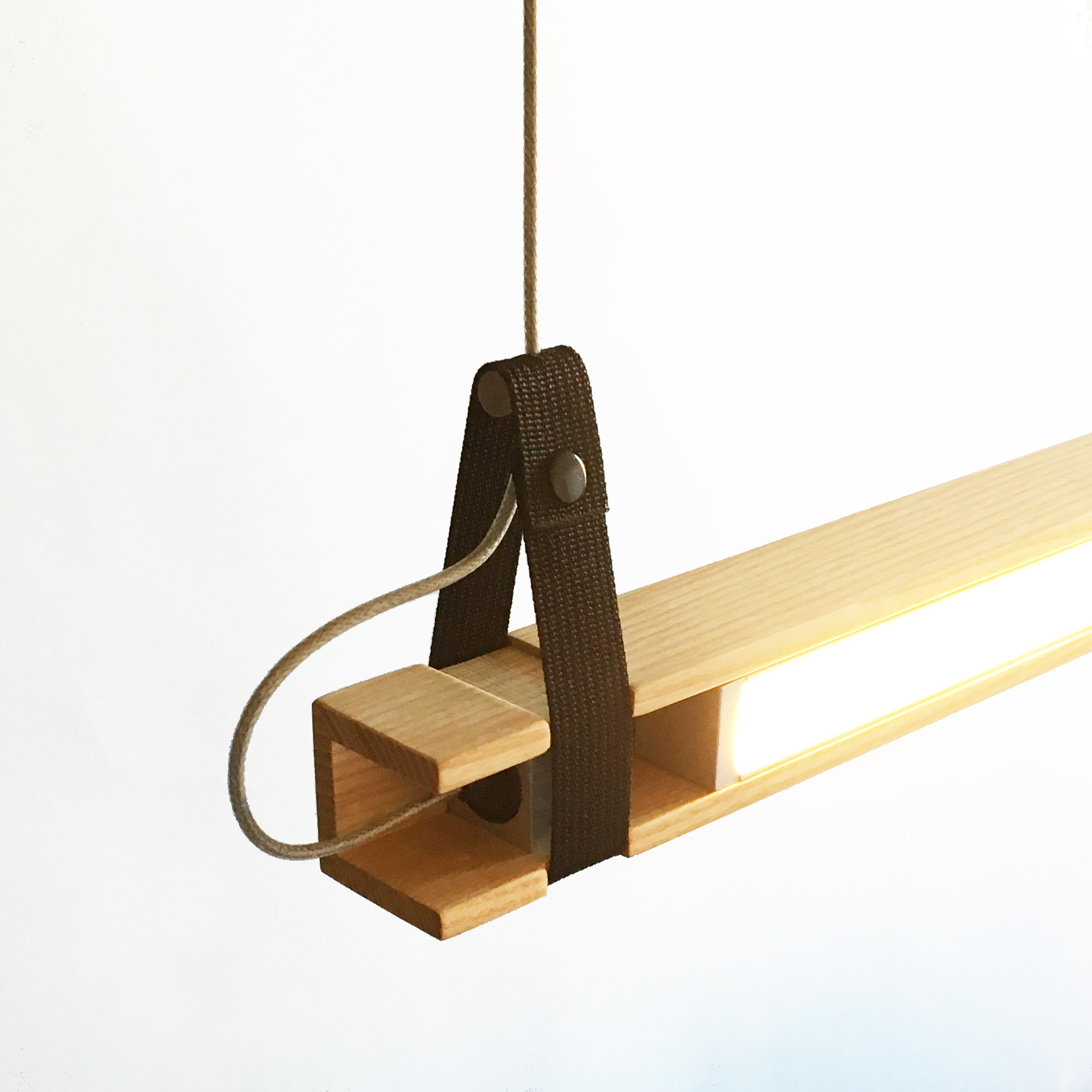
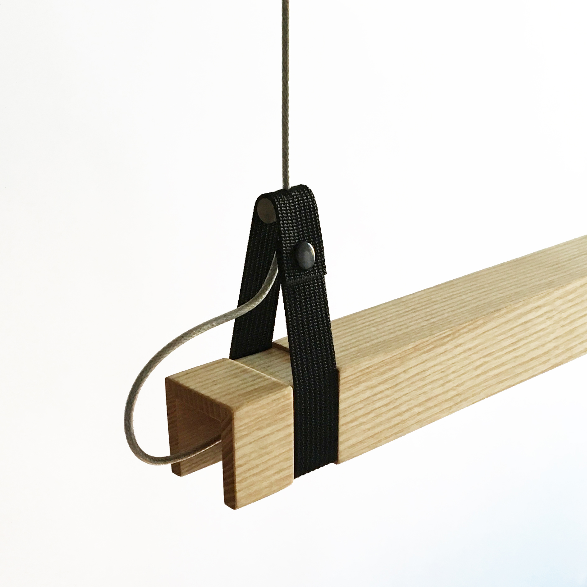
Down Side Up is a suspension light that rotates, able to change a space’s mood and function with a turn by hand. It’s a downlight, uplight, or anything in between. Perfect for hanging over counters, tables, and desks for work and play. DSU won “Best in Show” for Lighting at the 2016 BKLYN Designs.
43”, 55”, 67” lengths
Ash, aluminum, nylon, stainless steel
24VDC 5W LED/2700, 3000, 3500K
Pricing and additional specs upon request
Please inquire at info@populararchitecture.com
43”, 55”, 67” lengths
Ash, aluminum, nylon, stainless steel
24VDC 5W LED/2700, 3000, 3500K
Pricing and additional specs upon request
Please inquire at info@populararchitecture.com
hak
Hak
2016

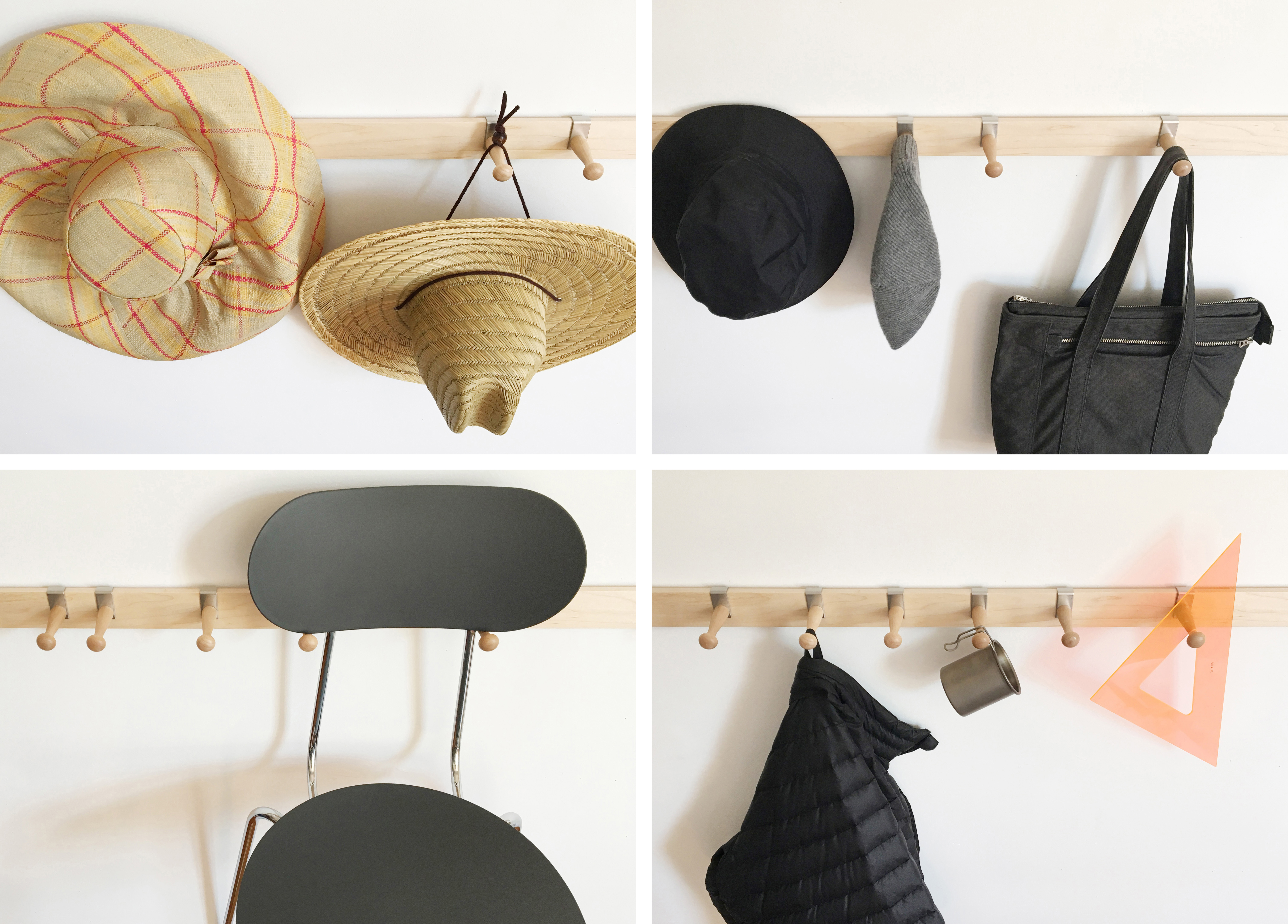
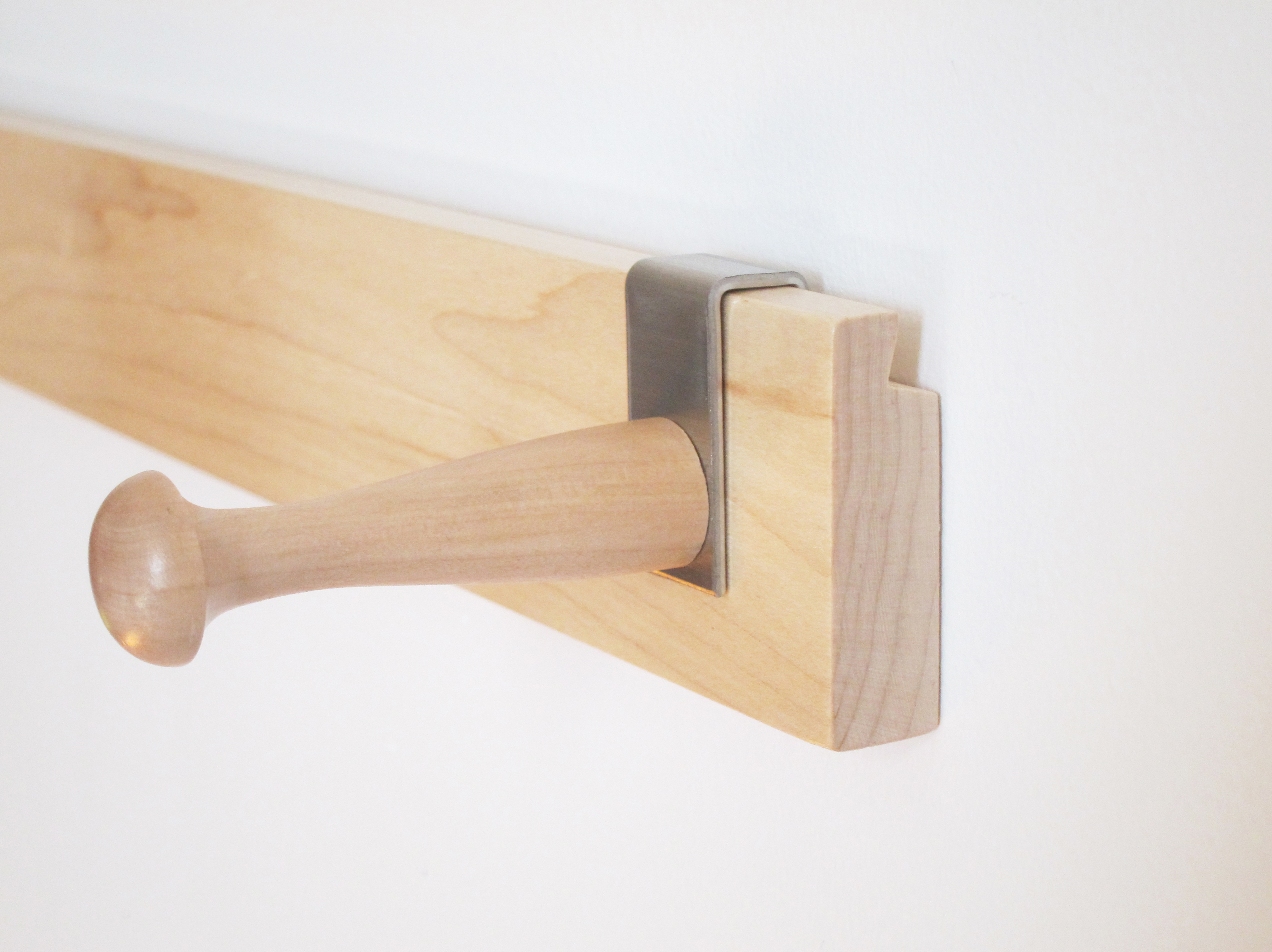
Hak is a hack of the iconic Shaker peg rack. Rather than the fixed peg spacing that suited the uniform lives of the Shakers, Hak’s sliding pegs accommodate a diversity of places and things.
Variable length and peg quantity
Maple, stainless steel
Pricing upon request
Please inquire at info@populararchitecture.com
Variable length and peg quantity
Maple, stainless steel
Pricing upon request
Please inquire at info@populararchitecture.com
beam
Beam
2008

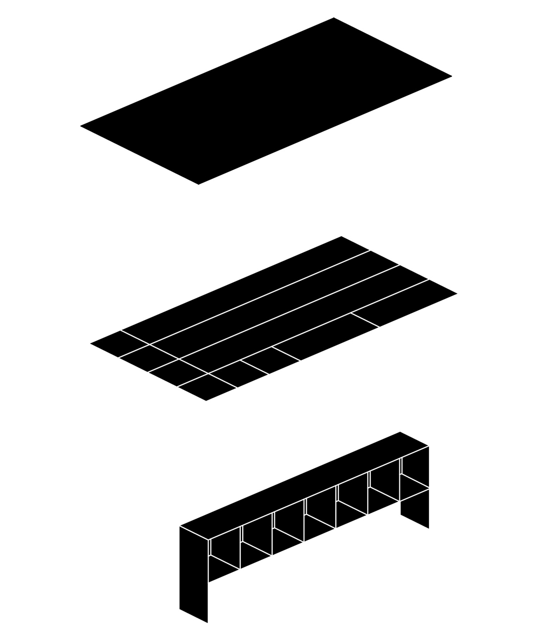
Sideboard made from the optimization of a full 4x8-foot sheet of plywood, the first piece developed for POPA’s Fullsheet family of products.
26.25”h x 85.5”w x 11.5”d
Baltic birch plywood
Plans for self-construction available.
Please inquire at info@populararchitecture.com
26.25”h x 85.5”w x 11.5”d
Baltic birch plywood
Plans for self-construction available.
Please inquire at info@populararchitecture.com
radhelp
An Encyclopedia of Radical Helping
Thick Press, 2024
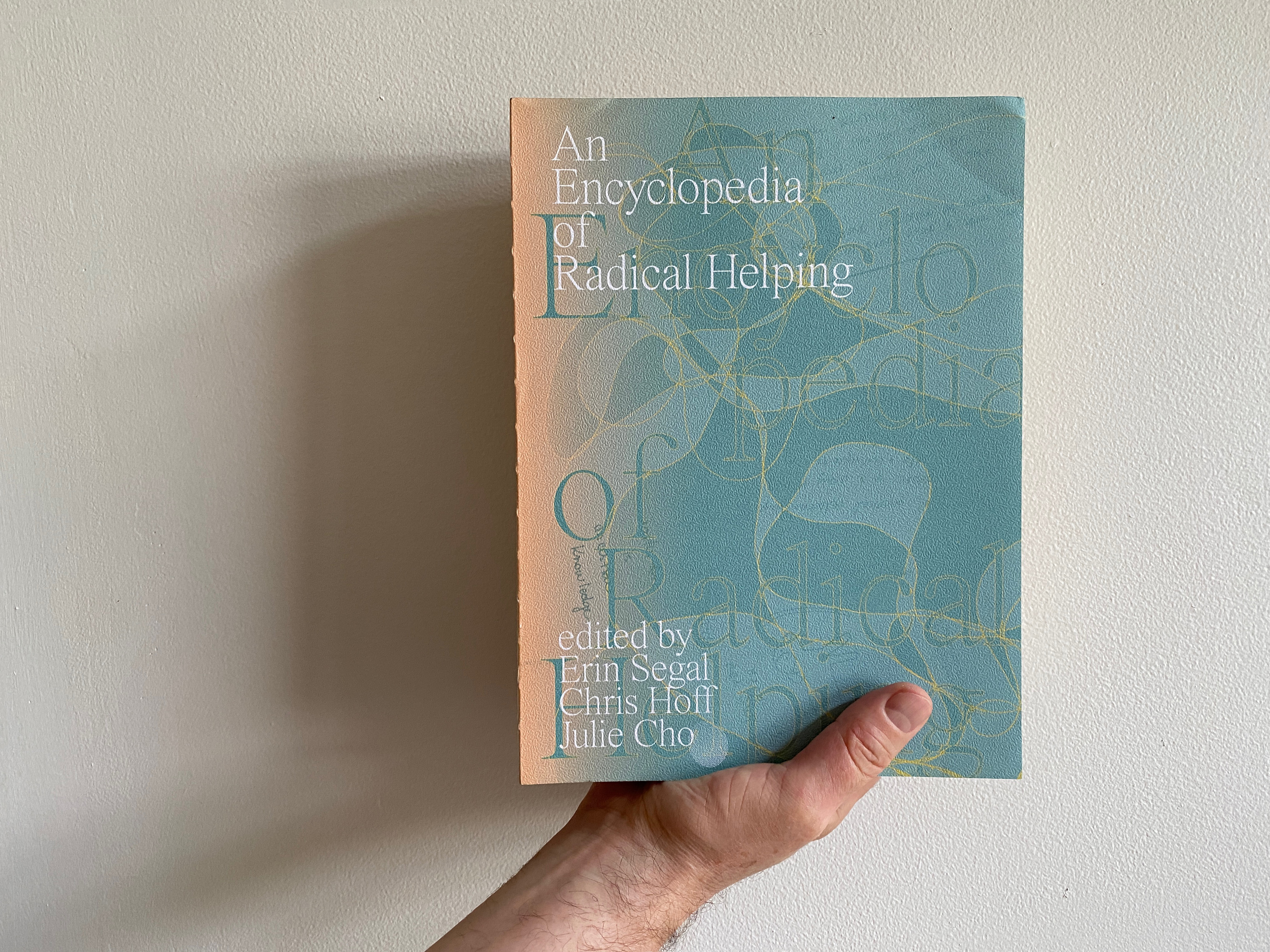
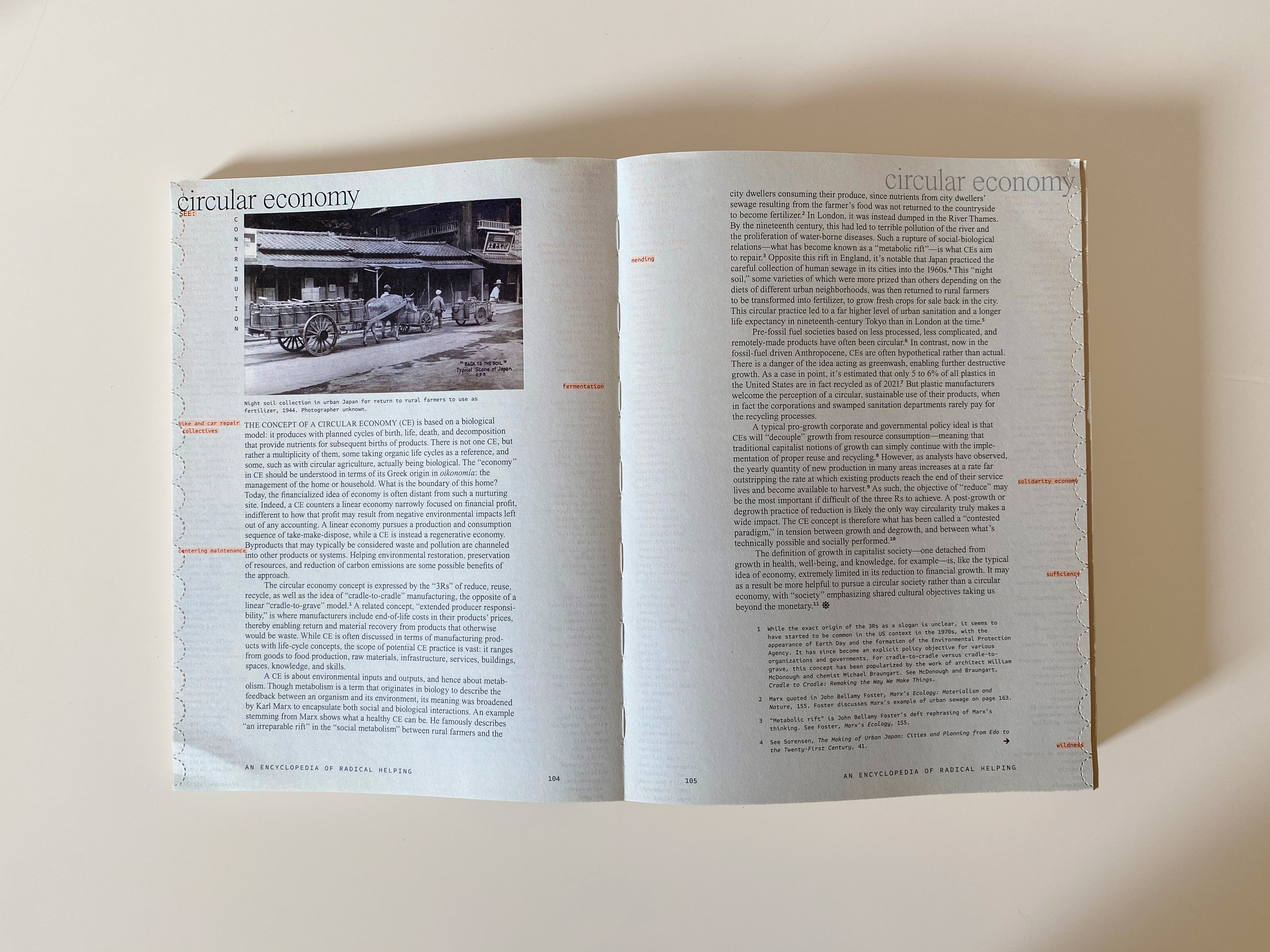
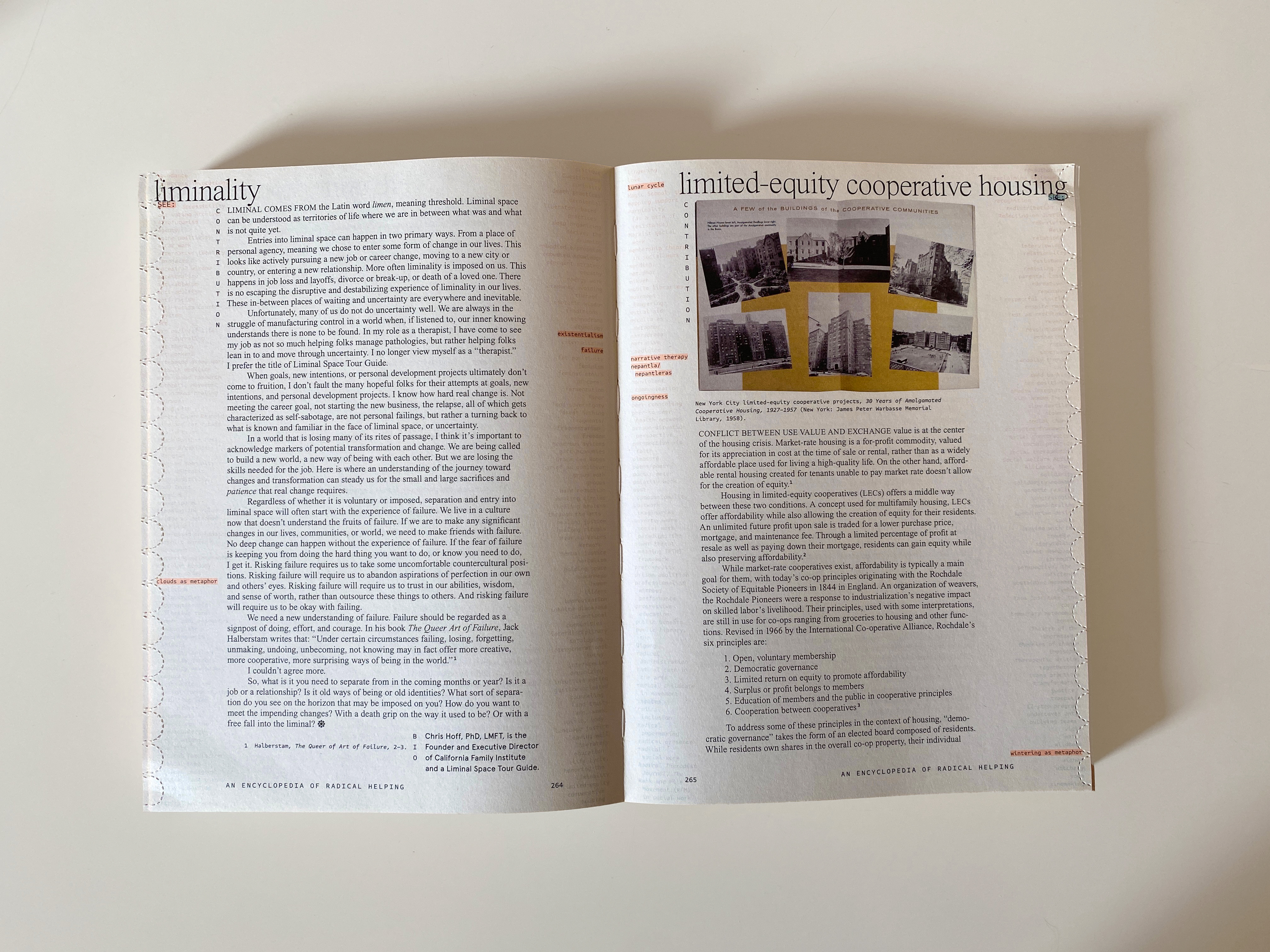
Eds. Erin Segal, Chris Hoff, and Julie Cho
English, softcover, exposed binding
10.25 x 7.6 in, 512 pp.,illus. color
Design by Omnivore Inc.
ISBN 978-1-7320666-4-9
︎︎︎ Purchase
With entries for “Circular Economy” and “Limited-Equity Cooperative Housing” by Casey Mack.
English, softcover, exposed binding
10.25 x 7.6 in, 512 pp.,illus. color
Design by Omnivore Inc.
ISBN 978-1-7320666-4-9
︎︎︎ Purchase
With entries for “Circular Economy” and “Limited-Equity Cooperative Housing” by Casey Mack.
digmet
Digesting Metabolism: Artificial Land in Japan 1954–2202
Hatje Cantz, 2022
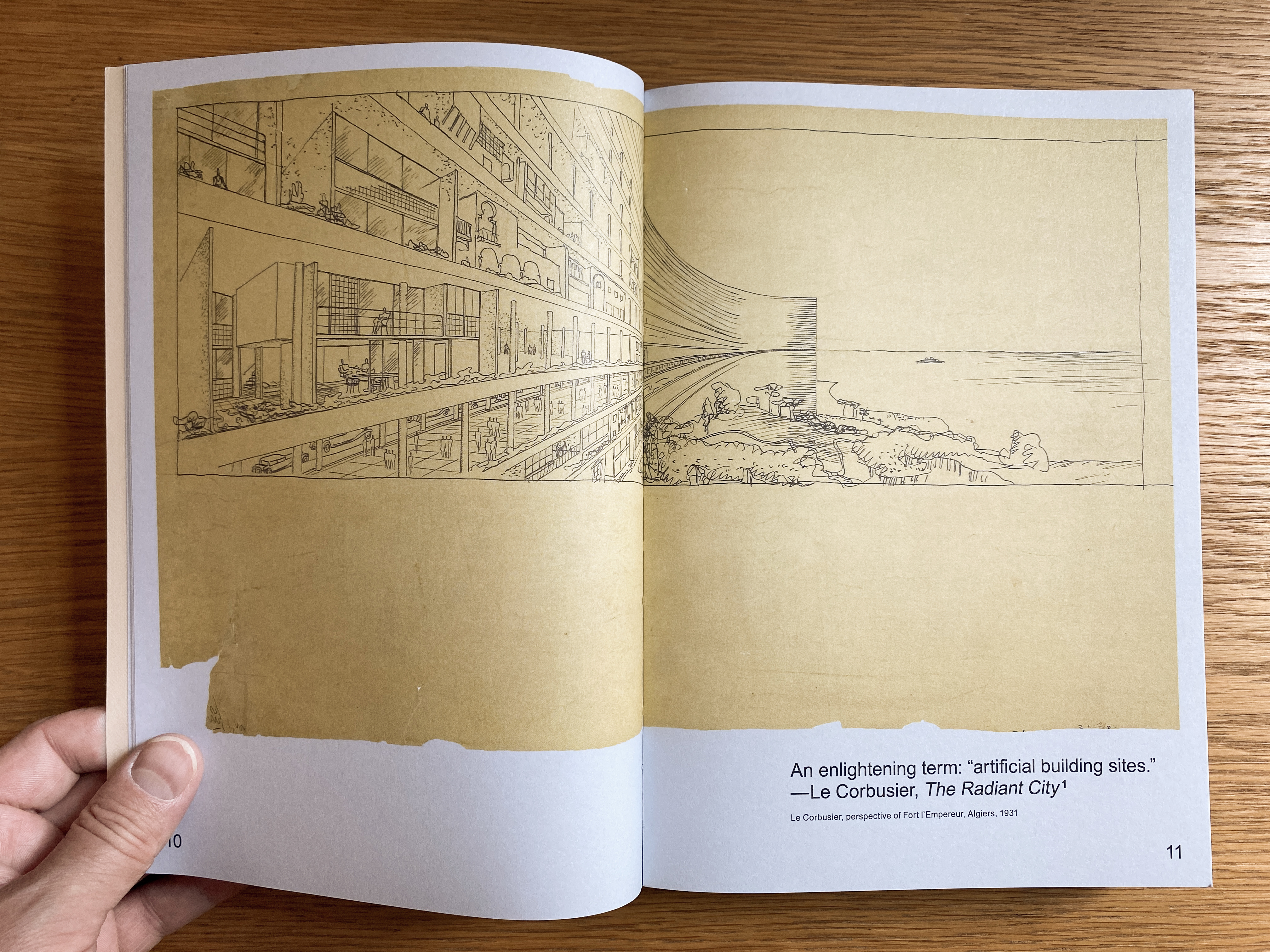
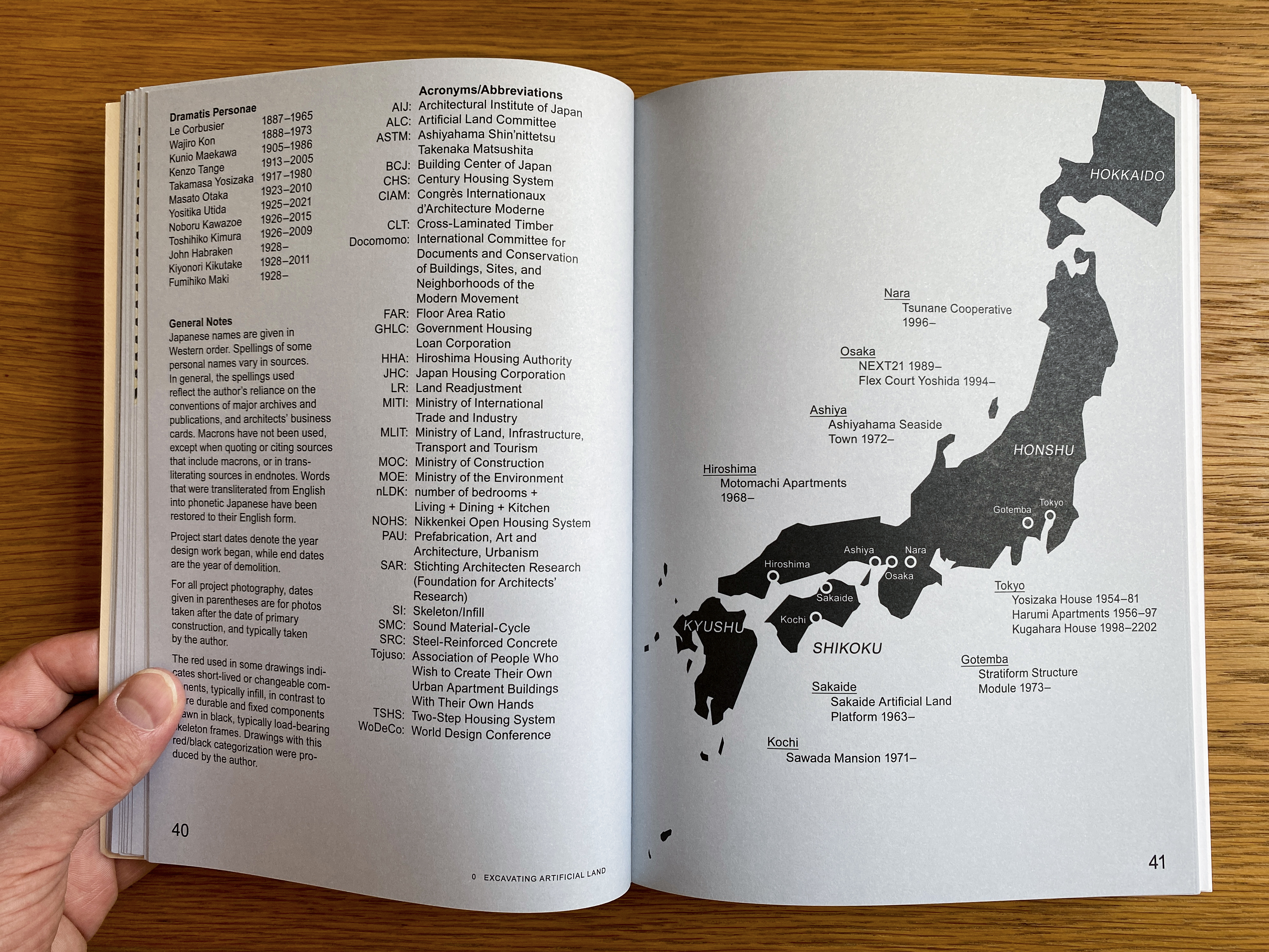
English, softcover
9.5 x 6.75 in, 368 pp., 257 illus.
ISBN 978-3-7757-4642-7
$40 (35% off$62 list price)
Free shipping within the U.S.
︎︎︎ Add to cart
How can housing better meet people’s diverse and changing needs? Moving away from the focus on capsule architecture that dominates so many studies of Japan’s Metabolist architects, Digesting Metabolism investigates the impact on Japanese housing of Le Corbusier’s idea of “artificial land,” perhaps architecture’s most famous concept that the fewest have heard of. Long buried by the term “megastructure” that it inspired, artificial land joins the individual and collective, envisioning housing as stacked platforms of plots for building freestanding homes of all variety. This book explores in detail eleven Japanese projects that translate this dream of durability combined with flexibility into built reality, illuminating its appeal for a nation whose existing land—from both earthquakes and cost—is highly unstable. First introduced to Japan in 1954 by Le Corbusier’s protégé, Takamasa Yosizaka, artificial land is essential to the Metabolists who debuted in Tokyo in 1960, with it sparking their desire to add “a time factor into city planning.” Yet artificial land has had a hold on Japan’s metabolic imagination well beyond the ’60s, promising domestic satisfaction and environmental resilience from the postwar period to today’s government policies. Digesting Metabolism uncovers this unique Japanese history and its possible future, finding examples of infrastructure, adaptation, and dweller control that challenge commodified models of housing around the world.
9.5 x 6.75 in, 368 pp., 257 illus.
ISBN 978-3-7757-4642-7
$40 (35% off
Free shipping within the U.S.
︎︎︎ Add to cart
How can housing better meet people’s diverse and changing needs? Moving away from the focus on capsule architecture that dominates so many studies of Japan’s Metabolist architects, Digesting Metabolism investigates the impact on Japanese housing of Le Corbusier’s idea of “artificial land,” perhaps architecture’s most famous concept that the fewest have heard of. Long buried by the term “megastructure” that it inspired, artificial land joins the individual and collective, envisioning housing as stacked platforms of plots for building freestanding homes of all variety. This book explores in detail eleven Japanese projects that translate this dream of durability combined with flexibility into built reality, illuminating its appeal for a nation whose existing land—from both earthquakes and cost—is highly unstable. First introduced to Japan in 1954 by Le Corbusier’s protégé, Takamasa Yosizaka, artificial land is essential to the Metabolists who debuted in Tokyo in 1960, with it sparking their desire to add “a time factor into city planning.” Yet artificial land has had a hold on Japan’s metabolic imagination well beyond the ’60s, promising domestic satisfaction and environmental resilience from the postwar period to today’s government policies. Digesting Metabolism uncovers this unique Japanese history and its possible future, finding examples of infrastructure, adaptation, and dweller control that challenge commodified models of housing around the world.
“Casey Mack's exceptional Digesting Metabolism is a profound exploration.... Through his original and forward-looking research, Mack subtly forms a perspective on the movement that gives an engaged outlook to the future, a kind of learning from metabolism.”
— Finn Geipel, partner, LIN Architects Urbanists; professor, TU Berlin
“[Digesting Metabolism] hits a sweet spot to an almost ludicrous degree: adaptive design, metabolism, cooperatives, circularity, participation, timber, housing, Japanese history and culture, etc. Check, check, check, check!”
— Dan Hill, director, Melbourne School of Design
“Digesting Metabolism is one of the better books about works of Japanese architecture that you have probably never heard of. But that’s exactly why you should read it.... Its promotion of ‘housing that stimulates rather than dictates’ can be an inspiration everywhere.”
— Naomi Pollock, FAIA
“...amazing and important.”
— Kenneth Frampton, Ware Professor Emeritus, GSAPP, Columbia University
“Casey Mack recharges the legacy of the world-famous avant-garde of the 1960s by revisiting actual built projects to document their post-occupancy life and inhabitants. His historical and ethnographical account is touching in its honest portrayal of success and failure, and is most inspiring and instructive for building towards more resilient and livable cities.”
— Dirk van den Heuvel, TU Delft and Het Nieuwe Instituut, Rotterdam
“Part study of housing typologies; part history of modern Japan; and part disquisition on how architecture might reconcile the spatial with the temporal, this book is a tour de force of scholarship and analysis.... Casey Mack weaves a fascinating historical narrative around the notion of 'artificial land,' spun from the threads of architectural ambition, idiosyncratic activism, social transformation, bureaucratic planning, and everyday practice.”
— Dr. Julian Worrall, Professor of Architecture, University of Tasmania
“Splendid book.... A fresh perspective on a topic (metabolism) that we thought we already knew all there is to know. Highly recommended!”
— Christian Dimmer, Associate Professor for Urban Studies, Waseda University
“An important work in foreseeing the relationship of tension between technology and art.”
— Osamu Ishiyama, architect; professor emeritus, Waseda University
“In this wonderfully refreshing work, Mack reconfigures the history of the Metabolists simply by moving the focus from megastructure to artificial land. In doing so, he eschews the easy slogan or image that infatuates so much of our design discourse for a more complex narrative of unfulfilled vectors — how the Metabolists addressed time, adaptability, flexibility. These vectors in turn identify that it is the world of the Metabolists in which we remain, and that it is these questions outside our comfortable control that as designers we must continue to grapple with.”
— Brett H. Schneider, Senior Associate, Guy Nordenson and Associates; Associate Professor, Department of Architecture, Rhode Island School of Design
Winner, “Best Publication in Architecture,” Juanzong Books Archive Award, 2022
ishiyama
Interview with Osamu Ishiyama
Setagaya-Mura, Tokyo, 2014
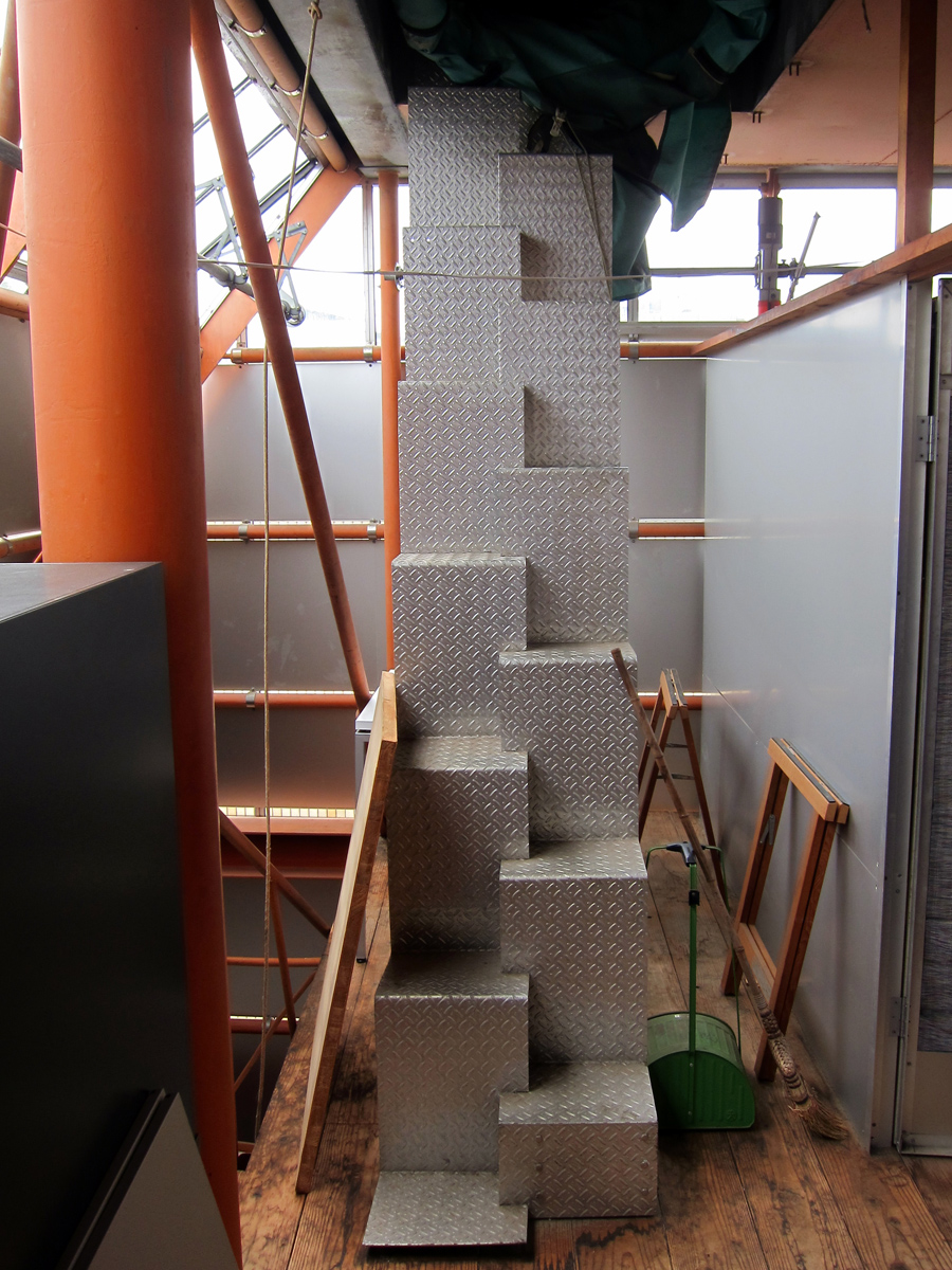
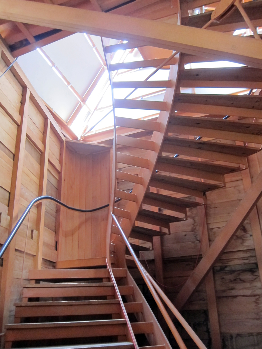
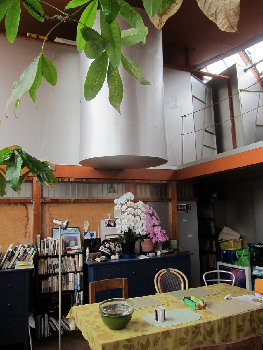

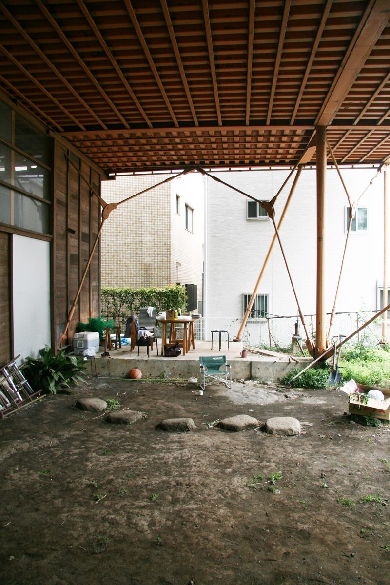
Transcription of interview
by Casey Mack
with architect Osamu Ishiyama, conducted as research for Digesting Metabolism. Translation by Riyo Namigata.
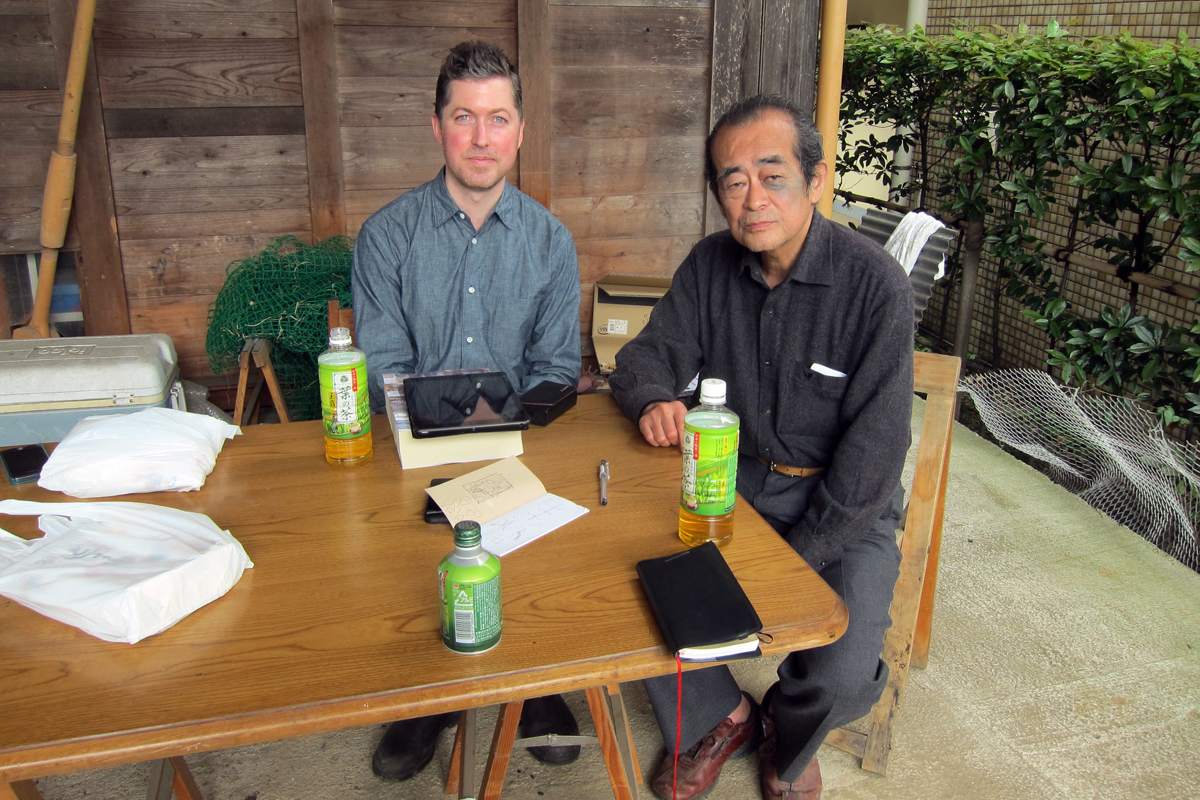
I first became aware of Osamu Ishiyama in the mid ’90s, when a photo of his Rias Ark Museum on the cover of the journal GA drew me in with its hybrid of familiar and strange, from salmon pink combined with what looked like salvaged airplane parts. Indeed, the art of Ishiyama’s architecture is a peculiar openness that his work achieves—not the clichéd inside/outside boundary-blurring of Japanese architecture, but the creation of linkages to multiple associations, processes, and participants. A 1968 graduate of Waseda University who studied under Takamasa Yosizaka—a main protagonist in my book Digesting Metabolism—Ishiyama generously met me and my research assistant Riyo Namigata for an interview in the spring of 2014. He shared his thoughts on Yosizaka and related phenomena at Setagaya-mura, his house and atelier in Tokyo where he has experimented on himself as much as conceiving ones for others.
Before the interview, Ishiyama takes us on a tour of the house...
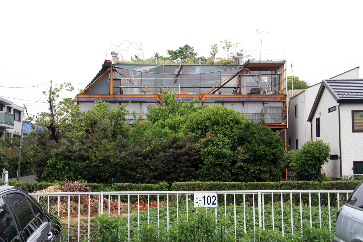
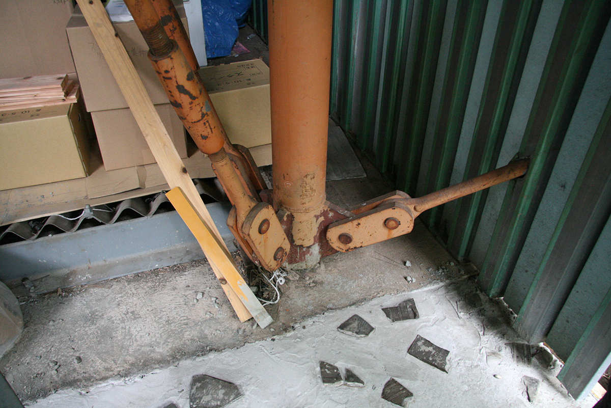
OI: [looking at the façade of the house from the parking lot across the lane] I used the theory of Buckminster Fuller: enclose the most volume with the least material through using tension. I thought of the house as made not of floors, but like layers of land, on which you can build cabins, other things. Like Henry David Thoreau.
CM: Right! I grew up near the pond where he had his cabin.
OI: Walden, yes, I went there, but I couldn’t find the cabin.
CM: Really? I think it’s been rebuilt. Did you happen to visit the Gropius House nearby?
OI: Yes, but I don’t like Gropius. [returning to the house tour] The structure of the house was made by shipbuilders. It was very cheap. I planted a roof garden, and for awhile I picked the vegetables, but it was too much work.
CM: So this façade is facing south, yes? Does the house get very hot in the summer?
OI: Yes, very hot!
Walking towards studio space being built underneath the house...
CM: You’ve used tension structures in several of your houses. Have you found they’re good to work with?
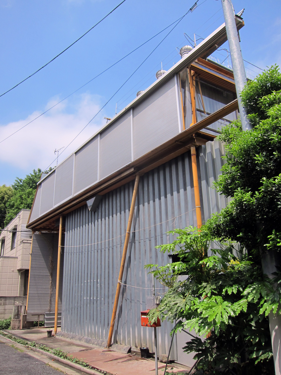
OI: No. Tension is theory and most people don’t like theory. Also, many difficult angles [demonstrates diagonal issue by pretending to walk into a tension rod and banging his forehead]. My wife and daughter liked the old house that was underneath [that’s been torn down]; they don’t like this house. This material [points to the corrugated sheet enclosing studio] is very cheap.
Everyone takes off shoes to head upstairs...
OI: These stairs were made by shipbuilders. They don’t like straight lines. The walls were made by a wood craftsman using no nails—a traditional technique.
CM: Are you still experimenting on the house?
OI: No, the experimenting is over. These are windows meant for greenhouses [gesturing to windows on the north side of the second floor]. We had them installed, but everything else we did ourselves. Very cheap.
CM: Does the house leak much?
OI: Oh yes! Here is an Italian camping tent for the roof [points up stair to roof, capped by the tent like a soft bulkhead]. Very nice color, but it leaks.
Heading back downstairs, looks to the family cat at the top of the stairs...
OI: People do not like this house, but cats, cats like this house.
Seated at a small table for the interview in the outdoor void beneath the suspended house, created by the demolition of the old wooden house...
CM: Yosizaka seems to be a marginalized figure within Japanese architecture culture. For example, none of the recent books on what Hajime Yatsuka calls the “Metabolist nexus” give him any proper recognition for his work on artificial land that would prove so central to Metabolism’s activities. Why do you think this is the way he’s been treated? Is it that his priorities didn’t match with those around him, like Tange?
OI: Tange and Yosizaka were extremely different kinds of architects with totally different attitudes. Tange was all about order and establishing a system, while Yosizaka’s thinking and method was much less clear. If you look at the Inter-University Seminar House, it’s a totally different approach from Tange’s 1960 Plan.1 Tange has to establish all the infrastructure first; only then can the rest of the building proceed on top of that system. Yosizaka on the other hand felt that his buildings could simply be placed on the site and people would create their own infrastructure of paths simply by walking between them. Do you know his proposal for Leopoldville?2 It is a simple explanation of his idea of “discontinuous unity,” where infrastructure is again left much more loose [sketches plan, and compares it to a sketch of Tange’s 1960 Plan].3 Yosizaka also never really articulated a position; he had more of a sensibility or attitude that made an impression. He never liked to tell his staff at Atelier U what they had to do.4 This lack of clarity certainly hurt his wider acceptance. And he died pretty young.5 Maybe if he lived longer, and had been able to design and write more, he would be differently remembered today.
CM: Yosizaka’s early proposals for artificial land housing in the mid ’50s combined a standardized system with accommodation of individual subjectivity. His later work seems to be much more an embrace of just the subjective and local specificity, with no longer any interest in the systematic or prototypical. Do you think he came to reject artificial land as a form of urban solution, the idea that he had so actively promoted?
OI: His house in Shinjuku leaked terribly through the roof.6 For Tange, a roof would have to be repaired just so, everything very exacting. Yosizaka’s wife complained to him to fix it, and he said, “OK, all we need to do is build another house on top and the leak will go away.” This was his way of thinking. So he built another house on top, a third story. So I think this shows that the idea of artificial land was very much a part of his approach still.
CM: I would describe your work not as Metabolist, but as metabolic. What was your impression or understanding of Metabolism while you were at Waseda?7
OI: They were the cool guys who wanted to make everything beautiful. But it was not one thing: there was Tange, and there was Otaka and Maki with group form, and Kikutake with his kind of fake ka theory.8
CM: Did you know Kawazoe?
OI: Oh, he was a crazy guy! He was the one who wanted to make Metabolism something they could all fit into. Always promoting.
CM: Yes, he was the propagandist. And a Marxist too then, yes?
OI: He was briefly. I think that for Tange and Kurokawa, beauty was always the number one priority. I think that for Yosizaka it was more like number two or three. He was always out mountain climbing, so much that I considered asking for my tuition back. Then he would come into studio and look at something terrible you’d drawn and say, “That’s good.”9
CM: Is there a relationship for you between Yosizaka’s discontinuous unity and seikatsu-gaku and your idea of “open technology”?10
OI: I hadn’t thought that before, but now that you mention it, I think that there is.
CM: NEXT21’s lead architect Yositika Utida is an advocate of what he calls “open systems,” and his work displays a strong commitment to modularity as a way to achieve such a system, reminiscent in aspiration to the flexibility through modularity of traditional Japanese architecture. Open technology for you seems to have no such commitment to modularity. Is that true? Are dimensional systems important for you?
OI: Utida is an architect really working for the state, for industrialized production. This is very different from myself. His work is really about establishing overall technical systems and logic. For example, here is a window, and so now all of a façade needs to be designed around repeating that technically perfect window. But he was influenced by someone influential to me, Ryo Kenmochi. Kenmochi thought that it was totally fine to combine different industrialized products, like this and this [places plastic bottle of tea next to iPad]. It’s interesting that you work on Utida. Not much is written on him in English.
The editor-in-chief of GA, Yoshio Futagawa—the son of the famous architectural photographer Yukio Futagawa—arrives for a meeting, indicating it’s time to wrap up the interview...
CM: Discussing the making of houses in an interview in 1997, you declared that in the future the “importance of architects will decline,” leading to their disappearance, because people will realize they can build a house themselves. Do you still feel that this decline will be or is the case? The impression from many architecture websites today is that Japan is being taken over by quirky houses, all designed by architects.
OI: Today I believe this even more. In Japan, about twenty-five percent of all houses are prefabricated.
CM: What do you think of Japan’s “scrap-and-build” phenomenon, a dynamic that seems especially strong with houses? Do you think it is indeed a huge problem environmentally, economically, and psychologically? Or, with a smart approach to reusing and recycling, is it OK?
OI: Oh, it is a very big problem. The average lifespan of a house in Japan is only 40 years; elsewhere in the world it is easily 100. Ninety-seven percent of construction in Japan is new construction, meaning there is only a very small renovation market.
CM: Is this a problem that you think architects can legitimately help fix?
OI: Absolutely not. It’s how they get their work!
1. Yosizaka’s Inter-University Seminar House is in Hachioji, Tokyo, completed in 1965
2. This was a competition proposal from 1959 for the Leopoldville Cultural Center, in Leopoldville (now Kinshasa), the capital city of the Belgian Congo (now the Democratic Republic of the Congo).
2. This was a competition proposal from 1959 for the Leopoldville Cultural Center, in Leopoldville (now Kinshasa), the capital city of the Belgian Congo (now the Democratic Republic of the Congo).
3. “Discontinuous unity” was Yosizaka’s name for his work’s somewhat vague method and ambition, emerging in 1958. Described as Buddhist-like by his former teaching partner, Makoto Suzuki, discontinuous unity was about a search for the identity or specificity of different architectural elements and then the quality of their interrelation. It was also a method inviting contributions by multiple people, with Yosizaka saying “let’s suggest it!” to be an expression of its attitude.
4. Yosizaka’s office was reorganized and renamed in 1964 as Atelier U, after being founded in 1954.
4. Yosizaka’s office was reorganized and renamed in 1964 as Atelier U, after being founded in 1954.
5. Yosizaka was born in 1917 and died in 1980, at 63.
6. In 1954, Yosizaka began construction of his house in Shinjuku, Tokyo, to demonstrate his interpretation of artificial land applied in Japan. It was first inhabited in 1955. An idea from Le Corbusier, artificial land proposed to think of a skeleton frame as stacked plots of buildings sites on which one could build with the same freedom as on a conventional terrestrial site. Yosizaka worked with Le Corbusier from 1950 to 1952. See Casey Mack, Digesting Metabolism: Artificial Land in Japan 1954–2202 (Berlin: Hatje Cantz, 2022).
6. In 1954, Yosizaka began construction of his house in Shinjuku, Tokyo, to demonstrate his interpretation of artificial land applied in Japan. It was first inhabited in 1955. An idea from Le Corbusier, artificial land proposed to think of a skeleton frame as stacked plots of buildings sites on which one could build with the same freedom as on a conventional terrestrial site. Yosizaka worked with Le Corbusier from 1950 to 1952. See Casey Mack, Digesting Metabolism: Artificial Land in Japan 1954–2202 (Berlin: Hatje Cantz, 2022).
7. Ishiyama (b. 1944) graduated from Waseda’s Department of Architecture in 1966, and from its graduate program in 1968.
8. Ishiyama refers to Kikutake’s trinity of ka, kata, katachi, translatable as image, system, and form, whose interrelation Kikutake took as the basis of his working method. See Kiyonori Kikutake: Between Land and Sea, ed. Ken Tadashi Oshima (Zürich: Lars Müller, 2016), 101-103.
9. Yosizaka started teaching at Waseda in 1954. He graduated from the school in 1941.
10. Seikatsu-gaku, or lifestyle studies, was an activity introduced by the architect-anthropologist Wajiro Kon, a generalization of his better-known “modernology” that studied the reception and use of modern wares (that is to say, Western-influenced wares) in 1920s Japan. Kon was a major influence on Yosizaka, who studied with him at Waseda. As for “open technology,” Ishiyama sees this as the opposite of “black box” technology that conceals its workings, seeking instead mixed modes of construction understood as such, transparent to intervention and addition. He has a numbered series of open-technology houses, of which Setagaya-mura, first occupied in 1997, is number one.
streethouses
Street-Houses
Taiwan, 2012
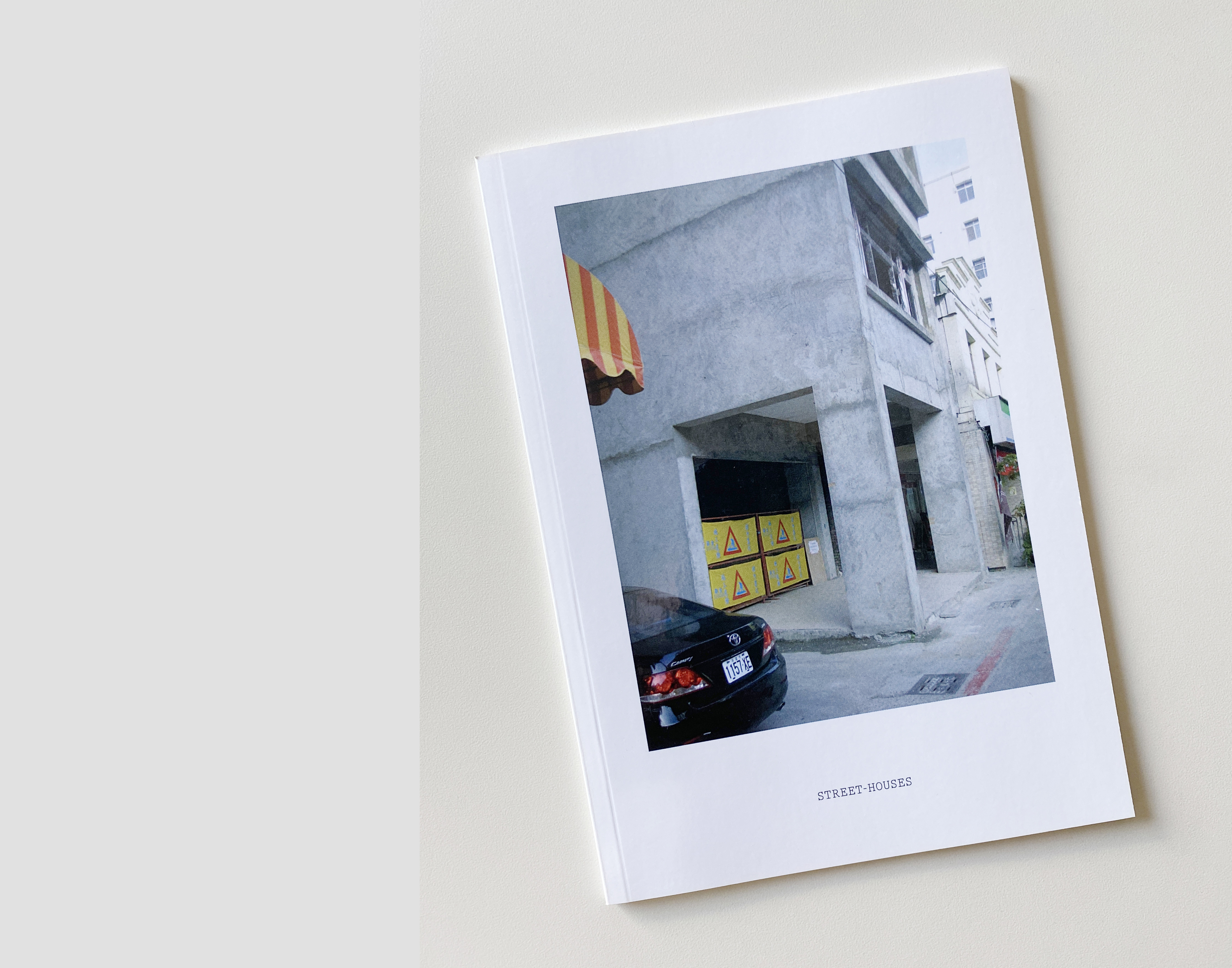
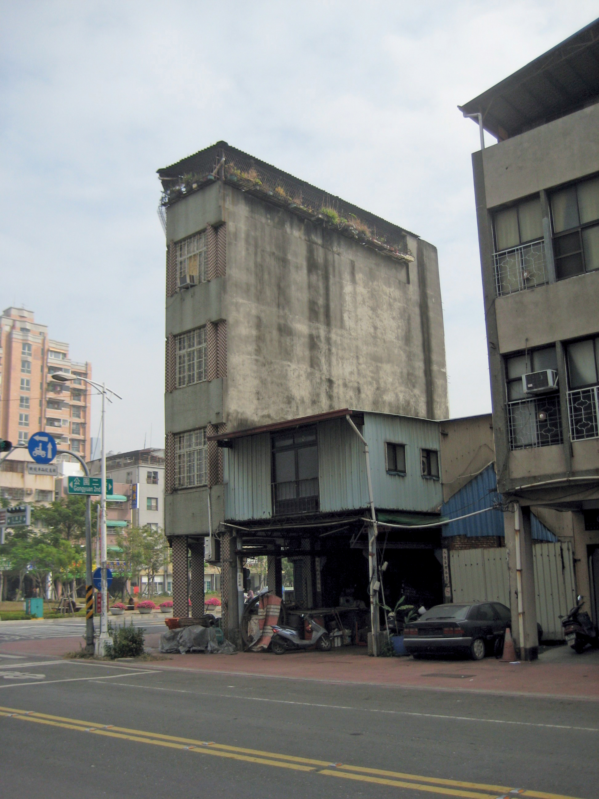

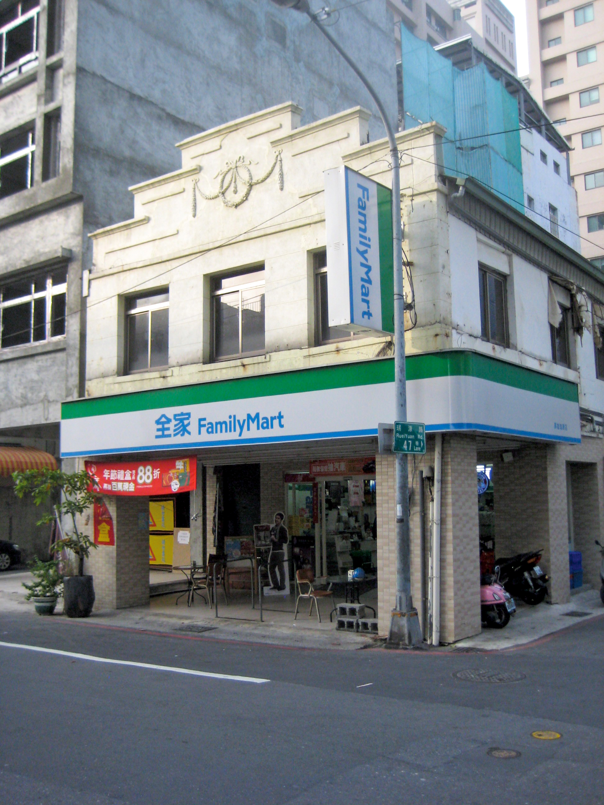
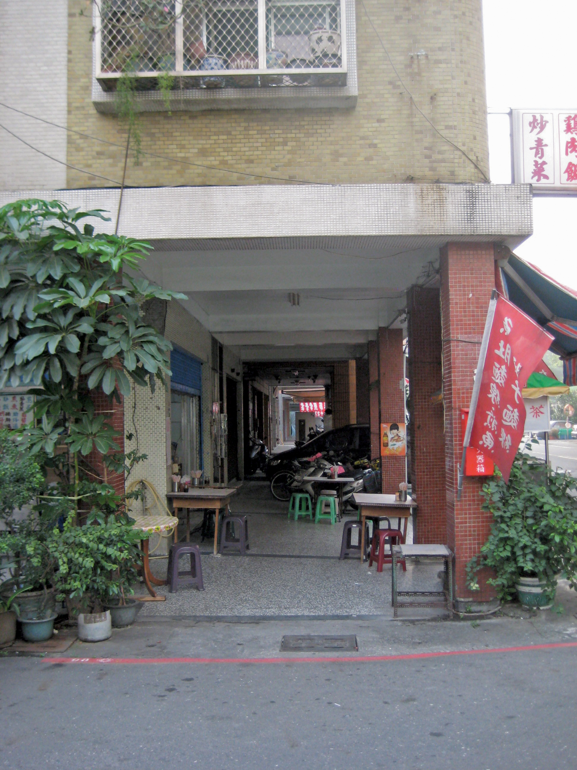
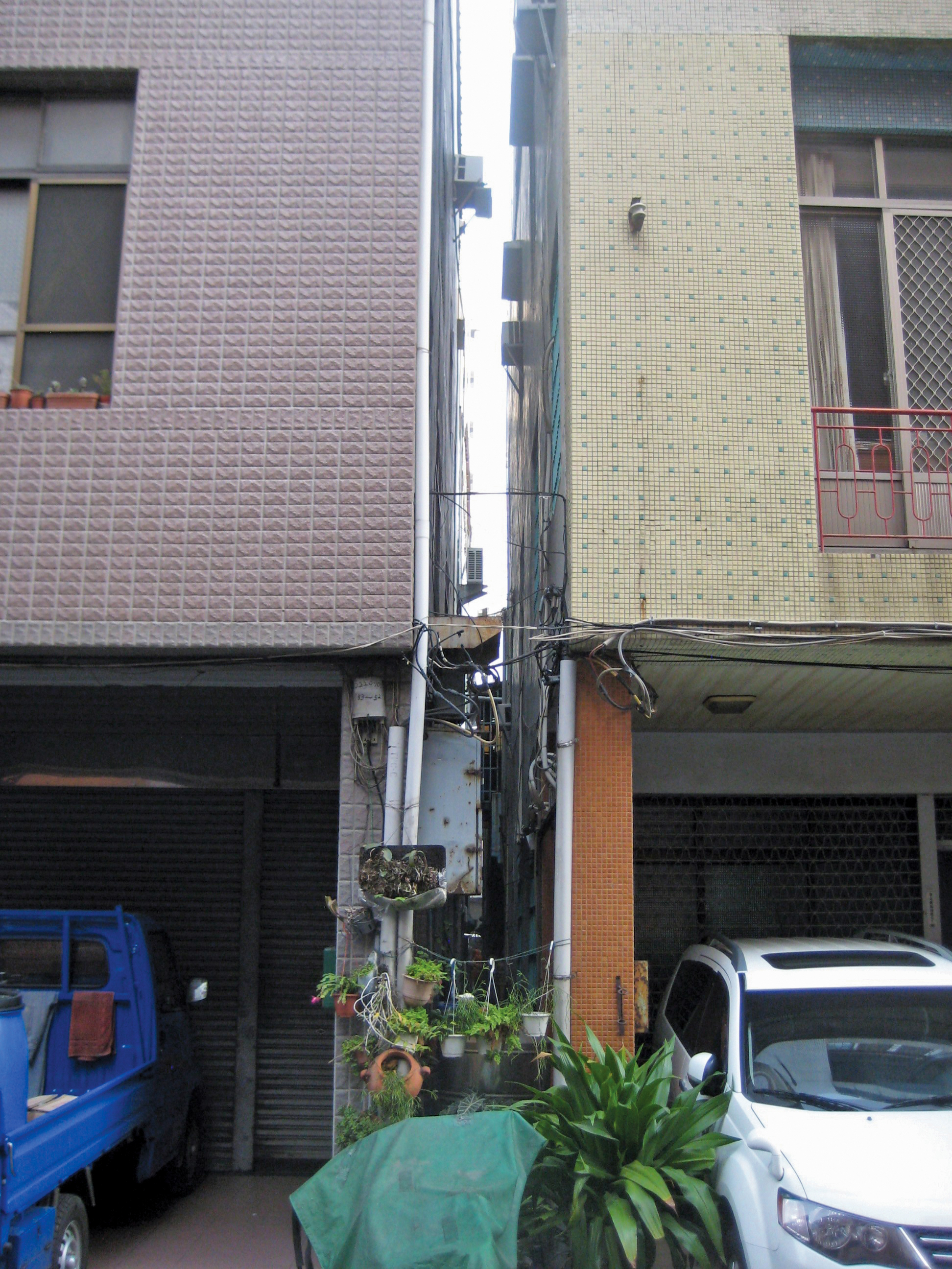
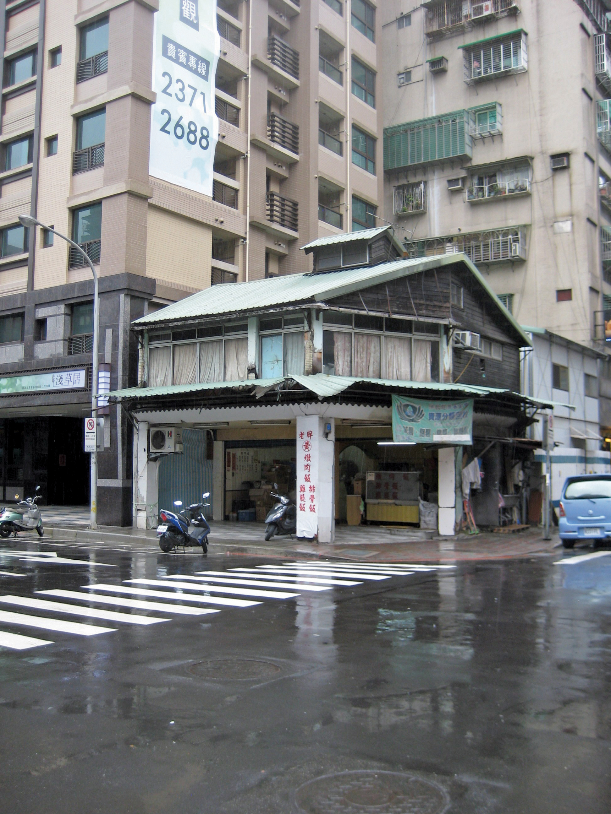
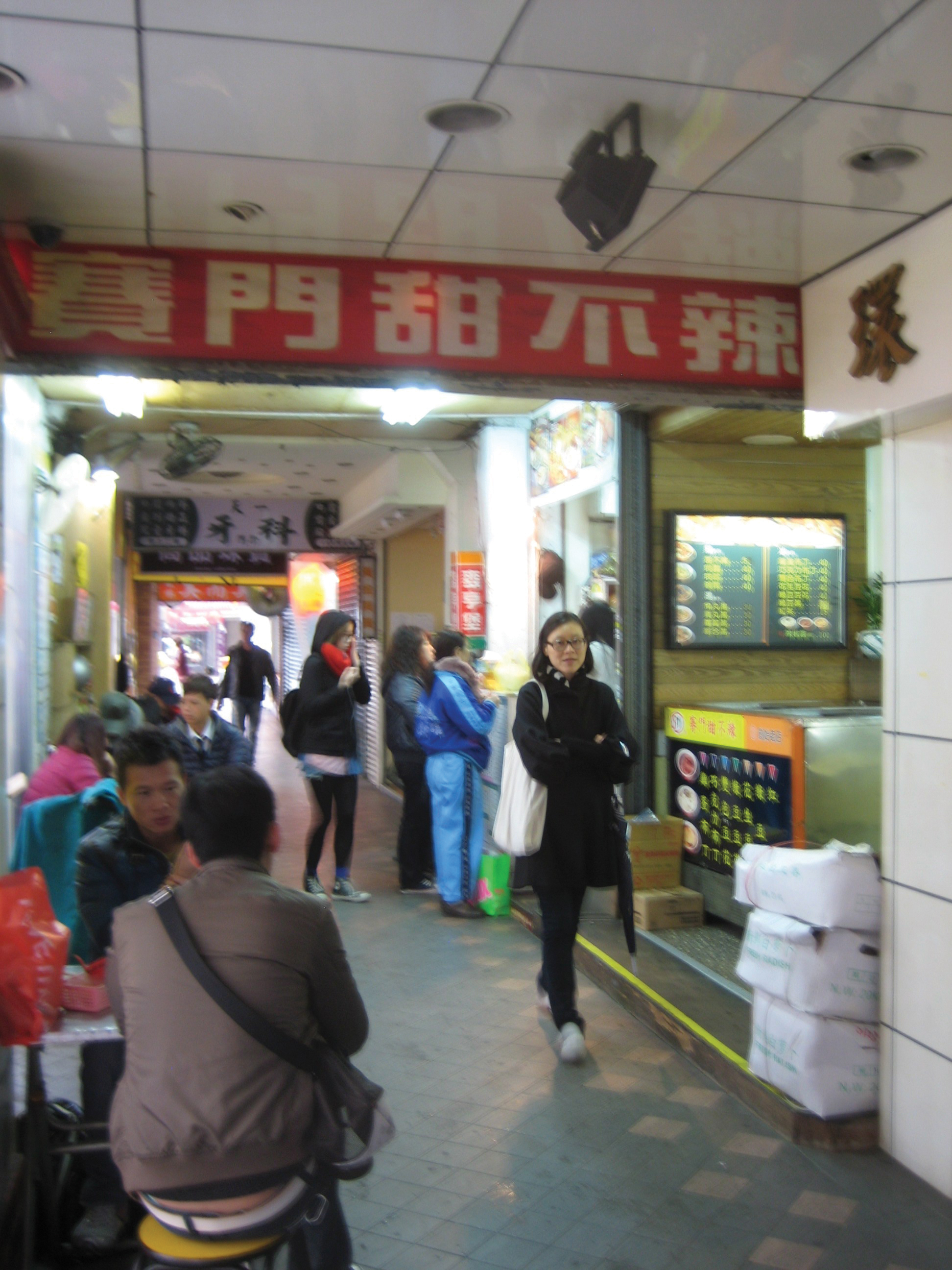
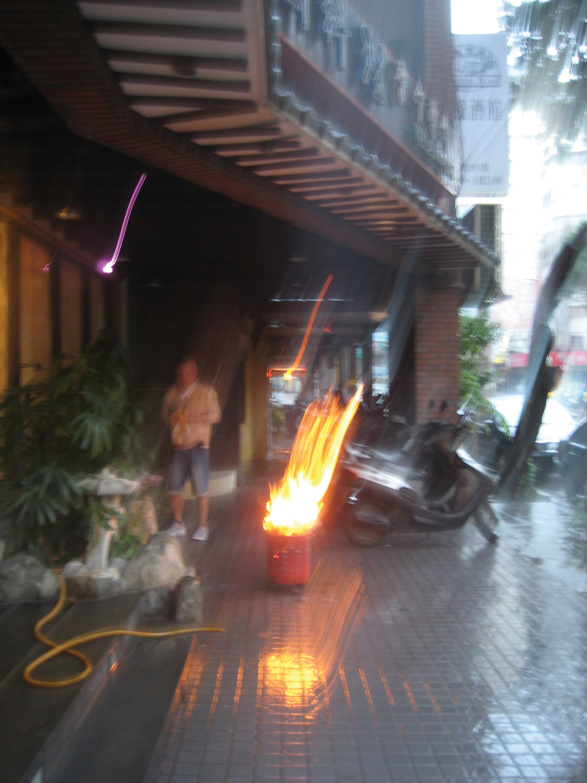
A self-published photo essay by Casey Mack, Street-Houses records this building type in Taiwan, as seen in the cities of Kaohsiung, Sinhua, Taichung, and Taipei. More commonly called a shophouse, the street-house name highlights the type’s operation as an incremental infrastructure, adding together to create continuous pedestrian arcades for more comfortable movement in a nation of intense sun and rain. Even when seen standing alone, a street-house is a seed of connection ready to happen. Introduced to Taiwan while under Japanese control, the street-houses shown in the essay offer an initial investigation into a colonial form, documenting variants of an architecture conceived for replication.
2012. 44 pp., 42 illus.
Softcover
14.8 x 21.0 cm, 8.3 x 5.8 in
$20
Free shipping within the U.S.
︎︎︎ Add to cart
2012. 44 pp., 42 illus.
Softcover
14.8 x 21.0 cm, 8.3 x 5.8 in
$20
Free shipping within the U.S.
︎︎︎ Add to cart
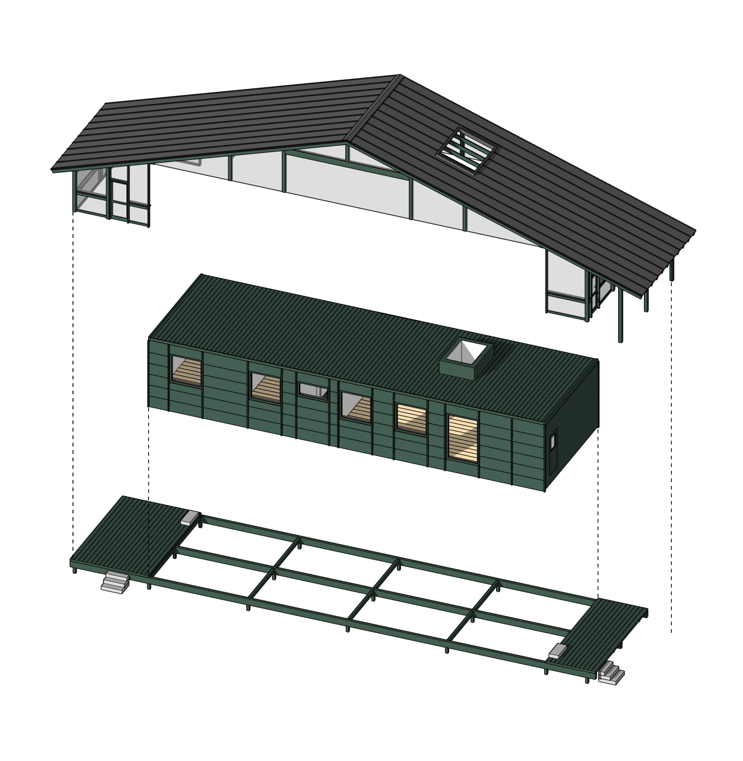 Passive Shack. Moultonborough, NH (2022)
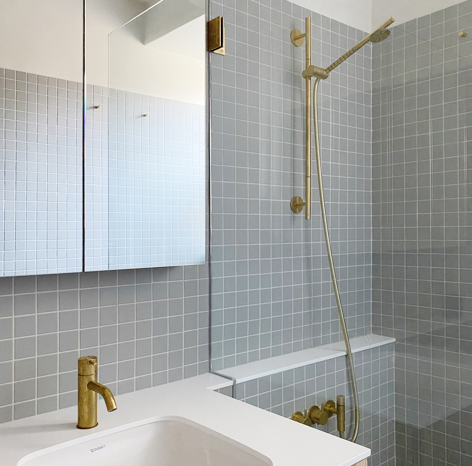 36th Street bathroom renovation. New York, NY (2021)
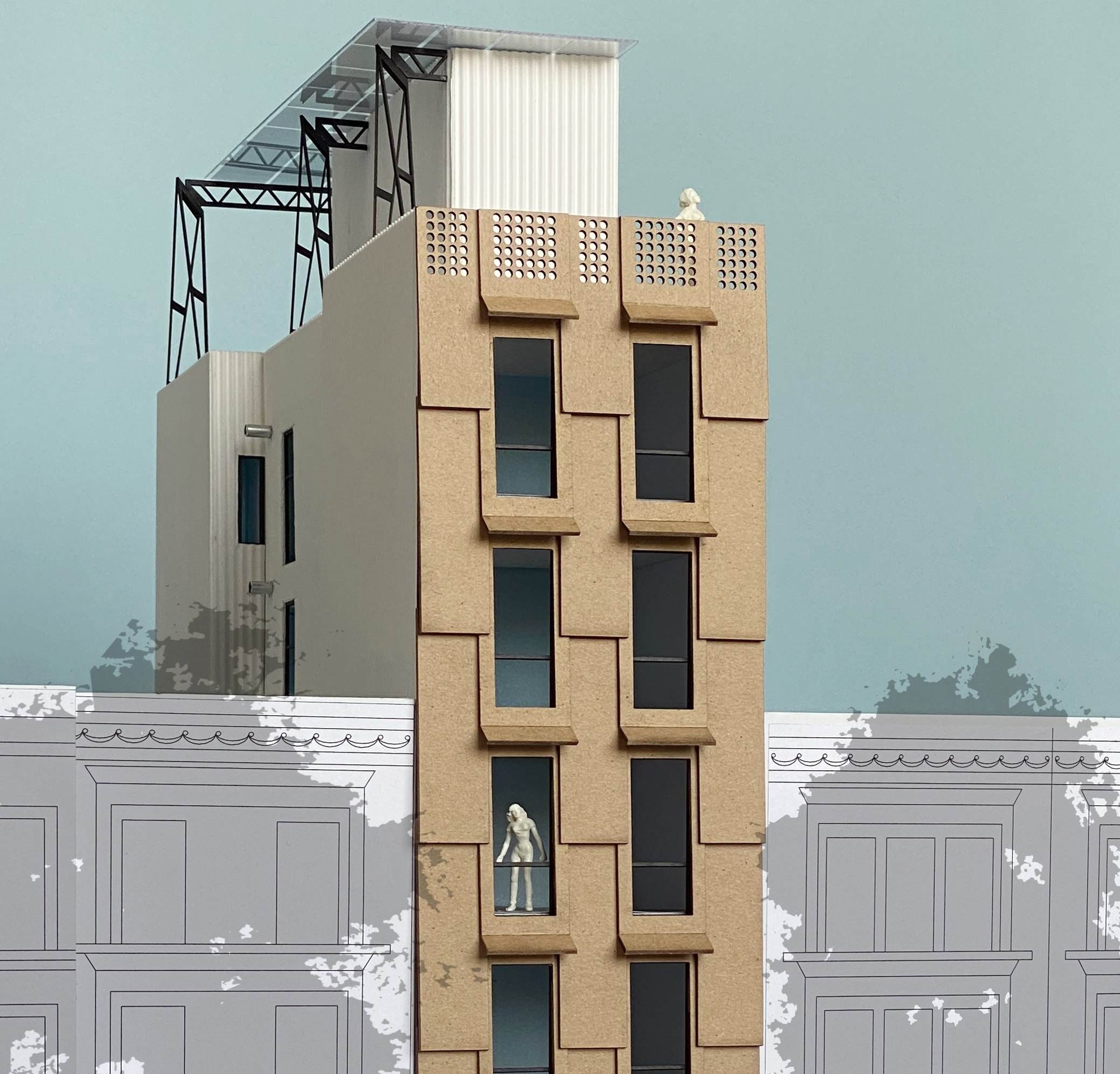 Big Ideas for Small Lots: infill competition proposal. New York, NY (2019)
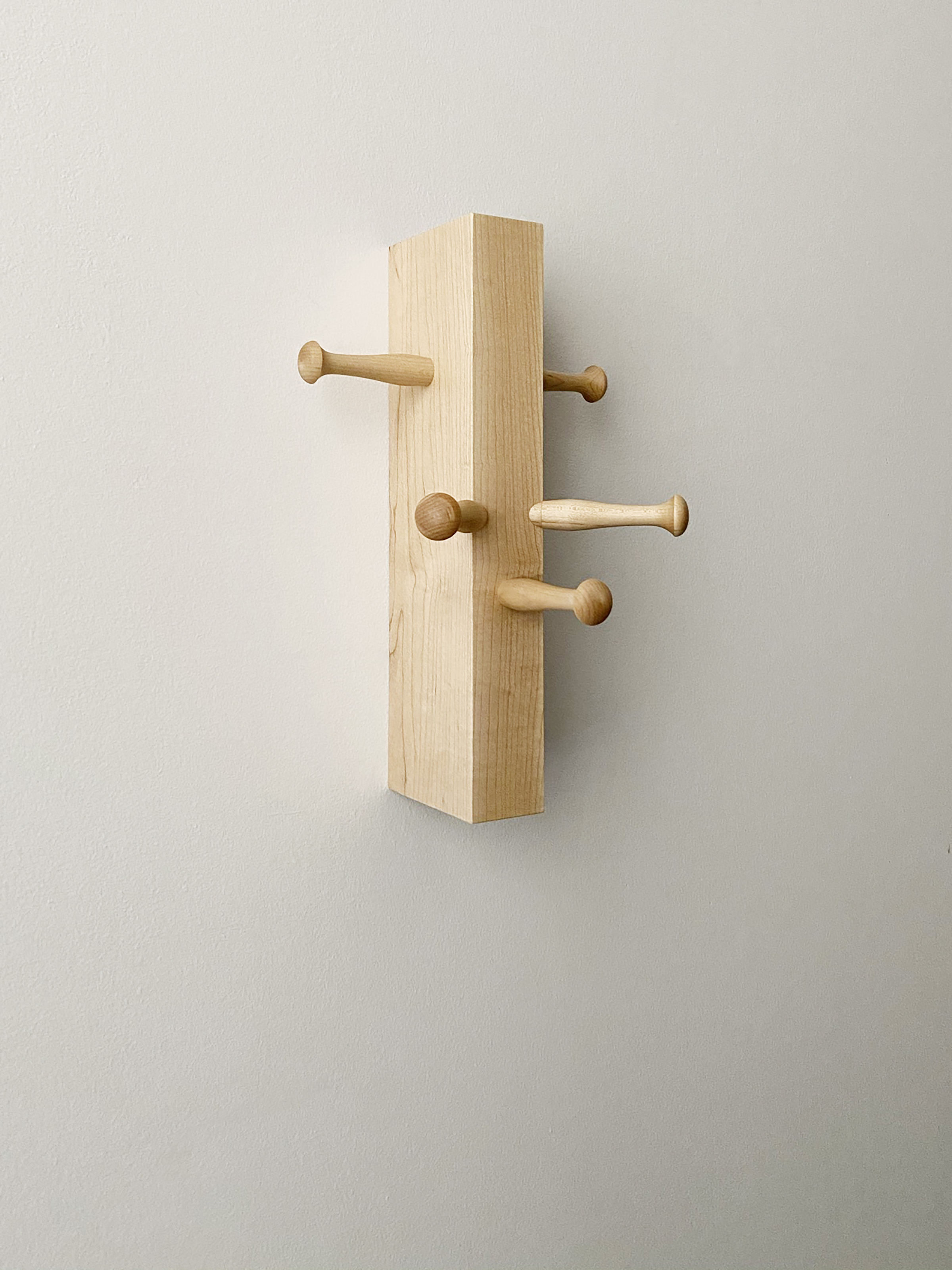 Wall Friends (2021)
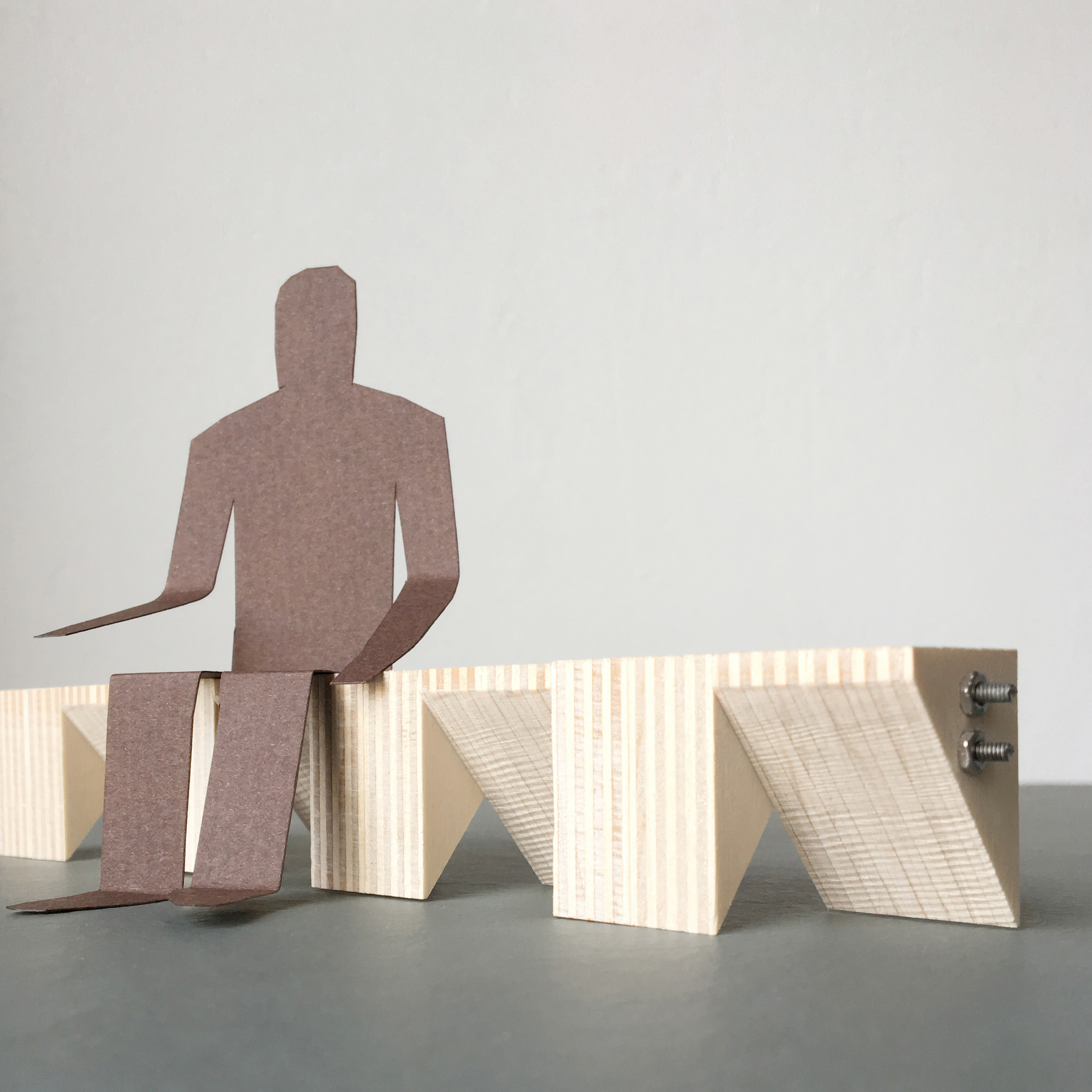 Endless Bench Study (2019)
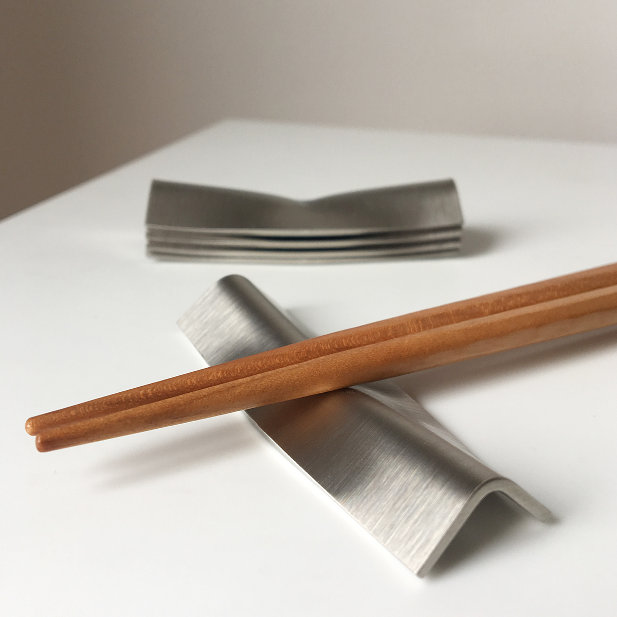 Aplati Rest (2017)
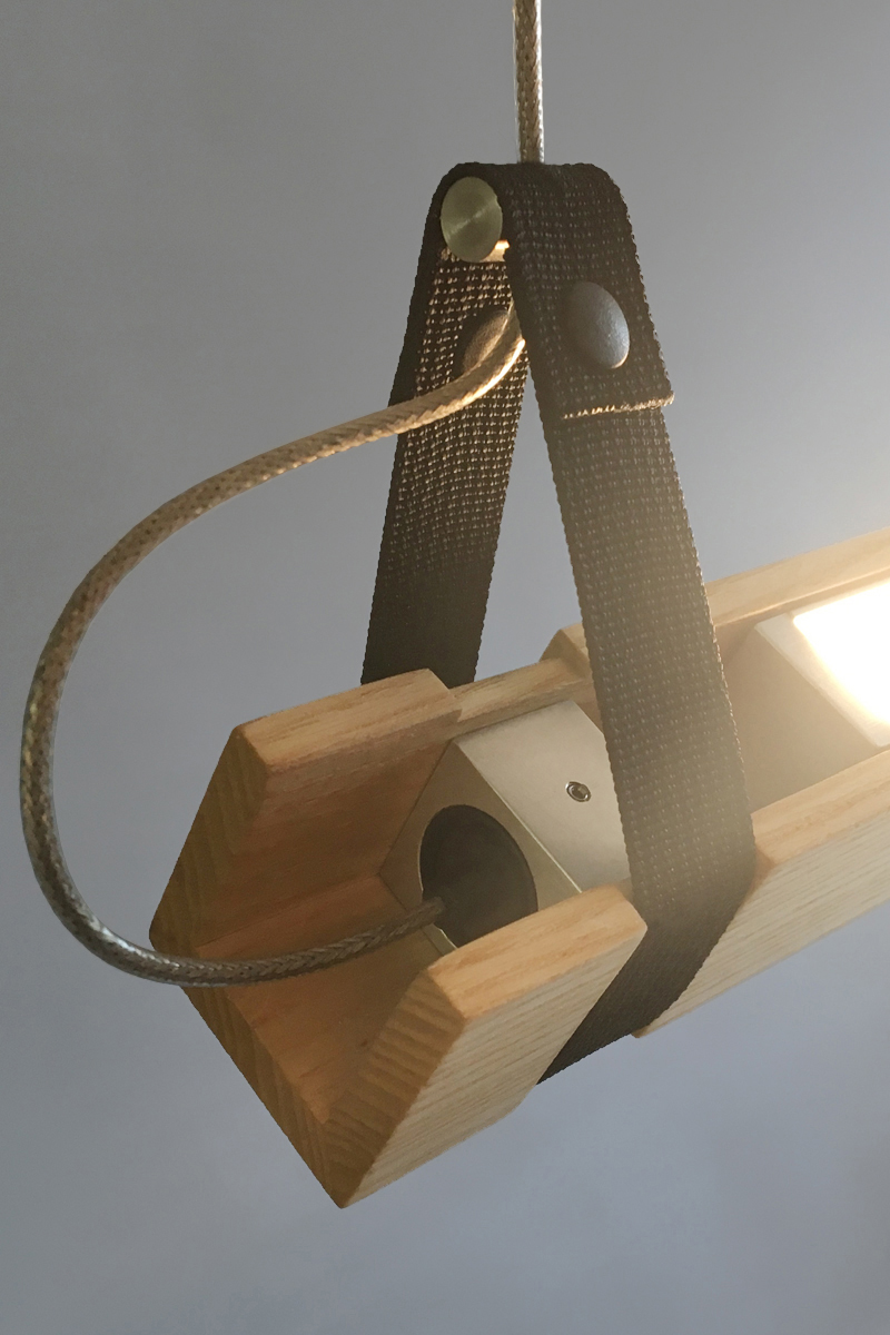 DSU Light (2016)
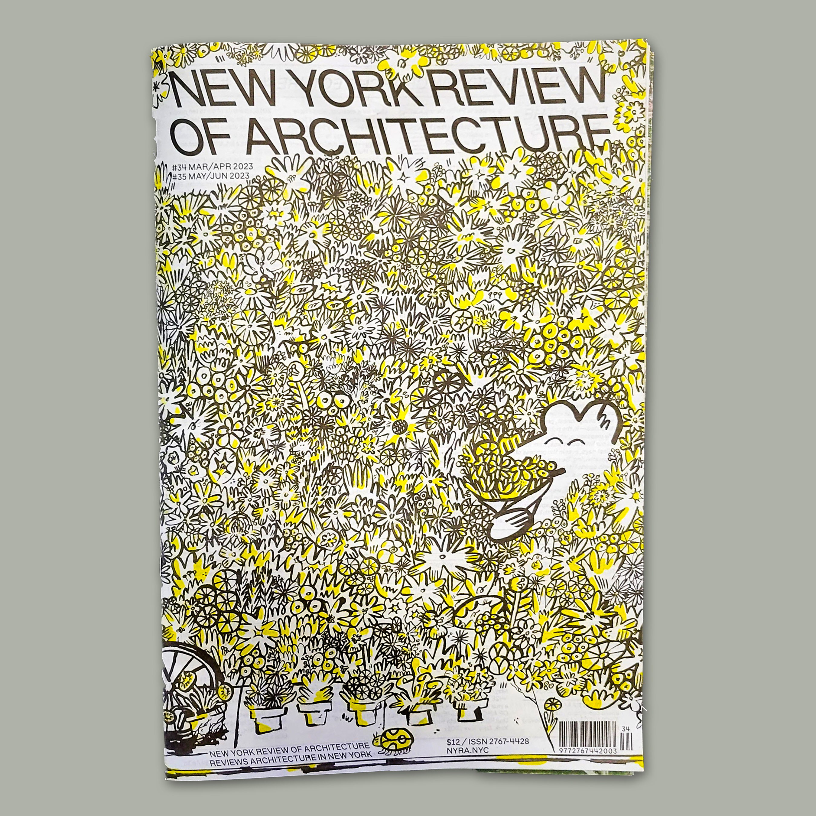 “Critical Distance,” a review of Manfredo Tafuri’s Modern Architecture in Japan in issue #34/35 of the New York Review of Architecture (2023)
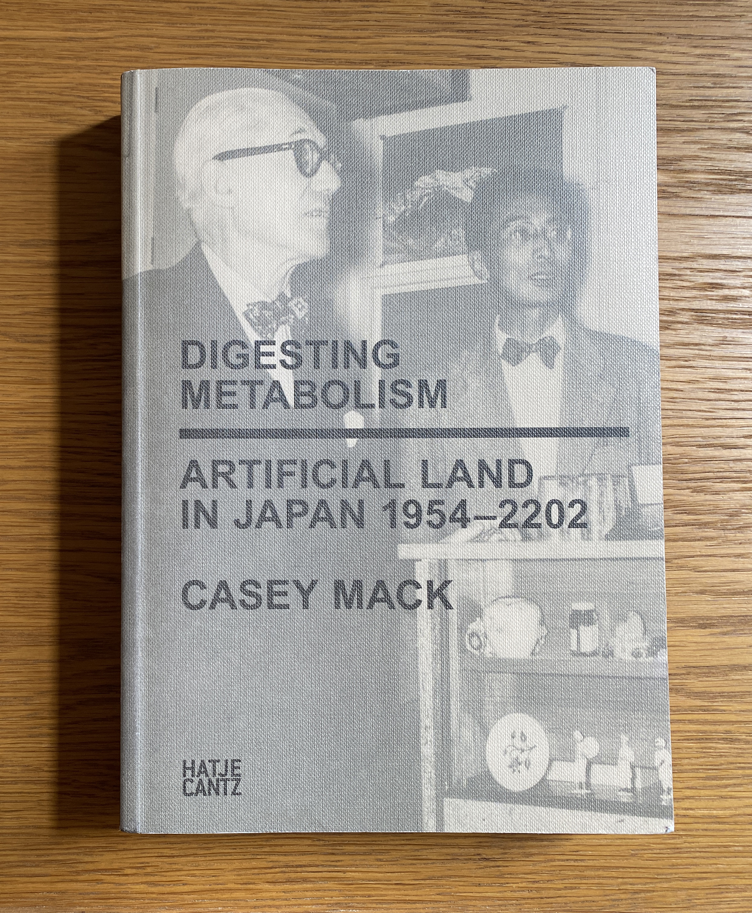 Digesting Metabolism: Artificial Land in Japan 1954–2202 (2022)
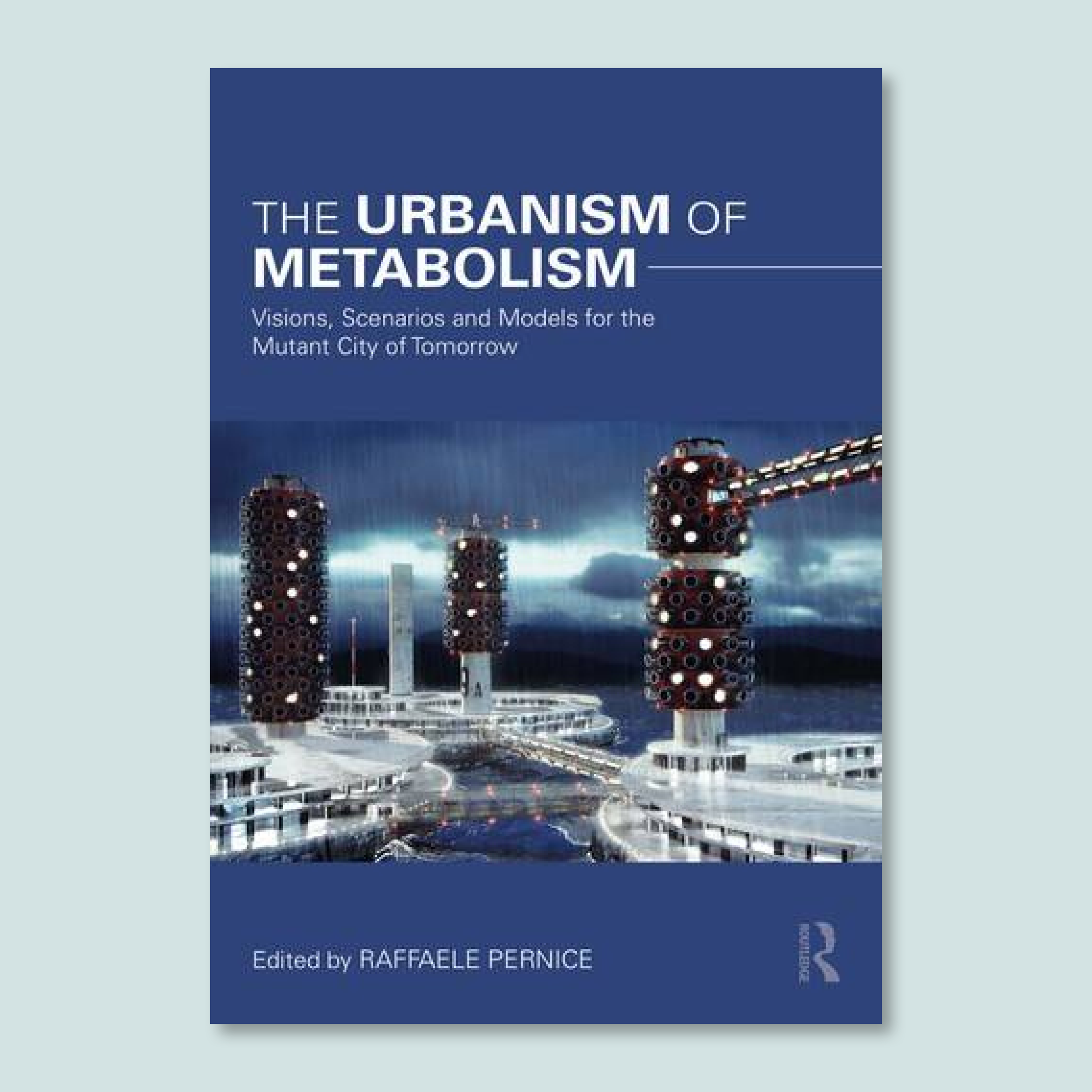 “Sunday-Carpenter Metabolism: Artificial-Land Housing and Resident Decision-Making,” The Urbanism of Metabolism: Visions, Scenarios and Models for the Mutant City of Tomorrow (2022)
 “Transformation and the Motomachi Apartments,” Inheritable Resilience: Sharing Values of Global Modernities, The 16th International Docomomo Conference, Tokyo, Japan 2020+1 Proceedings, Volume 3 (2021)
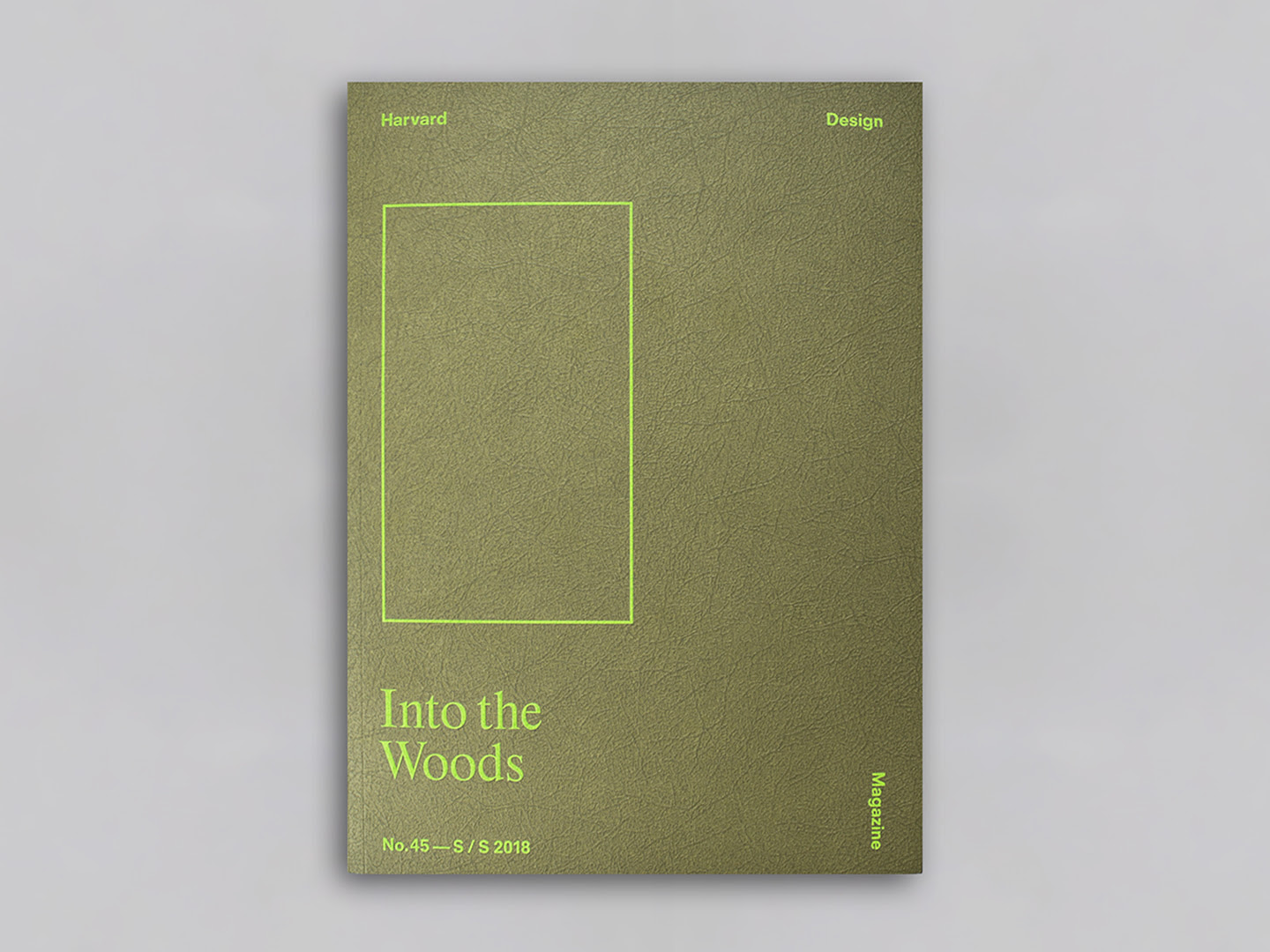 “Metabolizing Wood: Concrete Timber in Japan,” Harvard Design Magazine #45: Into the Woods (2018)
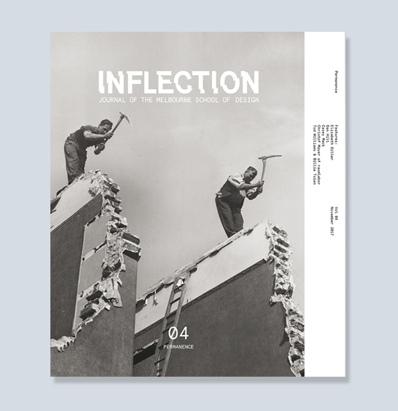 “Future Stock,” Inflection 4: PERMANENCE, Journal of the Melbourne School of Design (2017)
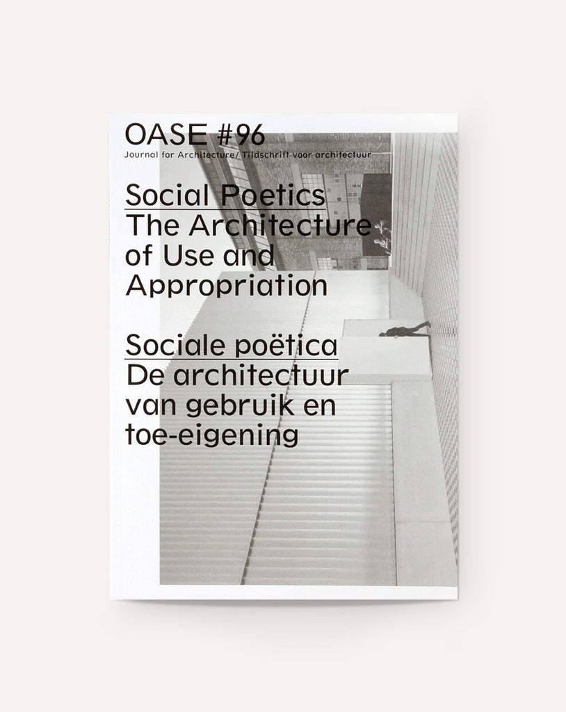 “From Bi-nuclear to Incre-rental,” OASE #96 Social Poetics: The Architecture of Use and Appropriation (2016)
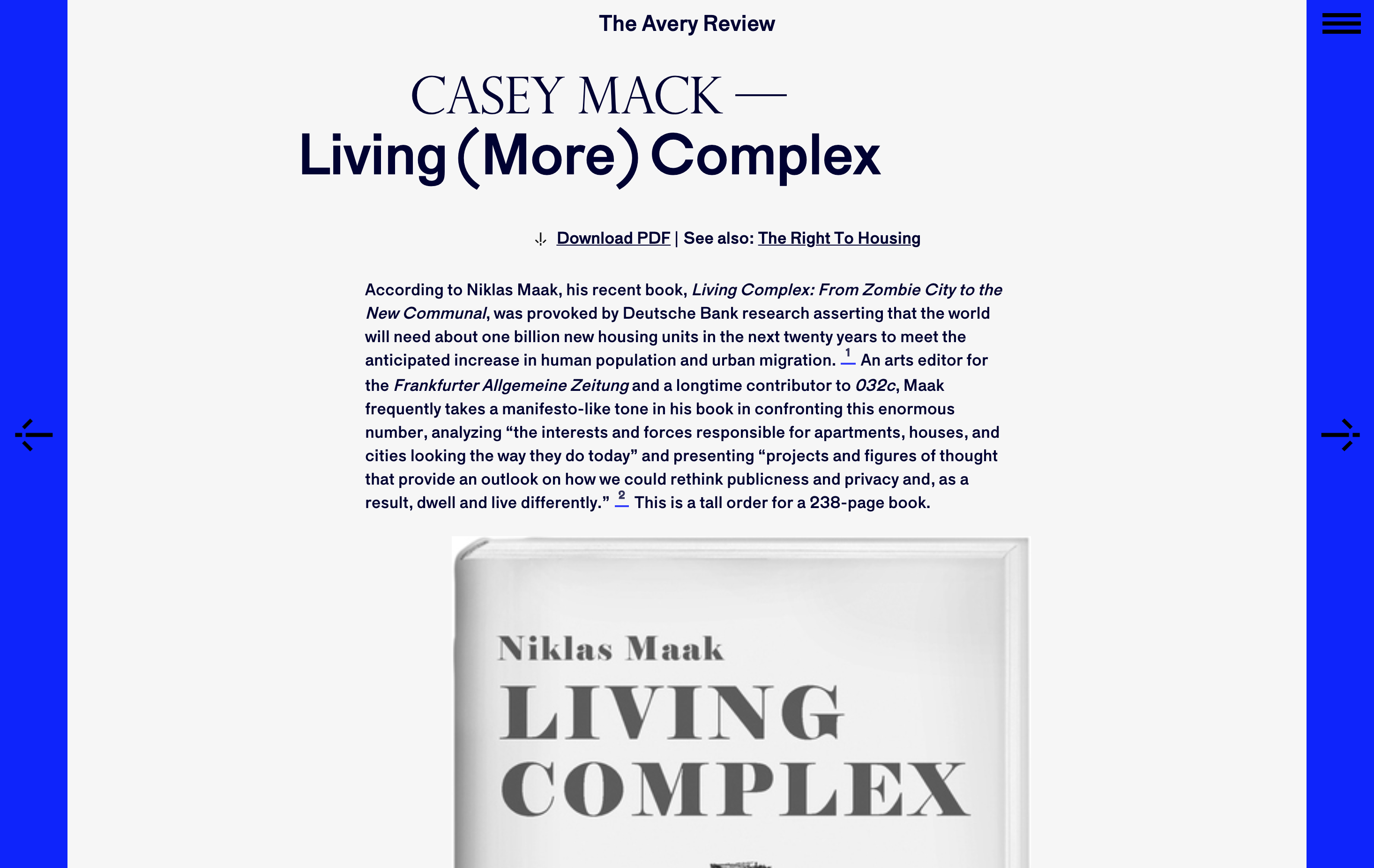 “Living (More) Complex,” The Avery Review 13 (2016)
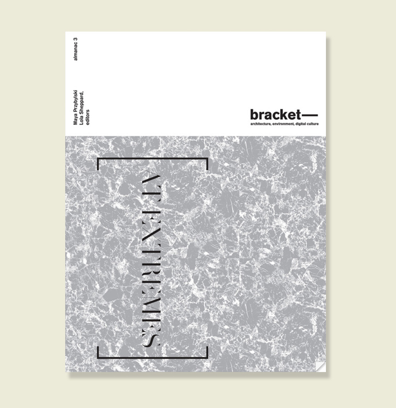 “Avant-Garde Real Estate” Bracket 3 [At Extremes] (2016)
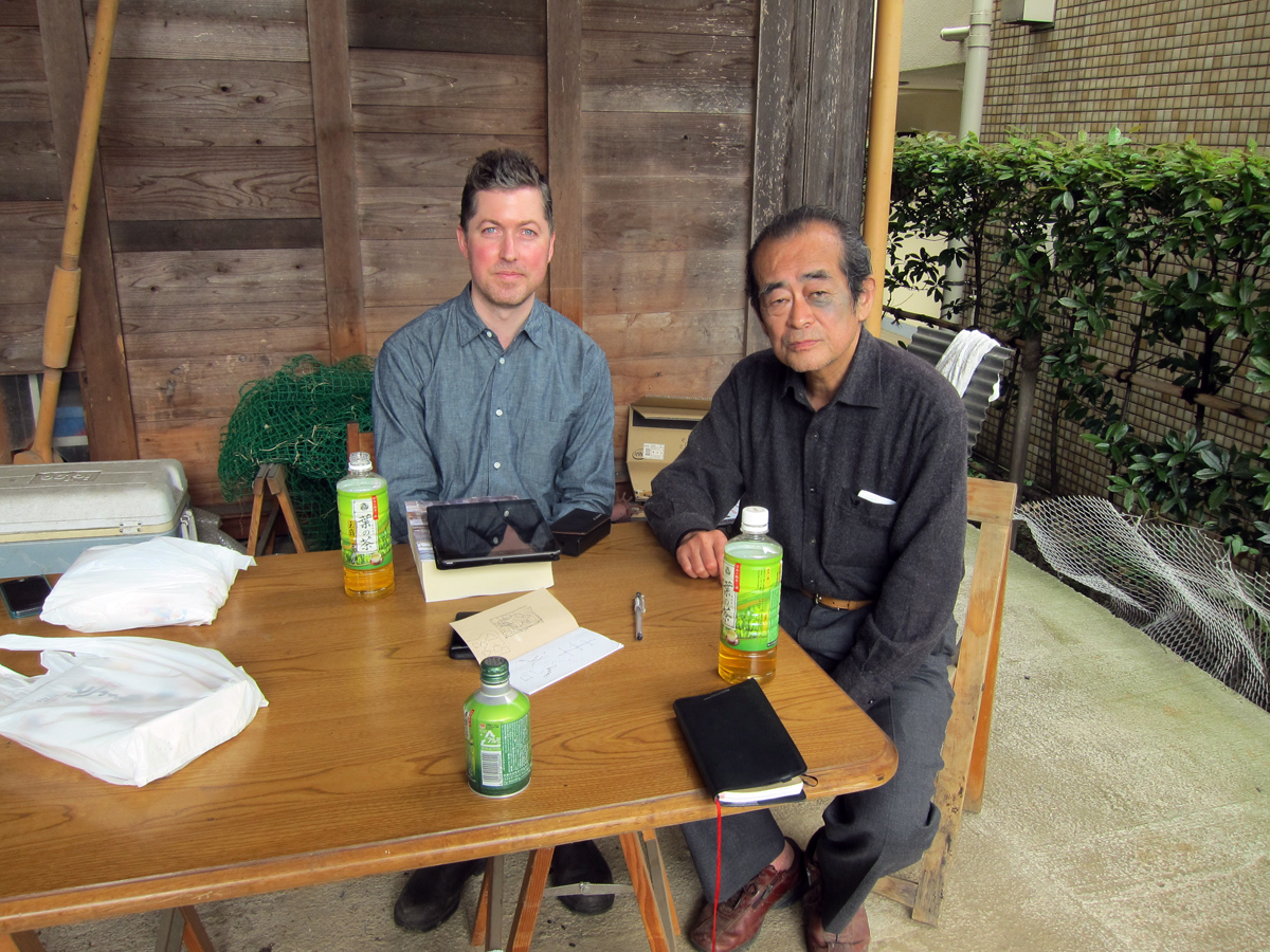 Transcription of interview with Osamu Ishiyama, conducted as research for Digesting Metabolism (2014)
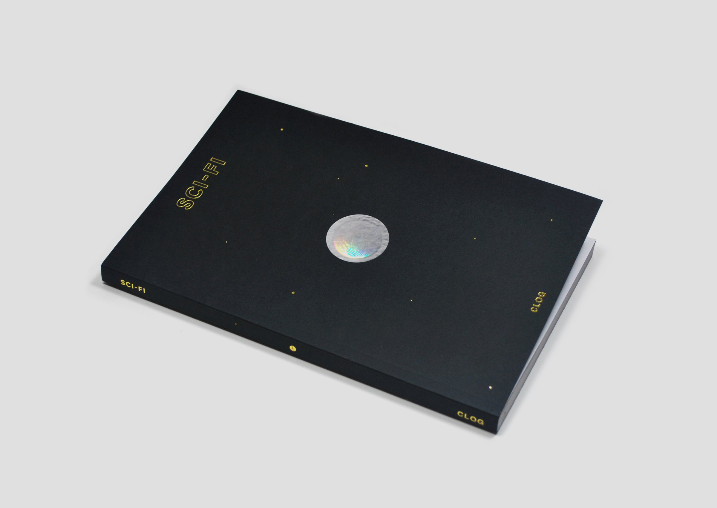 “Sci-Fi R&D” CLOG: SCI-FI (2013)